 Several months ago I was contacted by David Klein, Vice President of Charles P. Rogers & Co. in NYC (bed manufacturing), about working together with him on a project. He described his company as "a small idiosyncratic company that has been making a quality product for over 150 years". David had fallen in love with—and purchased—a 1953 Fageol Van that had been housed in The Golden Age of Trucking Museum which had recently closed its doors. The Fageols were beautiful vans that came in various sizes and configurations.
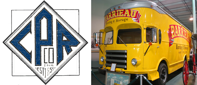
 Physically the truck was in good condition, and David loved and wanted to keep the brilliant yellow color that it had been given by the Barrieau family—the van's original owners. His vision was that this truck would become a moving billboard for CPR & Co, driving around New York, conveying "the Charles P. Rogers Beds message" in a manner that this van might have—had it been theirs back in the '50s. Wanting to keep as much historical accuracy as I could, I asked about older graphics and logos from the CPR & Co archives but there was very little except for this monogram (which I kind of liked).
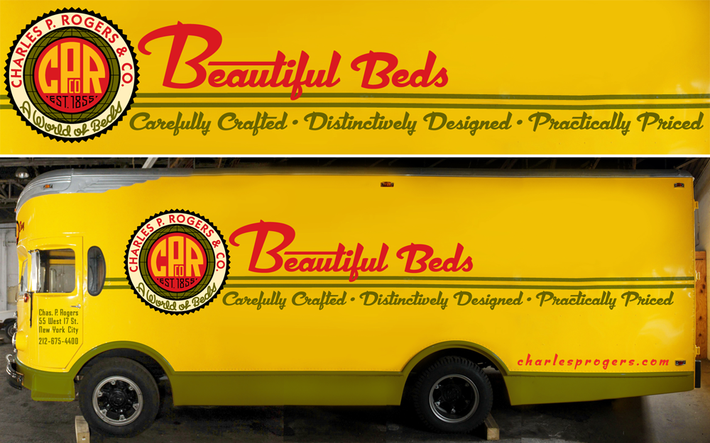
 So, I needed to create graphics that felt appropriate for this 1953 van, and which helped evoke a simpler time. The only concrete thing that I had to work with from Rogers & Co. was the monogram, so I used that design as a basis to create a "medallion" that could be used on the front and sides of the truck. Just prior to the call from David I had begun development of a new font (which became Dynascript over the next few months), and decided that somehow it felt right to use it for the supporting graphics/slogans on the sides of the van.
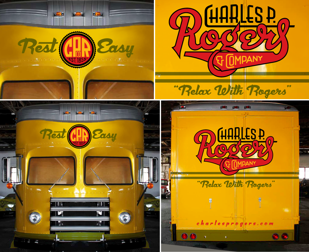
 The van is currently in the process of having my graphics applied, so what you're looking at is a Photoshop assembled composite of the truck with my design work superimposed.
  For the back of the van I created a logo in which I tried to evoke and encompass the over 150 year history of the company. Though it is a bit different from the mid-century vibe that Dynascript had helped give the front and side graphics, I felt it was appropriate and didn't conflict with them. Also, it might be noteworthy to mention that I used the non-connecting italic version of Dynascript for the URLs on the back and sides of the van.
Not unlike my project with Deliscript and the Canter's food truck, here was another instance of the influence that assignment work and font design had on each other. Even though they both started out as independent projects, they soon became inextricably entwined. Dynascript is probably a better font for it, because, with this project, I was trying to solve its design both from the point of view of a fontmaker, and from that of a font user.
Soon, when actual photos of the finished truck become available, I will post them here along with my development sketches and more detailed descriptions of the design process. Comments welcomed!
