This logo was selected for inclusion in Graphis Logo Design 8 Much of the design work I do tends to be seen by many as “vintage inspired”. I do frequently look to the past for inspiration, but it would be wrong to categorize all my work that way. Case in point: the logo I designed for “Sixty Second Green”. This website will have a series of tips presenting simple ideas and products that are “green” and eco-friendly. The site will propose simple yet powerful ideas on how people can save money and at the same time do good things for the environment—all within videos no longer than 60 seconds. My challenge was to create a memorable logo that would be reflective of the green/sustainability movement.
Working with Mark Pruett, owner and senior editor at Storyville Post (whom I had previously worked with some years back designing their logo) I came up with several loose ideas:
Many of the roughs used the obvious element of a leaf as a motif, but one was reminiscent of the design of the Universal Recycling Symbol, designed back in 1970 by USC student Gary Anderson.
Fortunately this rough was what the client reacted most strongly to, and we were able to develop a unique logo that didn’t resort to the usual visual clichés.
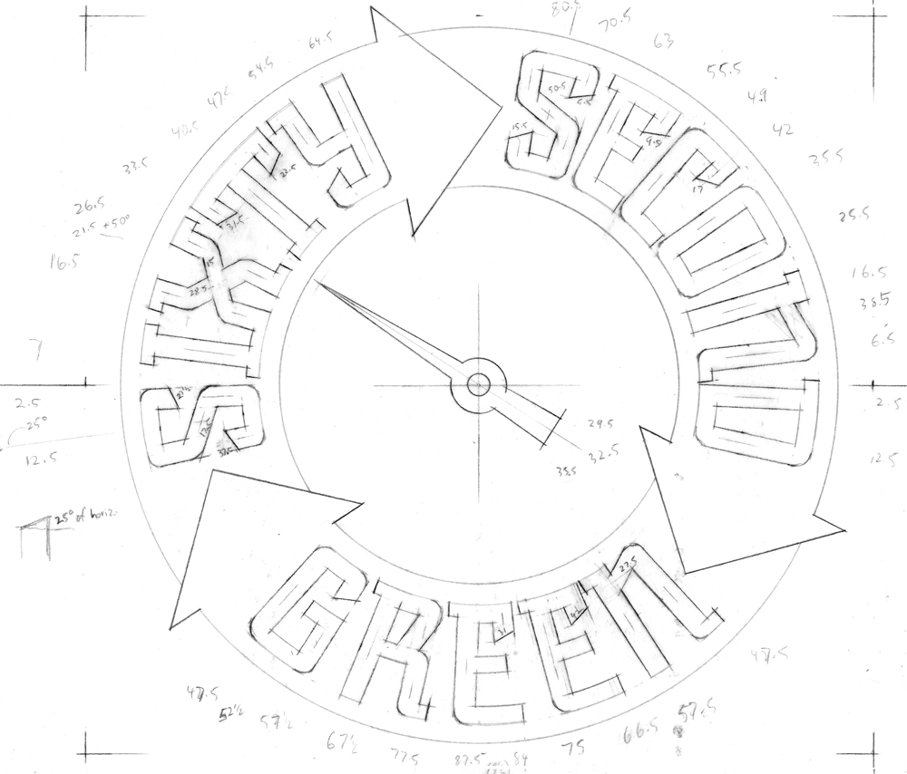
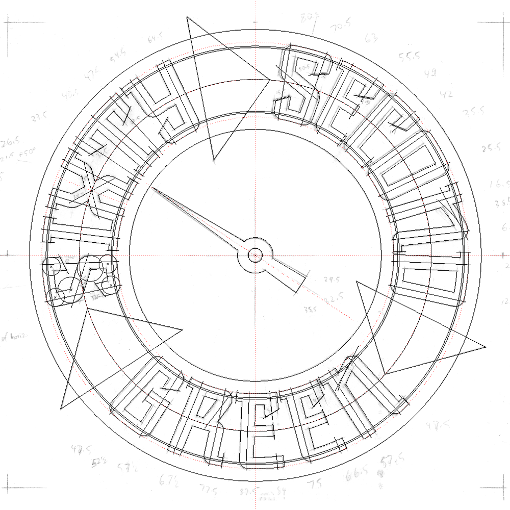
So to develop this design I first had to figure out its geometry by placing my original rough drawing in Adobe Illustrator and working over it:
Then I created a new drawing using the inner mechanics derived from my Illustrator sketch. One really cannot set type around a circle without it looking somewhat awkward, so you can see that the verticals in each letterform I’m creating point directly towards the center of the circle, and are marked in the pencil drawing with angle notations:
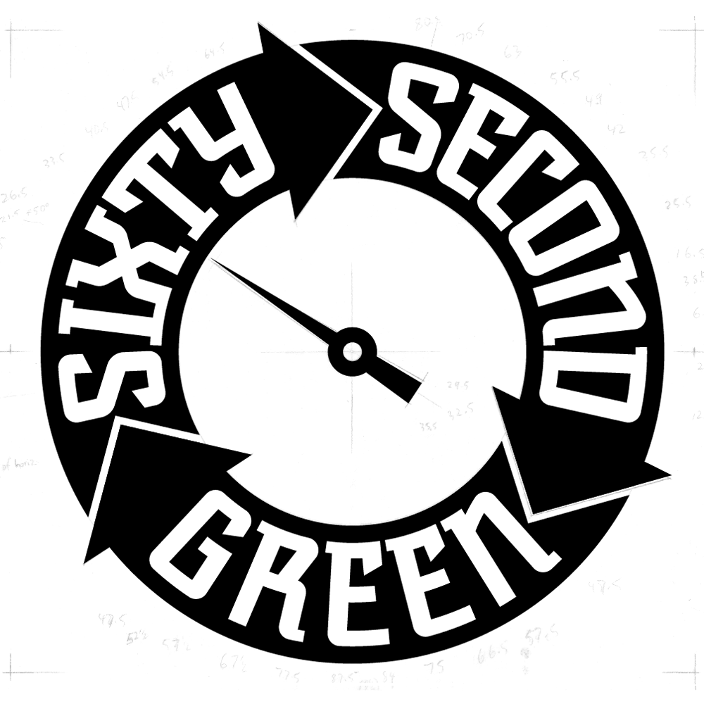
Using the angles I had earlier jotted down on the drawing, I started building the letterforms and the logo.
Note that the letterforms in the upper portion of the logo flare outwards at the top, while those at the bottom are pinched in at the their tops. Yet they’re all consistent within the logic of the design and don’t read as different sorts of letters:
I then created a version with a bit of shading and a black background:
This iteration was used for the animated version that Storyville Post created from my art for the Sixty Second Green videos:


