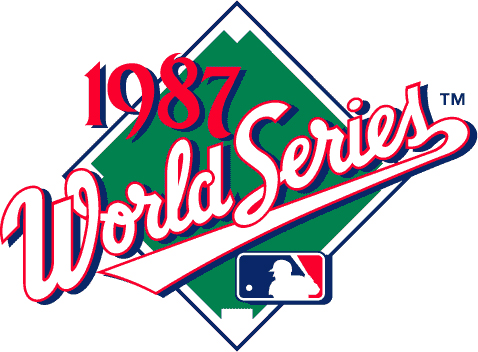
Recently Andy Heckathorne brought to my attention that Major League Baseball had used Metroscript in their logo for this years World Series logo. Admittedly it's not a major part of the design, but as Andy pointed out "It's the WORLD Series!".

In the Metroscript Manual I wrote that "You can change the proportion of the set type by scaling it either horizontally or vertically." The designer here has really pushed the reproportioning by scaling the type vertically at 72%. Below the sample is the un-reproportioned type. I don't know who the designer is who worked on this logo, but if anyone out there knows and wants to send me that info I'd like to properly credit him or her.
Actually I'm no stranger to the World Series logo, having actually designed it once some years back. I wasn't terribly thrilled with this design (below) so I tweaked it a bit a few years later, and that newer version is the one I now show on my website.

It was interesting for me to notice that the letterforms I used in this logo were in some ways precursors to the forms in both Metroscript and Deliscript.
I'd been using script letters similar to these in my assignment work for years before creating those fonts.
While I'm on the subject of the World Series, as a side note I thought that it might be worth mentioning that my wife, illustrator/designer extraordinaire Laura Smith, did a series of illustrated scorebook covers for Major League Baseball for what became known as the "Subway Series" in 2000.


