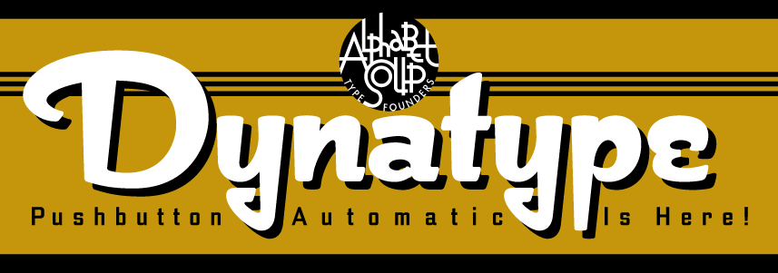
Alphabet Soup is proud to announce the release of Dynatype—the second of its “Dyna-Fonts”. WhereasDynascript was primarily a connecting script font with a non-connecting italic alternate style, Dynatype is first and foremost an upright, non-connecting font with an upright, connecting alternate component.

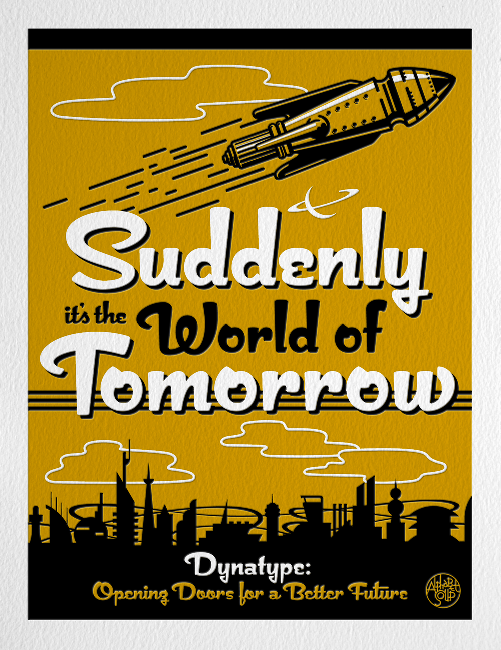
"Suddenly…it’s the World of Tomorrow!” With the push of a button Dynatype will automate your typesetting experience. Dynatype is actually 2-Fonts-In-1: without switching fonts you will be able to instantly change from Dynatype’s “regular” default style to its alternate connecting version with the simple push of a button.

To some these fonts may be reminiscent of various mid-century neon signage, and of sign writing, Speedball alphabets and even baseball scripts. The design of the Dyna-fonts also takes some cues from a historical typographic curiosity that began in Germany in the ‘20s and which lasted into the ‘60s—when Photo-Lettering gave it the name “Zip-Top”. Basically it was believed to be the wave of the future—that by weighting an alphabet heavier in its top half, one could increase legibility and reading speed. The jury’s still out on whether or not there’s any validity to this notion, but hopefully you’ll agree that in the context of this design, the heavier weighting at the top of the letters helps to create some uniquely pleasing forms, and two unusual fonts.

Typesetters across the planet will be able to set copy in their language of choice.

Dynatype’s 677 glyphs can be used to set copy in: Albanian, Basque, Catalan, Cornish, Croatian, Czech, Danish, Dutch, Esperanto, Estonian, Faroese, Finnish, French, Galician, German, Hungarian, Icelandic, Indonesian, Irish, Italian, Kalaallisut, Latvian, Lithuanian, Malay, Maltese, Manx, Norwegian Bokmål, Norwegian Nynorsk, Oromo, Polish, Portuguese, Slovak, Slovenian, Somali, Spanish, Swahili, Swedish, Turkish, and Welsh—and of course English. Sorry! Languages of the Lunar Colonies not yet supported.


Dynatype on MyFonts HERE.
Download the Dynatype Manual HERE
Dynatype Design and Art: Michael Doret
Dynatype OpenType Programming: Patrick Griffin/Canada Type


