Viewing entries in
Wayback Machine

Overspray

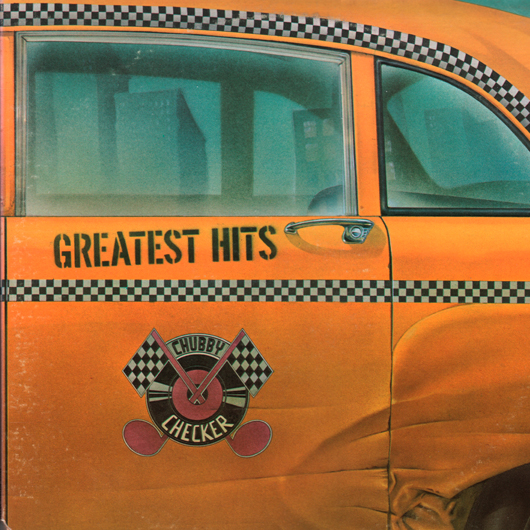
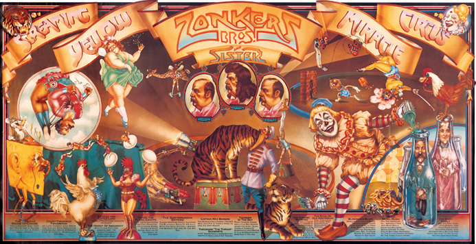
At the very beginning of my career I hooked up with airbrush wiz Charles White III. He rented me deskspace in his studio on Lexington & 26th Street in Manhattan, and helped give my career the push it needed. We did quite a bit of work together in those days—work that I'd like to think was groundbreaking illustration work. Rather than have typography slapped over an illustration, we tried to figure out new and inventive ways of integrating letter and image. This is evident in pieces like the Chubby Checker album cover where the title was part of the illustration—contained in the Checker Cab-like decal I created—or the Gentle Giant cover where I painstakingly figured out what dimensional lettering would look like as it wrapped around a glass jar. One of our first collaborations was the incredibly complex Screaming Yellow Zonkers poster which took a more traditional approach to the integration of letterforms and illustration.
Charlie is finally getting the recognition he deserves for that early work in the just released book Overspray by Norman Hathaway. The book features Charlie who, along with fellow artists Dave Willardson, Peter Lloyd and Peter Palombi, formed a quartet of California artists that transformed the illustration landscape in the '70s. Charlie, Dave and Norman together with legendary designer and art director Mike Salisbury (who contributed an essay to the book) were all in attendance at a book signing at FAMILY in Los Angeles on 11/12/08. To see photos from the FAMILY booksigning (which includes the back of my head) and some discussion from Norman Hathaway about the process and problems he encountered putting together this book, check out his Overspray Blog. To see more of Charlie's work from this period, I've put together a PDF of images (not currently available) culled from his website. Throughout his career Charles White III has been consistently one of the most interesting talents around. Visit his Olio website to see what he's been up to.

No Second Chances?

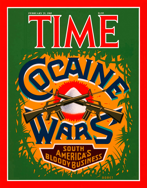
They say there are no second chances, but recently I found that statement to be not entirely true. I've designed and executed art for many covers of TIME magazine. I was never entirely pleased with the cover I did for TIME's "Cocaine Wars" story. I had originally wanted to focus the design around a skull image, and to have the letters in "Cocaine Wars" have snowcaps on them like the letters you'd see on ice machines. But the powers-that-be at time had me eliminate the skull (too menacing) and in it's place illustrate a small mound of "cocaine". The result as you can see was a still a fairly good cover but with a focal point that was kind of anti-climactic.

Fast forward to present day: Rick Klotz of FreshJive—an LA streetwear manufacturer, who also runs his flagship store Reserve in the heart of the Fairfax district—contacted me to see if they could license some of my older designs for silkscreened T-Shirts. He immediately gravitated to some of my TIME covers—including "Cocaine Wars" among others among others. Since I would have to reconfigure the art for silkscreen anyway I immediately saw this as an opportunity to make good on that design that I never felt right about. Freshjive will be distributing that T-Shirt design among others of mine in two different color schemes for their Summer '09 line.

For All You 'KISS' Fans Out There...

Years ago I did the cover for Kiss' album "Rock and Roll Over". When I did it, I styled it after another piece I had done—a cover for the Japanese graphics magazine IDEA. Over the years this piece has gotten more notoriety (founded or unfounded) than almost any other piece of art I've done. I've done many interviews about my experience doing this cover. This short interview was done for Rockpages Web Magazine, out of Greece, which is part of their year-long special on this rock group. Another more recent interview was done for "Tokyo Five" and can be seen HERE.

What I Do (#3 of 3)

Trying to cite a few sample pieces that are representative of what I do is not that easy. Although there are many common threads running through my work, much of it has ranged all across the board. Many people say they can always recognize it by "my style", but it's not as easy as picking out the work of many illustrators who have a style that's clearly definable. If I had to pick out several pieces that are representative of what I do, I might select the logo I designed for the NY Knicks, one of my covers for Time Magazine, the cover I did for the Squirrel Nut Zippers CD "Bedlam Ballroom" and the treatment I created for the New York Times of the Tribeca Film Festival. These pieces are all quite different in nature, yet tied together by what I believe to be my personal graphic vision.

What I Do (#2 of 3)

I created a teeny-tiny niche for myself when I started doing "letterforms" art—this was back in the ‘70s. For me that time was a low point for typography. There wasn’t that much going on design-wise that held my interest. I felt at the time that illustration and typography/lettering were seen and treated as two seemingly unrelated disciplines. To my mind typography had become uninteresting and was hardly ever fully integrated with images—whether they were photographic or illustrative. At the time the very popular modernist movement (as typified by such designers as Rudolf de Harak and Chermayeff & Geismar) represented a way of approaching design that for me held very little interest. When I looked back a few decades at the rich history of ephemera in this country it seemed that we were in visually lean times.

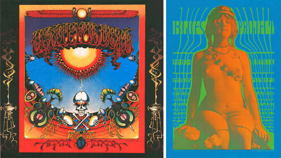
Early work by Rick Griffin (l.) and Victor Moscoso (r.)

While a student at the Cooper Union I was very taken with the "psychedelic" posters that had appeared on both coasts. The work of such artists as Victor Moscoso, Kelly & Mouse and Rick Griffin had a huge impact on me with their unusual use of color and integration of letterforms and striking images. Of course I don’t think I could have verbalized any of this at the time, I just knew what I liked—and wanted to see more of those sorts of things. So I started to create custom letterform solutions, working and collaborating with illustrators—specifically Charles White III and Doug Johnson. I soon realized that I myself could also be a maker of images and so, after gaining a little self-confidence, started to take on projects where the image and the typography associated with it became more integrated with each other—at times becoming one and the same. I guess this was to become my "thing"—the integration of letter and image. Soon, other young designers began imitating what I did. At the time I kind of resented it as “plagiarism”, but I soon realized that imitation was the most sincere form of flattery. Over the years my “imitators” branched out and found their own voices. So it’s gratifying to see that in some small way I may have influenced a generation of designers.

What I Do (#1 of 3)

People are always asking me how I ended up doing what I do. They also want to know if what I do has a "name". My intention was never to set out to be a "lettering artist", but somehow I always gravitated towards solving communication problems with letterforms. I guess in some ways I'm a designer who works like an illustrator. I have done work of all kinds in all sizes—from billboards to postage stamps, from logo design to labels, from CD covers to signage—and then of course there's font design. I don't feel it's ever a good idea to try to fit one's work into categories or niches: what I do overlaps several categories: illustration, graphic design, lettering, typography and font design. What I usually tell people is that I'm a "letterforms" artist—a definition vague enough not to be too confining, but at the same time giving a little more emphasis to the "lettering" part. How I ended up "inventing" this genre (I hope that doesn't sound too immodest) is a whole other matter. I don't want to give myself more credit than I actually deserve by focusing on this, but people are always asking how I got here . . . so, if you're interested, stay tuned for my next post for more of the backstory.