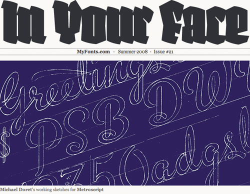
 My digital type foundry Alphabet Soup is the headline feature for this Summer's edition of the MyFonts newsletter "In Your Face". Not sure why they like me so much, but who's complaining?!
 My digital type foundry Alphabet Soup is the headline feature for this Summer's edition of the MyFonts newsletter "In Your Face". Not sure why they like me so much, but who's complaining?!
 Years ago I did the cover for Kiss' album "Rock and Roll Over". When I did it, I styled it after another piece I had done—a cover for the Japanese graphics magazine IDEA. Over the years this piece has gotten more notoriety (founded or unfounded) than almost any other piece of art I've done. I've done many interviews about my experience doing this cover. This short interview was done for Rockpages Web Magazine, out of Greece, which is part of their year-long special on this rock group. Another more recent interview was done for "Tokyo Five" and can be seen HERE.
 Metroscript is making it's Hollywood debut on the big screen by appearing in a climactic scene in the Universal/Marvel release "The Incredible Hulk". The font was used to create a large neon sign for "Williams Plumbing" that appears over the city. Check it out towards the end of Trailer 2.
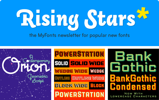 A month ago Metroscript was featured in the MyFonts monthly newsletter "Rising Stars" which highlights the bestsellers among their newer fonts. To our surprise Metroscript was featured again in the just released June edition of "Rising Stars"—but in addition they are now highlighting in the newslettter my three other font familes: my take on Bank Gothic (with lowercase characters), PowerStation and Orion. Thank you MyFonts!
Trying to cite a few sample pieces that are representative of what I do is not that easy. Although there are many common threads running through my work, much of it has ranged all across the board. Many people say they can always recognize it by "my style", but it's not as easy as picking out the work of many illustrators who have a style that's clearly definable. If I had to pick out several pieces that are representative of what I do, I might select the logo I designed for the NY Knicks, one of my covers for Time Magazine, the cover I did for the Squirrel Nut Zippers CD "Bedlam Ballroom" and the treatment I created for the New York Times of the Tribeca Film Festival. These pieces are all quite different in nature, yet tied together by what I believe to be my personal graphic vision.

I created a teeny-tiny niche for myself when I started doing "letterforms" art—this was back in the ‘70s. For me that time was a low point for typography. There wasn’t that much going on design-wise that held my interest. I felt at the time that illustration and typography/lettering were seen and treated as two seemingly unrelated disciplines. To my mind typography had become uninteresting and was hardly ever fully integrated with images—whether they were photographic or illustrative. At the time the very popular modernist movement (as typified by such designers as Rudolf de Harak and Chermayeff & Geismar) represented a way of approaching design that for me held very little interest. When I looked back a few decades at the rich history of ephemera in this country it seemed that we were in visually lean times.
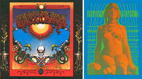
Early work by Rick Griffin (l.) and Victor Moscoso (r.)
While a student at the Cooper Union I was very taken with the "psychedelic" posters that had appeared on both coasts. The work of such artists as Victor Moscoso, Kelly & Mouse and Rick Griffin had a huge impact on me with their unusual use of color and integration of letterforms and striking images. Of course I don’t think I could have verbalized any of this at the time, I just knew what I liked—and wanted to see more of those sorts of things. So I started to create custom letterform solutions, working and collaborating with illustrators—specifically Charles White III and Doug Johnson. I soon realized that I myself could also be a maker of images and so, after gaining a little self-confidence, started to take on projects where the image and the typography associated with it became more integrated with each other—at times becoming one and the same. I guess this was to become my "thing"—the integration of letter and image. Soon, other young designers began imitating what I did. At the time I kind of resented it as “plagiarism”, but I soon realized that imitation was the most sincere form of flattery. Over the years my “imitators” branched out and found their own voices. So it’s gratifying to see that in some small way I may have influenced a generation of designers.
People are always asking me how I ended up doing what I do. They also want to know if what I do has a "name". My intention was never to set out to be a "lettering artist", but somehow I always gravitated towards solving communication problems with letterforms. I guess in some ways I'm a designer who works like an illustrator. I have done work of all kinds in all sizes—from billboards to postage stamps, from logo design to labels, from CD covers to signage—and then of course there's font design. I don't feel it's ever a good idea to try to fit one's work into categories or niches: what I do overlaps several categories: illustration, graphic design, lettering, typography and font design. What I usually tell people is that I'm a "letterforms" artist—a definition vague enough not to be too confining, but at the same time giving a little more emphasis to the "lettering" part. How I ended up "inventing" this genre (I hope that doesn't sound too immodest) is a whole other matter. I don't want to give myself more credit than I actually deserve by focusing on this, but people are always asking how I got here . . . so, if you're interested, stay tuned for my next post for more of the backstory.
Something I hear quite frequently runs something like this: "You'd have been perfect for our project, and I'd have hired you in a minute, but you know, we probably wouldn't have been able to afford you."
Well, many of the instances that clients believed this to be the case would actually have worked out just fine. If I had to depend only on the big-budget projects for my livelihood I'd probably go broke. The truth is I work for all kinds of clients, big, small and in-between. Many times the most interesting projects are the ones that don't have the huge budgets. There sometimes seems to be a direct inverse correlation between budget size and creative freedom. Often we can find a way to work something out.
Just as an example, a recent project of mine was to do logos for a pair of Los Angeles restaurants—one in Beverly Hills, the other in the Los Feliz/Silverlake area—Dominick's and Little Dom's, two recent additions by restauranteur Warner Ebbink.
The budget wasn't gargantuan, but we were also able to work out a situation where I was able to take advantage of his hospitality in exchange for my design expertise—it was win-win all around.
An interesting job I did recently was for a new client in Brooklyn. I designed a record label for the independent record company “Eschatone Records” who've started producing old-style vinyl records. This was the type of project that I never thought I’d get to see—but the surprising new found popularity of vinyl has given this genre a new lease on life. One of the owners of the company, Jed Davis, is a big fan of record labels from vinyl’s heyday, so I had a lot of fun giving this job some of the style I remembered from the 45 RPM labels I collected as a kid. A local art space Zakka Corp. in Brooklyn is hosting an exhibition of Eschatone's album art beginning May 23, 2008.

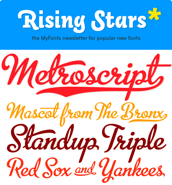 In mid-March I began selling my Alphabet Soup fonts through MyFonts. To my surprise, in that short period of time "Metroscript" rose to the top of their list of "Starlets". The Starlets list ranks all fonts that appeared on MyFonts within the previous 50 days according to their sales volume. MyFonts just sent out their May newsletter Rising Stars highlighting the best-sellers among their new fonts, and I'm proud to say that Metroscript is prominently featured.
This is all very gratifying to me—I arrived at font design by way of my career as a lettering artist—which is not the route taken by most font designers. Font design is a very different discipline from lettering in that it is a much more disciplined craft. I can make a piece of lettering sing by using all kinds of tricks and devices to create visual excitement. It does take a keen eye and lots of imagination and know-how to make a piece of lettering stand out, but font design is much less forgiving: you are limited to one letter next to another in a straight line, and every letter in a font must be in harmony with every other letter. I think much of Metroscript's success has to do with the fact that I brought a lettering artist's eye to a font designer's craft, and I think this may be appreciated by those who are looking for something a little different. I've been told that copy set in Metroscript resembles hand lettering more than any other font.
Paul Shaw has written a review of my Alphabet Soup Type Founders for the April issue of Print Magazine, where he writes about three of my four font releases. He didn't write about my latest release—an update of the classic Bank Gothic which has my newly added lowercase—because it hadn't been relased yet. At any rate you can check out the review either by going to the Print Magazine website, or if their website proves too troublesome, I've reproduced Paul's review here.
I recently did a logo for Bette Midler’s Las Vegas show at Caesar’s. The art director is actually and old pal of mine, Rod Dyer, a really colorful character who incidentally has a dual career operating one of LA’s best and longest running restaurants: Pane e Vino. Laura (my wife, illustrator Laura Smith) and I have loved going there for years—it’s undoubtedly one of our favorite LA restaurants. It has a fantastic outdoor garden seating area where you can always see some of Hollywood’s glitterati. One day while having lunch with Rod, Billy Dee Williams joined our table, Rod left, resulting in our having lunch with Lando Calrissian.

Bette's new show is at The Colosseum, where she takes over the slot occupied for years by Celine Dion. Bette alternates showdates monthly with Elton John and Cher.
I’ve been busy with work and with preparing a whole bunch of material for Thames & Hudson that they requested for an upcoming book entitled “Retro Graphic Design”. Once I have more details I'll publish them here. More posts sooner...thanks for your patience. -MD
Welcome to WordPress. This is your first post. Edit or delete it, then start blogging!