 No doubt by now you've seen the title treatment for "Sucker Punch". It seems to be everywhere. I don't know who designed and did the art for it—and perhaps it's best that I don't—because I have a lot of issues with this design including its plethora of inconsistencies. BUT . . . on the bright side, I will say that its free-wheeling disregard for convention is a welcome reprieve from the unimaginative, dull but "safe" typographic treatments that have taken over film promotions for the last few decades. The genres of action and sci-fi movies would seem likely candidates where designers could "stretch their wings" so to speak, and be much more creative with their typography and lettering. If "Sucker Punch" is seen as a successful promotion, perhaps it will be the beginning of a trend, marking the moment when it was OK for creative typography and lettering to return to movie advertising.
There was a time when I was regularly called upon to work on title treatments for feature films. In retrospect there seemed to be more creative freedom back then—less control exerted on creativity by clients. A lot of what I did never saw the light of day, and much of it I'd prefer not to show. But there were some that I'm still proud of.
 The one that most people remember is my treatment for Zardoz, a film directed by John Boorman—who had previously directed the amazing Deliverance.
The design of this treatment was derived from one of the plot elements in the film—crystal rings. Originally my design had the two Zs mirroring each other, but it was decided that would interfere with legibility. John Boorman liked my solution so much that he used it in the opening credits for the film:
![zardoz[blog]](http://static1.squarespace.com/static/56785ba269a91a9ca5808c79/56c4a736fe5f74a520cec7f4/56c4a737fe5f74a520cec875/1455728439487/zardozblog.png?format=original) It has been suggested by others that this design was the original inspiration of many rock and roll band logos done by others—such as "Asia" and "Anthrax":
It has been suggested by others that this design was the original inspiration of many rock and roll band logos done by others—such as "Asia" and "Anthrax":
 I have no knowledge that this actually was the case, but looking at them now I have to admit that it seems likely.
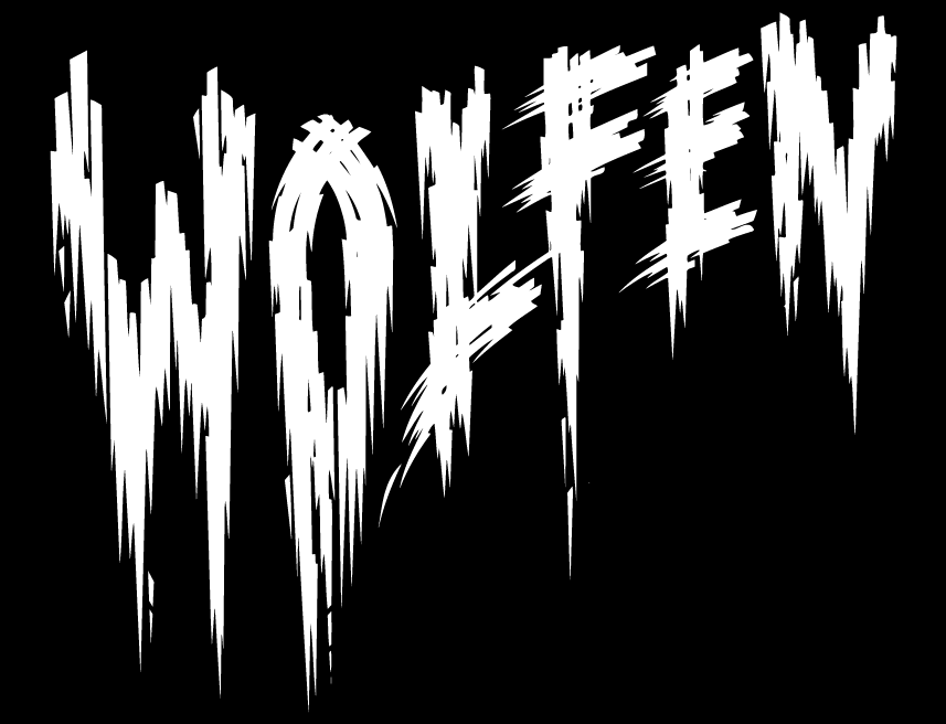
Another treatment I'm happy to have worked on was for Wolfen. This little seen film was directed by Michael Wadleigh and starred Albert Finney, Diane Venora, Gregory Hines and Edward James Olmos.
 In this particular design I was trying to do my sort of tongue-in-cheek take on all those great horror movie titles from the '40s and '50s . . . the ones with the lettering suggestive of dripping blood and ripping flesh—such as:

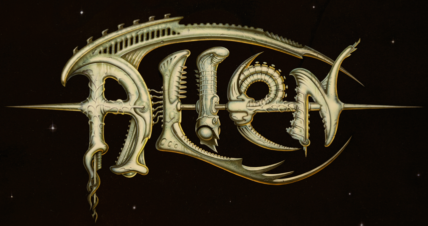
And finally, the one that I would really have loved to have seen the light of day:
 The title treatment I designed for Ridley Scott's Alien never made it into the public arena. It had some small promotional uses before it was run over by the Bill Gold Advertising machine and relegated to the back burner. At any rate, this was great fun to have worked on—the more so since I was able to work on it with my friend (the now famous "pop-surrealist") Todd Schorr. I designed and drew the forms based on the "bio-mechanical" forms I saw in some publicity stills from the production, and Todd painted the absolutely gorgeous finished art. Perhaps we went too far with this piece? I'll probably never know what really happened.
But what I do know is that in the years between then and now we haven't seen any great strides forward in the art of title treatments. Am I being over-optimistic in thinking that perhaps now we're at the beginning of a new Golden Age? I hope not.
#
