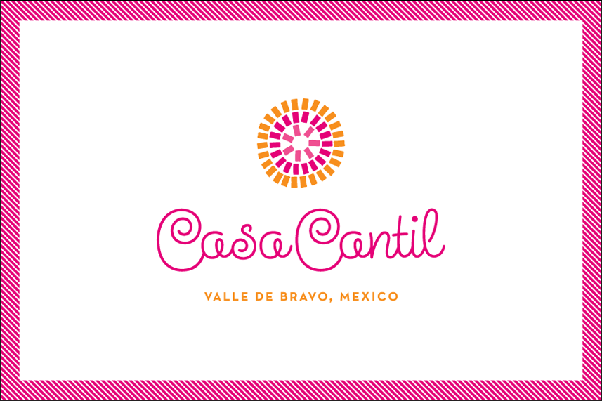
Another in my series of Alphabet Soup "Fonts In Use" this post highlights Steinweiss Script. I just heard from graphic designer Eric Baker who used the font in a design project for the graphic identity of Casa Cantil, a beautiful villa just a couple of hours outside of Mexico City. Here's his design in the context of a business card: What strikes me is that in this context Steinweiss feels quite contemporary—not quite the "vintage" look that one might have expected from such a font. My intention was to create a font that would be kind of like a chameleon – in that it could feel appropriate in many different contexts. Here it seems perfect for the 1960s Mexicana feel I think Eric was going for.
If you've used an Alphabet Soup font in an interesting way, email me some images—I'd be happy to post them!
