I thought it would apropos and an interesting idea to start the New Year off by initiating a series of posts that looks back at some of my work from times gone by. Much of this work will be pre-digital—done the old fashioned "analog" way, with pen and ink. Most was done as pre-separated art: I inked my art on multiple cells of frosted mylar using a Rapid-O-Graph technical pen. Basically the areas of black ink on each cell could be designated to print either with CMYK callouts or with Pantone numbers. It was a very laborious process that was easily duplicated after the first few versions of Adobe Illustrator had come out.
 |
 |
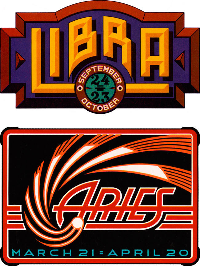
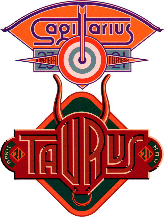
Four Astrology Sign "Logos" for VIVA Magazine
So right now let's set the Wayback Machine for the mid '70s and VIVA magazine published by Penthouse (a kind of Playboy for women). The Art Director—the late Rowan Johnson—asked me to design logos for their monthly astrology column which would change with each issue. Even though at the time I was paid quite a paltry sum for my efforts, this was a great ongoing project for me. Much like my recent "Jewish Zodiac" project, I saw this assignment as an opportunity to create a portfolio of distinct yet related logos. I think they really highlight the possibilities of using letterform design not as an end in itself, but as part of a total design concept where letters are treated as one of several related illustrative elements, and integrated into an expressive whole.
