Viewing entries in
Notes

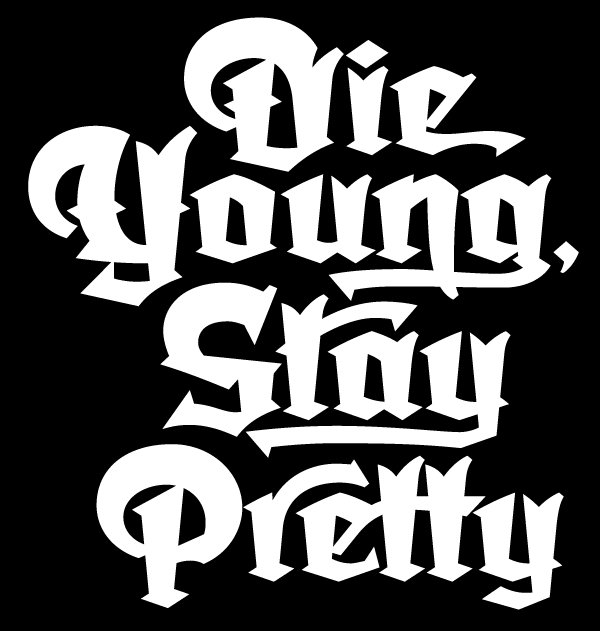
In the Works—New Blackletter/Hybrid Font

I have an aversion against taking the easy road. These days many font designers create their designs by referencing designs from the past. Make no mistake—there’s a goldmine of vintage designs out there waiting to be rediscovered. But there are a few of us font designers still left who want to create something that’s not been seen before . . . but that’s not that easy to do. Most of my fonts (with the exception of Steinweiss Script and DeLuxe Gothic) are completely new inventions.

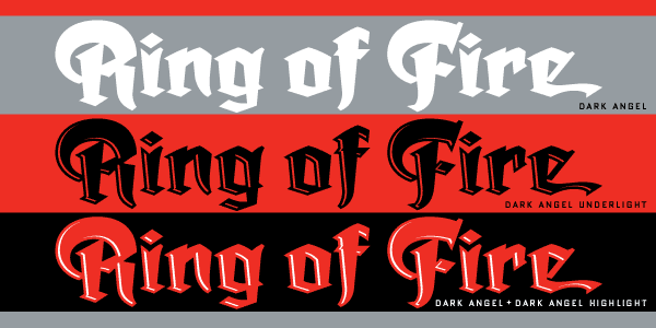
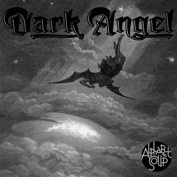
I’ve been working on the font design shown here for the better part of a year—ever since I completed the Dyna-Fonts. The beginings of this font can be traced back to a project I worked on many years ago: a logo I was asked to design for the Califonia Angels baseball team. The work I did for them never saw the light of day, but I always had a soft spot in my heart for one of the logo designs I developed. The letterform portion of my design was comprised of what I called a sort of “blackletter/hybrid”. So I took the basis of that design and expanded it into a full working typeface design. Its working title is currently “Dark Angel”, derived from the project it had originated from.

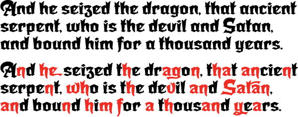
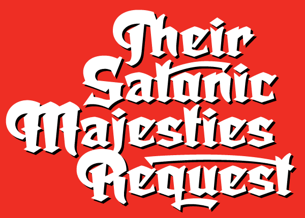
My intention is that this font be more versatile and more legible than most other blackletter fonts. It’s going to have many, many ligatures, alternates, and letters with tails, and free-floating swashes, giving designers many opportunities to create one-of-a-kind graphics and titling.

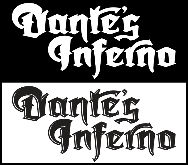
It will also come in two versions: a regular solid version and an “underlit” version with a sort of hand-tooled effect.

By the way, did you notice that there are virtually no verticals and no horizontals in this font? I would not have been able to execute this design as you see it without the incredible vector plug-ins from Astute Graphics—particularly VectorScribe. These plug-ins have definitely filled many of the gaps I found in Adobe Illustrator, making it possible for me to do many things that I wouldn't have attempted without them.

This font is currently in its final stages of programming and production, with a tentative projected release date of June or July 2013. The name “Dark Angel” isn’t yet set in stone, and I’d like to consider other suggestions for the name. If I end up using the name you've come up with for this font, you will be the first to receive a complimentary copy of it as soon as its released.

To send a name suggestion for this font, or if you’d like to be notified when the font is released, please drop me an email and I’ll put you on my list to notify.


Kiss Kulture Klash

Authors Note: Yes, I've previously done posts on this work, but there's always intense interest in this subject, and I'm presenting some new material here.

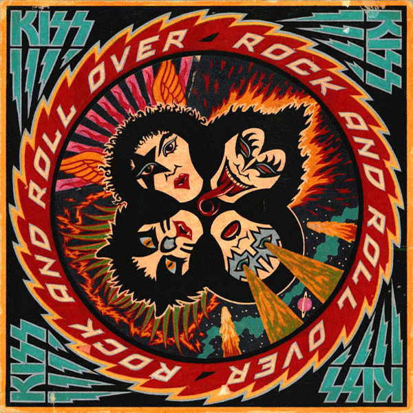
When I was asked to design and do the art for KISS’ 4th studio album Rock and Roll Over, I was fairly ignorant of the culture that was forming around the group. I was unencumbered by any preconceived ideas as to what the group and their music was about. Many are surprised to hear that Gene, Paul, Ace and Peter had to explain their different personas to me before I started working on the design.

I’d love to be able to show my working pencil sketches, but over the years they’d gotten lost or destroyed, and the only record left was the original colored pencil comp that I used to explain my concept to the group. A few months earlier I had done a cover for IDEA, a Japanese art magazine that had done an article about my work, and for whom I had created a cover. I really loved how that cover had turned out, so my thought was to try to emulate the look I had come up with on this new cover for KISS. My cover for IDEA had certain gamelike, and very graphic elements that I thought would work well telling the story of what KISS were about.

Since their makeup reminded me of classic Japanese Kabuki players, I thought the look would be appropriate. So I created a little story around each character and put them all together in a sort of “mandala” motif surrounded by a sawtooth blade with lettering. I kept the colors simple and bold as I had done with my IDEA cover. Here (yellowed and a bit worn with age) is the original colored pencil sketch I created for the group’s approval:

The meeting went particularly well, since I was expecting outright rejection of my idea—which at the time was pretty unorthodox for an LP cover. The changes gthey asked for, I felt, were fairly minor—adjustments to the faces (with the exception of Peter Criss), and rotating the lettering 90°.

The KISS logo already existed, but I felt it needed some help to work better with my design (Paul told me he had drawn it on his dining room table). So I redrew it, making the design more consistent, and adding the lightning strokes to help give movement to the sawtooth blade.

After the cover was done, I didn’t think about it very much. It was only years later that I came to understand that this cover had taken on a life of its own and become sort of a cultural icon. I started to realize that when I discoved all the incredibly blatant and poorly done rip-offs of my design. Rather than upsetting me, seeing all that was quite amusing . . . after all, isn’t imitation “the sincerest form of flattery”?

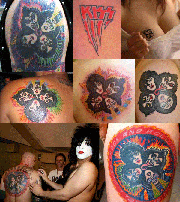
Another indicator to me of how pervasive this design had become in the culture was that people were having it permanently etched onto their bodies. This both horrified, and delighted me at the same time! Personally I would never have anything tattooed on my body—especially one of my own graphics: I’d get bored with the design way too quickly, and then it would be too late to do anything about it. Here are some shots of the process of one lucky soul having the complete Rock and Roll Over art permanently engraved on his right flank. The tattoo artist did a pretty good job, if you ask me!

And below, for your viewing pleasure, a few more of my favorite RaRO tattoo shots. I especially like the one of the guy getting his back autographed by Paul Stanley. Now that’s what I call Kiss Kommitment!

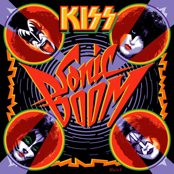
Speaking of Paul, he contacted me again recently. It seems that KISS were about to record their 19th studio album. They hadn’t done one of those for eleven years, and he told me they wanted to recapture some of the magic that the Rock and Roll Over design had provided for them when they were starting out. So, in a way they kind of wanted Rock and Roll Over All Over Again—the same . . . but different.

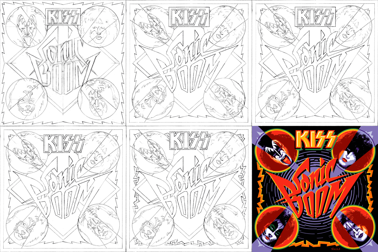
Attempting to recreate the success of an iconic image is a thankless task. You can’t realistically have that as a goal. The most you can do is to give it your all and try to do the best piece of art you’re capable of doing. Here are a series of rough sketches that led up to the finished design

The hardest part of this process was figuring out what to do with the four faces. This time Paul wanted them to be photographic instead of just plain old graphic—as they were the first time around. And I couldn’t get new photography—it had to be taken from existing files. The approach I decided on was to take the best photos I could find with the most contrast and shadows, and translate them into flat graphics that I could make work with the rest of the art. I’ve simplified the steps a bit, but here’s an example of what I did with the faces, using a photo I found of Gene’s face:

Everybody’s got an opinion as to whether the art for Sonic Boom is better or worse than that for Rock and Roll Over. Being so close to both designs it’s difficult for me to say. As far as Sonic Boom is concerned, I did the best I could within strict limitations provided by Paul. I think it solved the problem, and I’m quite happy with the results.

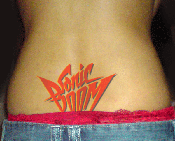
I’ll leave it to time, to posterity, and to others to decide if Sonic Boom becomes as much a cultural touchstone as Rock and Roll Over did. If it does, we may soon start seeing . . .

Purchase an original “Rock and Roll Over” press proof HERE

COMMENTS WELCOME! 


The Evolution of PowerStation

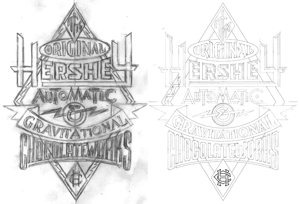
PowerStation is my one font that specifically evolved from a prior design assignment. I had been tasked with designing signage for Hershey’s Times Square flagship store. The signage needed to be designed in the spirit of a retro future-machine, à la Jules Verne or other Victorian “Steam Punk” aesthetic. So I came up with the following sketches in which I combined various lettering and type styles:

In the tighter version I designed the word “Hershey” to have a feeling of faceted letters, similar to what you might see on an old theater marquee:

Ever since I first became aware of them I’ve been faxcinated by the tactile qualities of these extruded plastic letterforms, and how they reminded me of candy. I’ve always thought there was something “delicious” about them.

So it seemed entirely appropriate to me that the word Hershey should be rendered that way, giving it a chunky, almost chocolatebar-like flavor. Note that in the final signage we needed to change the lettering of the word “Chocolateworks” to read “Chocolate Machine”.

I loved how my art turned out, especially the word “Hershey”. After this job was over it occured to me that I wasn’t aware of any fonts that successfully captured that particular faceted look. So I thought I’d try and see if I could make that work as a typeface:

I started sketching out various letters to see if it could be viable. As the font developed and it's strong industrial and moderne qualities became more apparent, I decided to name it "PowerStation".

As I developed PowerStation, it evolved from the one version I had adapted from the Hershey’s assignment into four different versions. These I decided to call Block, Wedge, Solid, and Outline. Then I thought I'd expand those into another four “Wide” versions. Now I had a family of eight different fonts.

But I guess I wasn’t able to leave well enough alone. Why not provide the added ability to set PowerStation in two colors? So I took the basic four faceted versions of PowerStation (Block, Block Wide, Wedge, and Wedge Wide) and broke each of them down into two separate fonts which, if set on separate layers, could provide 2 color typesetting. The solid “base” of the letters would be formed by setting the “Low” version of the font, and the facted part of the letter would be formed by setting the “High” version of the font on a layer directly above the “Low” version.

In other words a two color version of PowerStation Wedge could be achieved by setting PowerStation Wedge High over the same copy which would be set in PowerStation Wedge Low, and applying different colors to each layer.

Setting words like this in two colors can provide richness and variation when used imaginatively.

Some time after the release of PowerStation I discovered the next step in its evolution—that you didn’t have to be limited to two color typesetting with this font. I found that by combining the various PowerStation fonts in different ways one could set this font in three colors as well. The instructions for doing that may be a little long for this article, so if you’d like to see what’s involved with that, you can download the free PowerStation User Manual.

I originally created the serigraph above to celebrate the release of PowerStation. The signed and numbered edition is limited to 100 copies, and there are still some left. Click HERE to find out more about this offer.

License the PowerStation fonts HERE .

Purchase the PowerStation Serigraph HERE.

COMMENTS WELCOME! 


Alphabet Soup Font Guides and Manuals – Free Downloads

Many people have asked why I have only 9 fonts available for purchase. Part of the anwswer is that I’m sort of a perfectionist, and it takes me quite a long time to design, execute, and test a font to make sure it’s working properly. Also, all that work must be sandwiched in between design and lettering assignments—which must always take precedence. But there’s another reason why, at best, I can only turn out maybe one font design a year—and that is for me there’s a bit more to releasing a font than just having the font itself ready to go. There are a ton of supporting graphics that need to be created, and each font reseller has different requirements.

But more importantly, I decided early on that included with each font I would supply a full color PDF Guide or Manual (all 9 pictured above). From these multi-page PDFs one can get a very good idea of what these fonts look like in use, and gain an understanding their special features and how to access them. For example, the PowerStation Manual explains how to set layered copy in 2 or three colors, and in the Deliscript Manual you’ll find out how to access the special “t-crossbar” feature (among others). You’ll also learn some important “Do’s” and “Don’ts” for each font and (if you’re interested) read about how these fonts came to be.

Originally these manuals were only intended to be included with the font download at purchase, but I realized that they should also be available for prospective buyers as well as others—they might help with a decision, or just serve as inspiration. I’ve put links for all 9 PDF downloads together on one page, together with several case studies of some of my design work. So feel free to go the DOWNLOAD page and click on 1, 2 or all 9 of them.

COMMENTS WELCOME!


Update: Terry Chouinard Got Your Help!

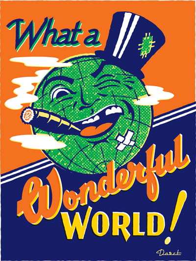
I'm very pleased to report that Mr. Chouinard achieved his Kickstarter goal. Those who've invested $35 or more can choose from among the prints by 15 different artists—myself included–to receive as one of the perks for being a contributor. See Terry's Kickstarter page for details. I'm also pleased to report that Terry will make available to me 100 beautifully printed 18" x 24" letterpress copies of my "Wonderful World" artwork, below, which I will sign and make available as soon as the ink dries. So even if you missed being a contributor to his campaign you can still obtain a copy of that print. If you'd like to reserve one, send me an email and I'll be sure to set one aside for you. Thanks!

Terry Chouinard Needs Your Help!

Terry Chouinard is a master letterpress printer. Letterpress printing is a craft that is slowly disappearing, but there are still some great practitioners out there keeping it alive. Mr. Chouinard has invented a device that will greatly enhance their ability to keep ink colors accurate and consistent throughout a print run—no matter how big or small. One of his followers wrote a really nice piece describing what he's done on her blog Quince & Quire. He's looking for small investors to be able to make his "Ink Dial" a reality—and has posted it on Kickstarter. Terry asked me to donate a piece of art so that he could offer a signed, limited edition, letterpress version of it as a reward to investors, and I gladly offered my piece "Wonderful World". For an investment of as little as $35 a beautiful hand-printed 18" x 24" letterpress version of this art could be yours.

Wonderful World


There are 14 other artists who have committed art to Terry to try to help him get his Ink Dial off the ground. Please check out this very worthy project. The more you donate the more prints you could be rewarded with by the likes of Marian Bantjes, Andrew Byrom, Paul Shaw and Jack Unruh. His deadline on Kickstarter is coming up soon—take a look and see if you don't want to support this very worthy project.

So Why No New Posts Lately?

(In case you're wondering) I haven't really been able to post anything of note lately because I've just been far too busy with work. Since I decided long ago to do everything myself, if I can't get to it, it just doesn't get done. With that in mind I thought I'd just take this free moment to make a quick note of what I've been up to. First and foremost I've been working with a new and exciting client in the film industry. I'm not at liberty to discuss what I've been doing yet, but suffice it to say that what I've been working on will soon be highly visible to anyone living in the civilized world . . . and I think it's some of the best work I've ever done. Stay tuned, because, when I am able, I will be posting "case studies" of the stages these lettering treatments went through–from rough ideas to finished art.

Second...in case you haven't noticed I'm not the most prodigious of font-makers, averaging maybe one new design a year at best. I've had a new script design in the works for quite some time now, and it's getting close to completion – hopefully within a month or two. Like most of my font work, it's a completely new design—not a rehash of something from  the past that's been unearthed. But at the same time many will think that it looks "familiar" without quite being able to place it! So, in the coming weeks, time willing, I'll be posting some snippets of this new design before it's official release.

Speaking of fonts, I just learned that Steinweiss Script was voted by Graphic-Design.com as the "official font" of their 17th Annual Fall Fonts Festival. About the choice, Fred Showker wrote that this font was "a masterful creation because of the multitude of special settings, alternative characters, ligatures and frequently used pairs and triads of letters that go together differently than straight typesetting"  and that "the real value of Michael Doret's fonts is the incredible amount of work he builds into each font. He actually tries hundreds of different settings, looking for problem areas and opportunities for alternates. You'll only find a handful of fonts out on the market that are this flexible and complete ... a half dozen of those are Michaels!" Wow! Thanks Fred!

Alex Steinweiss, 1917 – 2011

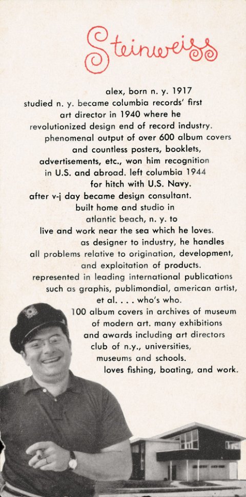
Just having returned from vacation, I discovered that while I was incommunicado Alex Steinweiss—one of my heroes and the inspiration for my Steinweiss font—had passed away. So I'd just like to add my voice (belatedly) to the chorus who have recognized him as one of the giants of 20th century design, who has influenced countless people in the design and illustration fields, and brought delight to millions of others through his beautiful work. The world is indeed a lesser place without him. R.I.P. Mr. Steinweiss.

Fonts In Use: GQ Picks Steinweiss Script for their Comedy Issue

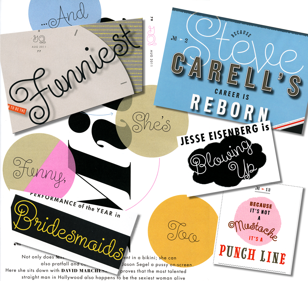
I just got a call from my pal Glenn Parsons of Astrolux Design who informed me that my last font release Steinweiss Script was all over the new issue of GQ Magazine. Kudos to their Creative Director Jim Moore for making such a smart choice!* Here's a collage of a few of the pieces taken from different pages in the current issue. I think these demonstrate nicely some of the versatility of this font, such as the ability to set words on curved paths—and still have all letters connect properly. You can find links to all the outlets where Steinweiss Script is sold (as well as all my other fonts) on the Alphabet Soup pages of my website. I'm also proud to announce that Steinweiss Script is now being sold from the YouWorkForThem website, my newest font reseller.

*Update – June 7,2012: I stand corrected. The choice to use Steinweiss Script was made by GQ Design Director Fred Woodward. My apologies for not checking on that first. M.


Collage of Steinweiss Script Samples in GQ

My Mentor Sol Schwartz In Solo Exhibition at the Norman Rockwell Museum

We all have certain people in our lives—without whom those lives would most likely have taken very different paths. For me there's one person who stands out above all the rest, and his name is Sol Schwartz. I have often spoken about how my growing up in Brooklyn was a formidable influence on what I was to become. When I was a student at Sheepshead Bay High School (quick aside: Larry David was one of Sheepshead's more notable graduates) Sol was a young teacher overflowing with energy, ideas, and inspiration he wanted to share with his students. I don't think anyone was more inspired by Sol than me. More than any other person, Sol is the reason I became a designer. In fact, while my parents were making plans for me to attend law school (unimaginable!), Sol met with and somehow convinced them it would be a better idea to allow me apply to art school. Then he encouraged me to apply to the best: Cooper, Yale and Pratt. I ended up attending my #1 choice, Cooper Union, the experience of which in the end totally transformed my life. So I have a lot to thank Sol for. This month Sol has been accorded an honor that has been long overdue: the Norman Rockwell Museum is giving him a solo show "Sol Schwartz: Drawing in the Dark". Drawing In The Dark

One of Sol's great loves has always been drawing from life. This particular show focuses on the drawings he's created of artists at live performances during summer seasons at Tanglewood, Shakespeare & Co., the Berkshire Theater Festival and Jacob's Pillow. He does these drawings of musicians, conductors, dancers and actors in the dark, while he is in the audience watching them perform. His love for the theater arts permeates every line he draws. With his drawings from Tanglewood one can almost hear the music—the line work being imbued with an energy and life that would not be possible in any other medium.

Sol is one of those artists who cannot help themselves from constantly drawing (I think he might actually draw in his sleep!). His series of nudes drawn with pastel on colored paper are reminiscent of the old masters. When I saw these recently I couldn't help but look up an old self-portrait I had done in Sol's classroom just to compare it with his work, and see if I saw any influence.

Looking at it (and looking back) I think my "drawing" skills may have left a bit to be desired, so I hope in that regard I wasn't too much of a disappointment to my teacher! Sadly I won't be able to make it to the opening at the Norman Rockwell Museum, but for anyone in the Stockbridge, Massachusetts area the opening will take place on Saturday, July 9th. Those who can make it will have the extra added pleasure of listening to Sol give a commentary on his work at 6:00 PM. As a former student of his, I can honestly say that listening to Sol speak is something you won't forget!

You can purchase Sol's book "Drawing Music – The Tanglewood Sketchbooks" through Amazon.

Laura Smith Interviewed by Anne Telford

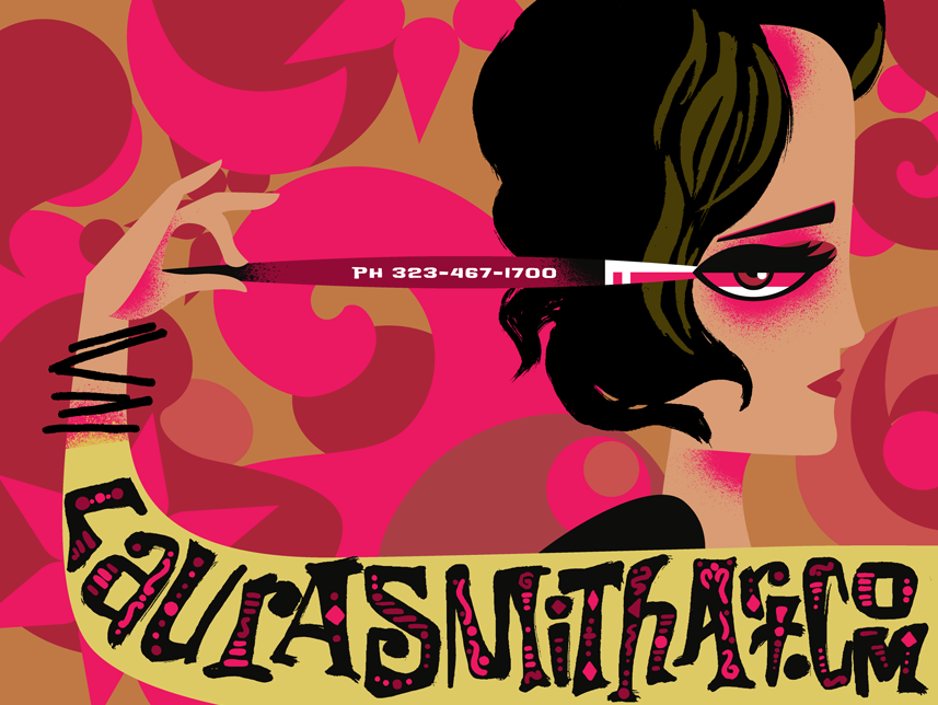
My wife, Illustrator Laura Smith, was recently interviewed by Anne Telford about her whimsical illustrations for the Summer 2011 edition of The Directory of Illustration's Illustration Voice – the online illustration newsletter. Anne was the founding managing editor of Communication Arts magazine, and is now their Editor-At-Large.

The current issue of Communication Arts magazine (Illustration Annual 52) also features Laura's cover illustration for The Graphic Artists Guild Pricing and Ethical Guidelines (see my previous post on this), and is she currently featured in the Guild's Member Spotlight.

In addition that PEGs cover was recently honored by the Society of Illustrators: Illustrators 53, and was also a winner in the Altpick 7 Awards.

Scripts: Elegant Lettering from Design's Golden Age

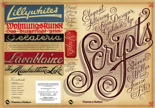
Sunday I picked up a book at Hennessey + Ingalls (my local bookseller), and I spent the day marveling at the treasure trove of typographic gems it contains. The book is "Scripts: Elegant Lettering from Design's Golden Age" by the dynamic duo of Steven Heller and Louise Fili.

If you're like me, and love type—especially vintage scripts—you must get this book. The culmination of over 30 years of digging through swap meets, flea markets and antiquarian bookstores, it is a priceless collection of ephemera by two passionate collectors.

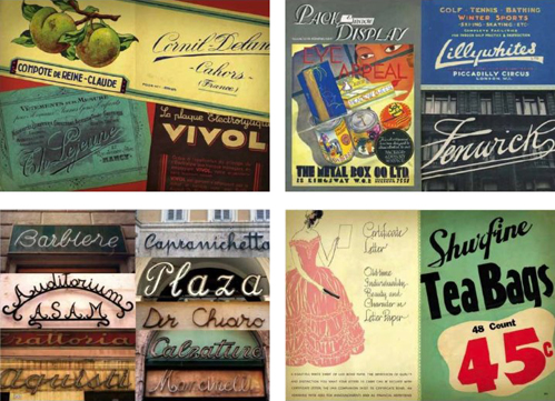
The book's 352 pages are filled with well over 300 examples from around the globe, from advertising to street signs, from type specimens to invitations and personal letters, spanning the period from the 19th to the mid-20th century. I could spend days poring over this book. It is as rich a collection of typographic material as I have seen in years—and much of it I have never seen before. I LOVE this book!

The book is readily available from Amazon.com, but (personal note) why not shop locally and check out the book in person at your nearby (non-chain) bookstore? You might pay a few dollars more, and it might not be as "convenient", but in this day and age wouldn't it be worth it to give them your support?

In-Depth Interview Just Posted

I recently did an in-depth interview with Sonali Vora a writer based in India for the blog VectorTuts+. This is a blog of tutorials, articles, freebies and more on all things vector. Their roster of writers is truly international, coming from such diverse countries as Ukraine, India, Australia, England and the good ol' US of A.

Sonali introduces the interview with these words: "We recently had the opportunity to interview this award-wining designer, lettering artist, and illustrator. Michael talks about his childhood influences, his education and his brilliant start at a freelance career. He tells us about his experience working with some of the big clients and the valuable projects that challenged him to explore his creative potential". Those of you out there who are curious to learn a little more about what makes me tick might want to take a look at it.

Just Revealed: 3 Colors Typesetting With PowerStation Fonts

PowerStation in 3 Colors It's always nice when someone reveals something new to you about your own work. That's what has recently happened in the preparation of the Creative Characters newsletter that MyFonts has just published on my work. While helping to prepare font samples for the sidebar, Anthony Noel was experimenting with my PowerStation fonts, and stumbled across a capability that I had not intended.

PowerStation Sample

In setting the copy he inadvertantly combined both PowerStation Block and PowerStation Wedge. When I designed this font for 2-color layered typesetting, I had not even considered combining these two fonts on layers, one over the other. But that's exactly what Mr. Noel did, with what for me were unexpectedly interesting results. I would have never thought it would work, and so never tried it.

So what's come out of this is that we've discovered that PowerStation can now be typeset in three colors. Two color typesetting was always achievable with either the PowerStation Block fonts or the PowerStation Wedge fonts. The difference is that one would need BOTH of those packages in order to set type in three colors. I've created a PowerStation User Manual Supplement (1.1 MB download) which outlines the steps that need to be taken to effectively create three color typesetting. PowerStation my be purchased from MyFonts, Veer, FontShop, FontBros or YouWorkForThem.

"Appetite" Opens at Cooper's Lubalin Center

"Appetite – A reciprocal relationship between Food & Design" opened last night at my alma mater The Cooper Union, hosted by the Herb Lubalin Study Center. The exhibition explores how design influences our day to day relationship with food, and covers everything from restaurant signs and menus to supermarket price labels and takeout packaging.

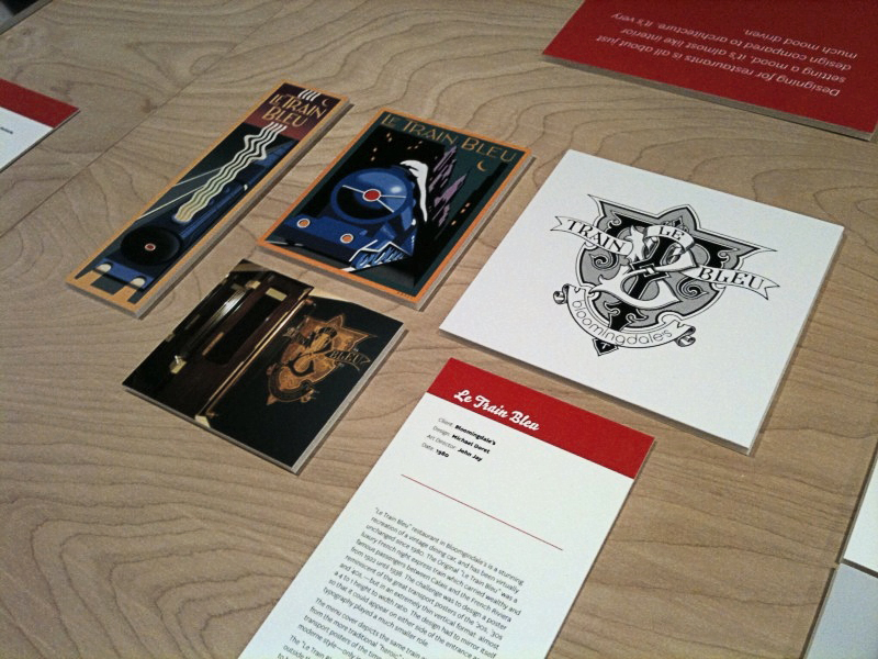
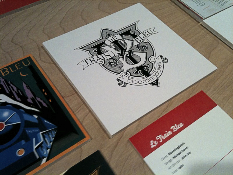
I was fortunate enough to have some of my work included in this show—my "Le Train Bleu" project that I had recently highlighted in this blog. Although I couldn't make it to the opening, my good friend Louise Fili was kind enough to send me some snaps of my work displayed in the exhibition:

Hungry for more? The exhibition is at 41 Cooper Square (3rd Avenue between 6th and 7th Streets), NYC. The show runs through October 9th. The gallery hours are Monday through Friday: 12–7; Saturday: 12–5. The exhibition was curated by Alexander Tochilovsky. Read an interview with Alexander about this exhibition at Eye Blog, and read more about it and see more photos of the exhibition from the opening at Design:Related.

Paris Loves Letters

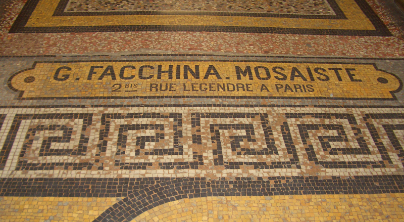
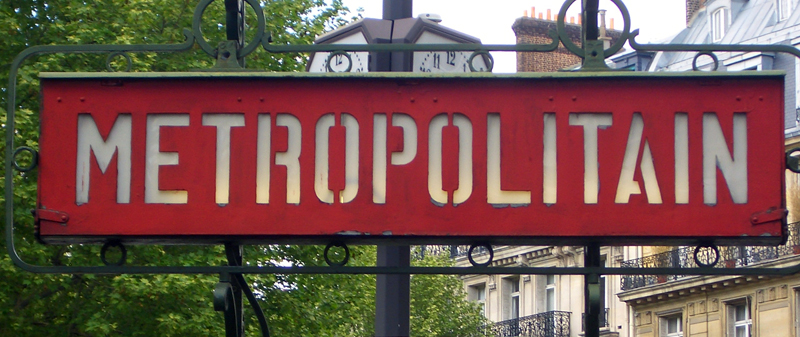
I'm just back from a stay in The City of Light, and just wanted to share an impression I had that typography and lettering are admired and extremely well respected there—possibly as much or more than anywhere else in the world. If nothing else, Paris is a city where history permeates everything, and you can almost trace its history through the many layers of lettering and signage that stretch back over many decades. I say respected because so much of it has been preserved, and not painted over or replaced just to be up to date. In fact, many shops kept and preserved the lettering from previous incarnations, even though the name and nature of the business had changed. It was refreshing to see that just about every business that had a public face, from the smallest boutique to the largest high-end stores, all took great pains to maintain an artful, thoughtfully designed appearance. Aesthetics on every level are a part of the culture, and an understanding of the importance lettering and typography seems to be universally understood and encouraged. Here is a small sampling of some snapshots I took while strolling around the city:

My new favorite restaurant in Paris—not so much for the food, as for it's graphics and interior.

The mosaic floor of one of Paris' many arcades.

A sandwich shop. I love those colored bottles!

Metro signage – not the typical art nouveau version everyone's familiar with.

Paris' Wax Museum . . . an Art Déco Extravaganza

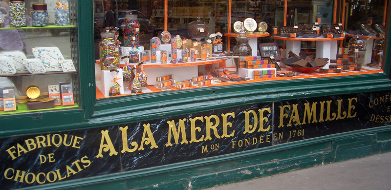
A confectionery shop with signage that dates back . . . who knows how long? Still in perfect condition.

Contemporary tile work in the Metro's Concorde Station. This incredible project was begun in 1989 and contains the text of The Universal Declaration of Human Rights. This typographic work covers the entire arched wall and ceiling of the station.

And finally, (please excuse the shameless plug) while walking the streets of the Marais, I happened across a shop called "L'Art du Buro" which had my QWERTY pen displayed front and center in its window. Certainly an ego boost, if ever there was one!

Art Imitates Life...Imitates Art (Canter's Truck #3 of 3)

SignQuest was the company that RoadStoves had recommended to "wrap" the truck with the graphics I had designed. They produce large scale banners and signs as well as vehicle wraps. One interesting project they were recently involved with was wrapping the Hollywood Sign for the "Save the Peak" campaign. The goal of this campaign is to raise funds to purchase the land adjacent to the Hollywood sign. Hopefully this would prevent commercial development that would permanently mar the view of the iconic sign and the world-famous silhouette of the hills that frame it. Wrapping the Hollywood Sign was a complex project, but wrapping a truck properly is also difficult and time consuming. Getting it right means placing the many strips of 3M Controltac vinyl film in the right positions:

Louie Navarro is seen above carefully positioning the vinyl on the service side (the side from which the food will be served) of the truck. He must carefully gauge where to position the film at the back of the truck so that the graphics end up at the right spot by the time they reach the front.

Over on the driver's side, Louie positions the main graphics. There are many ins and outs to the truck surface, and the Controltac film is flexible enough to conform to them all, ending up looking very much as if it had been painted on. It's pretty amazing.

Here's one photo of the driver's side. I'll post more photos from different angles as they become available.

In the meantime the  Canter's Truck has begun cruising the streets of LA with Bonnie Bloomgarden at the helm. To find out when they're going to be in your area you can follow them on Twitter.

Photo: Adam Stein

Coming Soon . . . Canter’s Truck Post #3 of 3

Due to my inability of being able to get good photographs of the completed Canter's truck, I'm holding up posting the final chapter in this saga. I hope to be able to get some better shots by the end of this week. If not I'll just post what I've got.Thanks for your patience!

Above: Careful placement of my credit below the trash receptacle.

Deliscript Critique on FontFeed

Belgian designer and writer Yves Peters has been posting his comments and critiques about the winners of the TDC² 2010 Typeface Design Competition, and has finally reached the Display Type category—the one in which Deliscript was selected. While Yves' comments are considered and thoughtful—and with regard to Deliscript were for the most part on target—I feel as if I would like to comment on a couple of his remarks.
Yves mentioned the "Word Logos" I have thrown in, and mentions that they're only in English and that there aren't that many. I agree with this. I probably shouldn't have put them in at all. I had literally been working for months on Deliscript, and really wanted to get it out for release, so I guess I rushed through their creation, thinking of them as just a small extra feature to include. They probably don't add that much to the font, and I should have thought of the European market as well. The next time I do a feature like that I'll definitely try to do it in a much more expansive manner.

Yves also mentions that he is "unsure about the finer details in the character shapes", citing that "some curves and joins seem rather stiff, and the weight distribution and contrast in the character strokes appear a little off in some parts". I'm not sure, but I think this perception on his part may stem from cultural differences that we share, and from a possible misunderstanding of what I'm referencing. What I'm going for is not really in the lexicon of classical font design—rather it is from the American pop culture vernacular—from all the (traditionally) untrained eyes that created all the wonderful signage and ephemera that I grew up with.

Coming to font design from that background, I can totally understand how what I'm trying to do can seem foreign to those who are trained to look at fonts from a traditional perspective. While I'm sure we all share some of the same font heroes (such as Morris Fuller Benton) I also celebrate those whose work joyously displayed a flagrant lack of regard for what some would consider to be "the formal rules of design". It is to these designers whose names we'll probably never know—and to their typographic "mistakes" and flourishes that I find so engaging—that I try to pay homage to in my lettering and font design work.