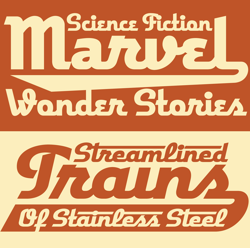
Belgian designer and writer Yves Peters has been posting his comments and critiques about the winners of the TDC² 2010 Typeface Design Competition, and has finally reached the Display Type category—the one in which Deliscript was selected. While Yves' comments are considered and thoughtful—and with regard to Deliscript were for the most part on target—I feel as if I would like to comment on a couple of his remarks.

Yves mentioned the "Word Logos" I have thrown in, and mentions that they're only in English and that there aren't that many. I agree with this. I probably shouldn't have put them in at all. I had literally been working for months on Deliscript, and really wanted to get it out for release, so I guess I rushed through their creation, thinking of them as just a small extra feature to include. They probably don't add that much to the font, and I should have thought of the European market as well. The next time I do a feature like that I'll definitely try to do it in a much more expansive manner.
Yves also mentions that he is "unsure about the finer details in the character shapes", citing that "some curves and joins seem rather stiff, and the weight distribution and contrast in the character strokes appear a little off in some parts". I'm not sure, but I think this perception on his part may stem from cultural differences that we share, and from a possible misunderstanding of what I'm referencing. What I'm going for is not really in the lexicon of classical font design—rather it is from the American pop culture vernacular—from all the (traditionally) untrained eyes that created all the wonderful signage and ephemera that I grew up with.
Coming to font design from that background, I can totally understand how what I'm trying to do can seem foreign to those who are trained to look at fonts from a traditional perspective. While I'm sure we all share some of the same font heroes (such as Morris Fuller Benton) I also celebrate those whose work joyously displayed a flagrant lack of regard for what some would consider to be "the formal rules of design". It is to these designers whose names we'll probably never know—and to their typographic "mistakes" and flourishes that I find so engaging—that I try to pay homage to in my lettering and font design work.
