 Please read Parts 1, 2, and 3 of this series before proceeding!
Whether or not you are aware of it, there’s a #%@*load of gross and disgusting candy out there—either in form, or in content—or both. How much there is—is incredible. Who’s eating it? Juvenile boys and immature adults! So Gary Shafner thought: wouldn’t it be fun to gather all the gross candy together under one roof? And thus “Yucky” was born. In this boutique you will find every form of revolting, sickening and nauseating confection imaginable. Eyeballs, severed fingers, blood, snot, maggots, poop, insects, zits, scabs, worms and earwax will be among the delicacies you’ll be able to choose from—and many of them dispensed directly from toilets!
So the design challenge in doing a logo for Yucky was to capture the gross nature of what this store was about, doing it with a sense of fun, but not to create a graphic that was itself repellant. This was a true challenge!. Then I remembered one of my favorite illustrators from when I was growing up: Basil Wolverton—the self-professed “Producer of Preposterous Pictures of Peculiar People who Prowl this Perplexing Planet”! If his name isn’t on the tip of your tongue, his “outrageously inventive” work (below) may be familiar:
It occurred to me that to design a logo in the spirit of his illustration might just be the ticket. After pondering this for a bit I decided that the central letter in YUCKY—a “C”—could be created as if it were a Basil Wolverton head, mouth wide open, and hurling over or through the letters to its right. The other letters surrounding the “C” could contain or support other items expanding on the revolting candy idea. And so I began my “homage” to the great Mr. Wolverton, starting with some very rough sketches:
I liked where this was going, so I got a little tighter, developing the drawing a bit further:
This was the point that I presented this idea to Gary, not knowing how he’d react. Fortunately, he was familiar with Basil Wolverton, and was totally in tune with my idea:
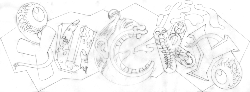
I felt I needed to refine some of the detail in the drawing and develop the character a bit more, making it more “Wolverton-esque”, so I did some pencils like these:
Then finally I had the pencil drawing base on which to build the final art of “Yucky”:
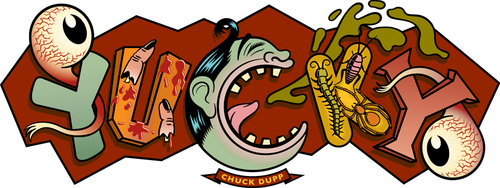
At first I believed I could create the art as would have Mr. Wolverton, with pen and ink. My first feeble attempts only proved to me that he had incredible control over the drawn line, and I had virtually none. So, with my tail between my legs, I went back to my Mac and started drawing the logo in Adobe Illustrator. Gary decided that the character at the center of the logo should be appropriately named “Chuck Dupp”:
I tried to imagine what sorts of colors Wolverton would have used, that all at once could be disgusting, yet “candy-freindly”. I couldn’t come up with a good reason to NOT make Chuck a sickening shade of green:
A further development of the color, adding bloodshot eyes, a background color and dropshadows:
And finally some stippling all over, and highlights in the barf—giving the whole thing a bit more dimension, grit, and Wolverton appeal:
The back wall of Yucky is tiled, very much like a public restroom. And like a restroom it is fitted with toilet bowls (as I mentioned earlier) from which candy will be dispensed. Here’s the wall as it was when the space was being built:
Gary figured that what could be better than to bring back the idea of the old arcade photos—you know, the ones where you could get a photo of you (and your pal’s) head(s) popping up behind—and apparently on the body(ies) of—some life-size painted, ridiculous looking figures:
Gary’s reinvention was that here you could get a photo of yourself sitting on one of the toilets, and in front of your legs would be a painted cut-out of a pair of legs with pants around the ankles. To cap it all off and make this Kodak Moment more memorable Gary wanted to have painted on the tile overhead a large version of the “Yucky” logo. Sounds good to me!
So Gary hired the very multi-talented sign-painter, fine/guerilla artist, and sculptor Richard Ankrom. Not having any talent at all myself for doing this kind of difficult handwork, I decided to look in on Richard as he worked on this and brought my logo to life. I couldn’t have hoped for this to be done any better than what Richard did. Below, a few shots of the logo as it materialized on the tile wall, starting with a shot of Richard in the space, in preparation mode (notice the "1-Shot" sign painters' paints):
A shot of the paper roll, taped to the tile wall, and through which Richard will pounce the linework he’ll need to follow:
The pounced linework can clearly be seen in this shot before any painting had started. Also clearly seen in the reflective tile is my hand taking the shot:
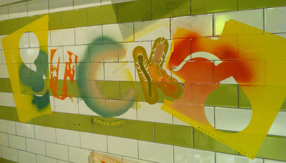
Gary uses all sorts of various methods and techniques to achieve his results, from laser or hand-cut friskets, to airbrush to regular old old-fashioned handwork with paintbrushes:
Here we are at about the halfway point, the pounced lines still visible:
Richard said he really got into painting the bloodshot eyes:
One of the later stages was when the black linework gets added in. Here Richard is doing some of the stippled, textural brushwork using a “mahl stick” to keep his hands off the wall and prevent them from smudging the wet paint. The paint can take up to a day to fully dry:
Finally . . . it was worth all the hard work! When I selected color for this logo, I had no idea that a color had already been selected for the tilework. Fortunately everything meshed together beautifully:
And here’s the “Yucky” photo-op minus, of course, the dropped pants cutout—picture yourself here:
Next up . . . in our final installment we’ll take you back to where it all began—Part 5: “Tinseltown”.


