Viewing entries in
News

Fun With Type!

Last year I became a beta-tester for Astute Graphics’ Adobe Illustrator plugin “VectorScribe”. Those who know me know that I’m not really a very tech-savvy person. I get quite comfortable just sticking with doing things the way I usually do them. Over the years I’ve become very adept at using Illustrator, and was not overly excited at the thought of having to learn some new tools. I’d heard of Illustrator plugin tools, but I’d never really thought of using them before. So, to my surprise, I almost immediately embraced the new tools in VectorScribe. They work really well, ironing out a lot of the inherent flaws in Illustrator. I’d learned to live with a lot of those flaws, but once I learned I didn’t need to live with them anymore, those “flaws” started to look more and more like gaping wounds. VectorScribe is great—now I don’t know how I ever got along without it! You can download a little Case Study we did about VectorScribe here. I would definitely encourage all serious Adobe Illustrator users to at least try the 14 day free trial version. It will change your life!

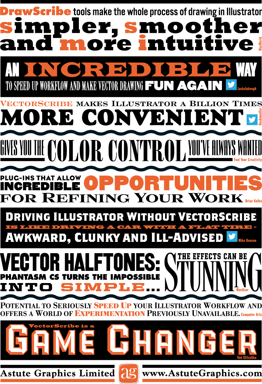
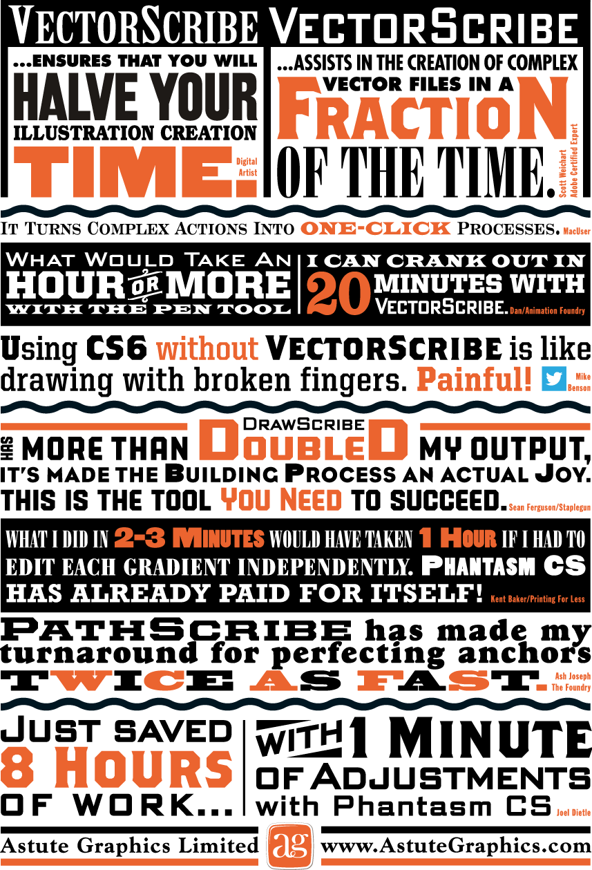
So when the good folks at Astute Graphics asked me if I’d work on a little printed promo for them I thought “Well, why not? I really believe in their products”. The front and back covers of the piece were to be covered with testimonial quotes about their plugins from other users. The challenge was to make this list of quotes visually exciting. Most of my work is lettering-centric, but with this project the challenge was to only use set type and limited color—something a little different for me. I did use two of my own fonts, PowerStation (currently on sale) and DeLuxe Gothic: see if you can find them. Anyway, I think you can see that it’s possible to create a lot of visual fun by just using the basics, and combining them in imaginative ways. This is real Alphabet Soup!

Above is how the front cover turned out...

...and the back cover below:

The Dyna-Fonts Winners at Applied Arts

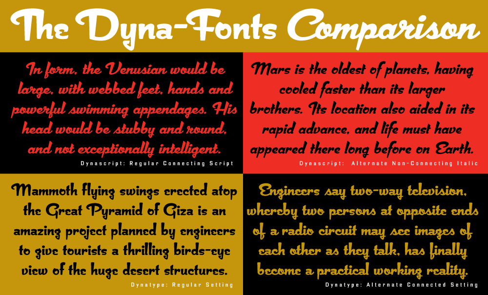
The judges at this year's Applied Arts Design Competition, in their first ever Typeface Design category, selected both Dynascript and Dynatype as winners. They were selected as The Dyna-Fonts—a typeface family.

I'm very proud of these fonts, and am pleased that they've begun to get the recognition I think they deserve. They work extremely well both together and separately, and in both display and in smaller settings, as you can see from the comparison below (click to enlarge).

I've begun to make both Dynascript and Dynatype available together at a reduced price. They can be found under the name "The Dyna-Font Collection" which can be purchased at MyFonts.

The Dyna-Fonts are now following in the footsteps of some of my other recent fonts that have garnered industry acclaim—most notably Deliscript, which was lauded by the Type Directors Club in their TDC² 2010 competition and also in 2011 by CA's Typography Annual 1, (the page excerpt of which can be seen HERE), and  Steinweiss Script—also recognized in this year's Typography Annual 2, (the page excerpt of which can be seen HERE). After being named a "Rising Star" Metroscript became "MyFonts’ Brush Script Font of the Year" and was subsequently named as #5 in Smashing Magazine’s “30 Brilliant Typefaces For Corporate Design“. The magazine went on to say about Metroscript: "lettering artist Michael Doret has adapted his trademark hand-lettering style to the computer, creating one of the most sophisticated suites of script fonts on the market.”

Andrew Byrom Discussion at A+D Museum/LA

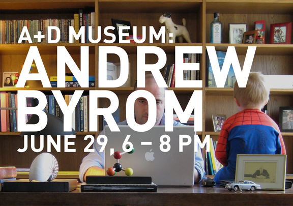
I met Andrew Byrom about a year ago when he gave a short talk at Pecha Kucha Night in Los Angeles. His creatively innovative and non-traditional approach to experimental typographic design really blew me away: I had never before seen work like his which blurred the edges between graphic design, scupture, and conceptual/perfornance art. There’s really no easy way to describe his work. He just let me know he’s giving a presentation on June 29th at the Architecture and Design Museum. If you’re interested in what’s happening on the cutting edge of typographic design, don’t miss this event!

See you there.


Audio Interview w/Tony Ross at TonyTeach

TonyTeach is an online learning center where you can find video tutorials, podcasts and live training for Flash, Toon Boom Animate, Photoshop, and more—both for free, and for purchase. Recently Tony Ross caught up with me, and we had a half hour discussion about how I work, my inspirations, digital vs. analog, and about my career in general—plus I give a couple of useful tips on using Adobe Illustrator's pen tool that even this seasoned teacher was surprised by. Here's a recording of that discussion: Tony Ross Interview

Update: Terry Chouinard Got Your Help!

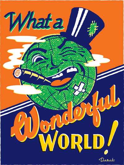
I'm very pleased to report that Mr. Chouinard achieved his Kickstarter goal. Those who've invested $35 or more can choose from among the prints by 15 different artists—myself included–to receive as one of the perks for being a contributor. See Terry's Kickstarter page for details. I'm also pleased to report that Terry will make available to me 100 beautifully printed 18" x 24" letterpress copies of my "Wonderful World" artwork, below, which I will sign and make available as soon as the ink dries. So even if you missed being a contributor to his campaign you can still obtain a copy of that print. If you'd like to reserve one, send me an email and I'll be sure to set one aside for you. Thanks!

Terry Chouinard Needs Your Help!

Terry Chouinard is a master letterpress printer. Letterpress printing is a craft that is slowly disappearing, but there are still some great practitioners out there keeping it alive. Mr. Chouinard has invented a device that will greatly enhance their ability to keep ink colors accurate and consistent throughout a print run—no matter how big or small. One of his followers wrote a really nice piece describing what he's done on her blog Quince & Quire. He's looking for small investors to be able to make his "Ink Dial" a reality—and has posted it on Kickstarter. Terry asked me to donate a piece of art so that he could offer a signed, limited edition, letterpress version of it as a reward to investors, and I gladly offered my piece "Wonderful World". For an investment of as little as $35 a beautiful hand-printed 18" x 24" letterpress version of this art could be yours.

Wonderful World


There are 14 other artists who have committed art to Terry to try to help him get his Ink Dial off the ground. Please check out this very worthy project. The more you donate the more prints you could be rewarded with by the likes of Marian Bantjes, Andrew Byrom, Paul Shaw and Jack Unruh. His deadline on Kickstarter is coming up soon—take a look and see if you don't want to support this very worthy project.

Typography Enters the Space Age! - Dynascript's World Premiere on MyFonts

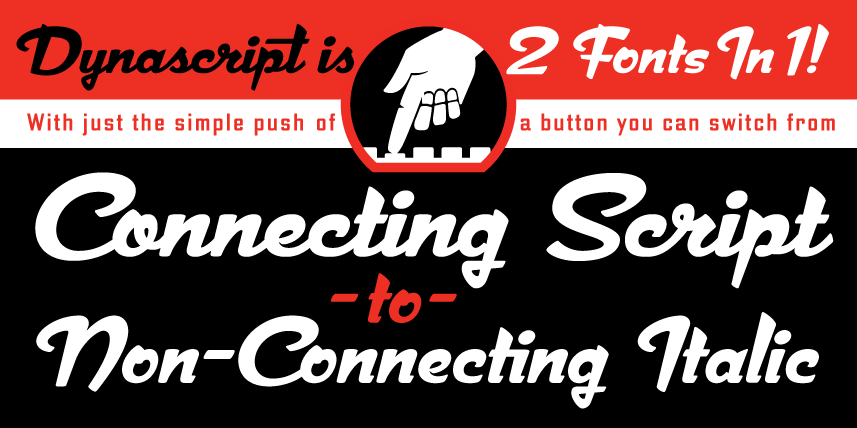
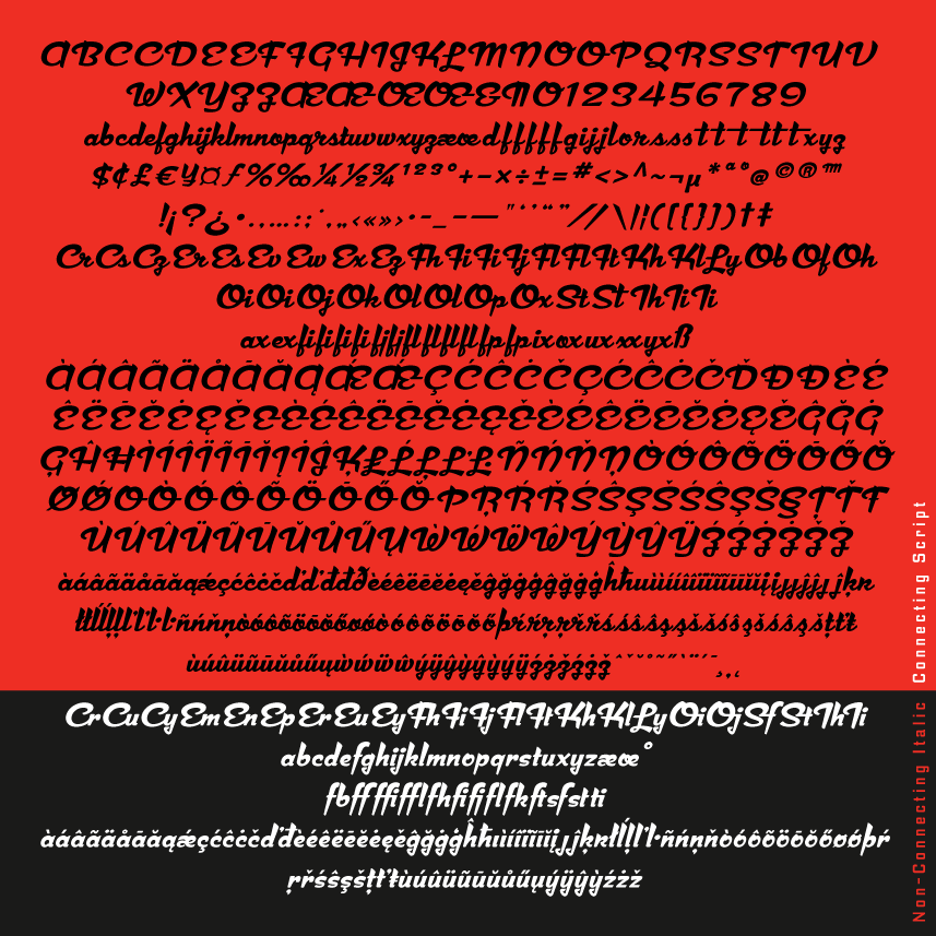
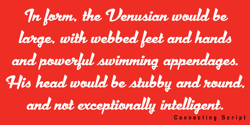
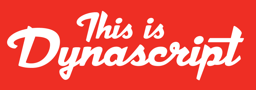
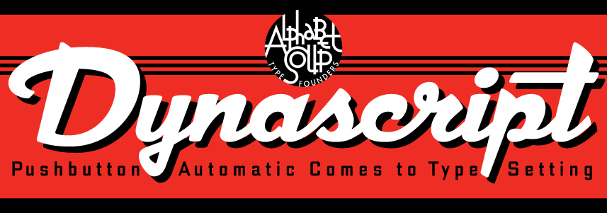
DynascriptDynascript brings the ease of “Pushbutton Automatic” to your typesetting experience. Dynascript is actually 2-Fonts-In-1: without switching fonts you can instantly change from Dynascript’s connecting font to the non-connecting italic with the simple push of a button. (Just press the “Stylistic Alternates” button in the OpenType palette.) 2 Fonts In 1! Typesetters across the planet will also be able to set copy in their language of choice. Global Language Support Dynascript’s 694 glyphs can be used to set copy in: Albanian, Basque, Catalan, Cornish, Croatian, Czech, Danish, Dutch, Esperanto, Estonian, Faroese, Finnish, French, Galician, German, Hungarian, Icelandic, Indonesian, Irish, Italian, Kalaallisut, Latvian, Lithuanian, Malay, Maltese, Manx, Norwegian Bokmål, Norwegian Nynorsk, Oromo, Polish, Portuguese, Slovak, Slovenian, Somali, Spanish, Swahili, Swedish, Turkish, and Welsh—and of course English. Sorry! Off-world languages not yet supported. Dynascript Complete Character Set What is Dynascript? It’s is a completely original, never before seen, bold script font—but to some it may be reminiscent of various mid-century neon signage, and of sign writing, Speedball alphabets and even baseball scripts. The design of Dynascript also takes some cues from a historical typographic curiosity that began in Germany in the ‘20s and which lasted into the ‘60s—when Photo-Lettering gave it the name "Zip-Top". Basically it was believed to be the wave of the future—that by weighting an alphabet heavier in its top half, one could increase legibility and reading speed. The jury’s still out on whether or not there’s any validity to this claim—but you can decide for yourself!

Dynascript makes it's debut today on MyFonts, and we'll start its special introductory sale on MyFonts tomorrow (25% Off!).

For more detailed information please download “The Dynascript Manual” pdf (800 kb).

Dynascript Design and Art: Michael Doret

Dynascript OpenType Programming: Patrick Griffin/Canada Type


I Am Pleased To Announce...

...that my latest font design is just about ready for release. It's a script font in OpenType format, but I believe it's unlike anything else on the market.Dynascript (connecting script) What makes Dynascript unique (apart from its design) is that it's actually two fonts in one. The default font (above) is a connecting script. However, with the simple press of a button in the OpenType palette you will be able to convert your copy into the alternate non-connecting version of Dynascript (below)—a very different look! Dynascript (non-connecting script) Dynascript will contain almost 700 glyphs with support for the following languages: Albanian, Basque, Catalan, Cornish, Croatian, Czech, Danish, Dutch, Esperanto, Estonian, Faroese, Finnish, French, Galician, German, Hungarian, Icelandic, Indonesian, Irish, Italian, Kalaallisut, Latvian, Lithuanian, Malay, Maltese, Manx, Norwegian Bokmål, Norwegian Nynorsk, Oromo, Polish, Portuguese, Slovak, Slovenian, Somali, Spanish, Swahili, Swedish, Turkish, and Welsh. Oh, and I almost forgot—English.

I'm currently involved in creating the supporting graphics, and I hope to have Dynascript released very soon. Also in the works—a completely redrawn upright version of Dynascript which I should have ready for release withinin the next few months.

So Why No New Posts Lately?

(In case you're wondering) I haven't really been able to post anything of note lately because I've just been far too busy with work. Since I decided long ago to do everything myself, if I can't get to it, it just doesn't get done. With that in mind I thought I'd just take this free moment to make a quick note of what I've been up to. First and foremost I've been working with a new and exciting client in the film industry. I'm not at liberty to discuss what I've been doing yet, but suffice it to say that what I've been working on will soon be highly visible to anyone living in the civilized world . . . and I think it's some of the best work I've ever done. Stay tuned, because, when I am able, I will be posting "case studies" of the stages these lettering treatments went through–from rough ideas to finished art.

Second...in case you haven't noticed I'm not the most prodigious of font-makers, averaging maybe one new design a year at best. I've had a new script design in the works for quite some time now, and it's getting close to completion – hopefully within a month or two. Like most of my font work, it's a completely new design—not a rehash of something from  the past that's been unearthed. But at the same time many will think that it looks "familiar" without quite being able to place it! So, in the coming weeks, time willing, I'll be posting some snippets of this new design before it's official release.

Speaking of fonts, I just learned that Steinweiss Script was voted by Graphic-Design.com as the "official font" of their 17th Annual Fall Fonts Festival. About the choice, Fred Showker wrote that this font was "a masterful creation because of the multitude of special settings, alternative characters, ligatures and frequently used pairs and triads of letters that go together differently than straight typesetting"  and that "the real value of Michael Doret's fonts is the incredible amount of work he builds into each font. He actually tries hundreds of different settings, looking for problem areas and opportunities for alternates. You'll only find a handful of fonts out on the market that are this flexible and complete ... a half dozen of those are Michaels!" Wow! Thanks Fred!

Steinweiss on Steinweiss

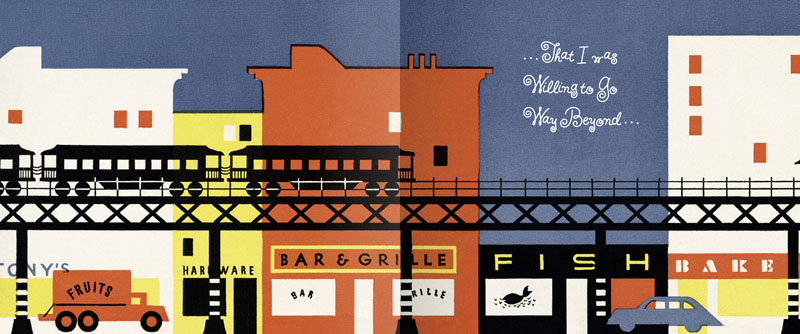
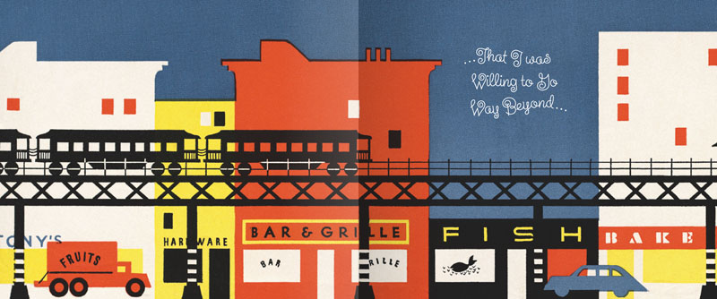
When I originally did the title lettering for "Alex Steinweiss: The Inventor of the Modern Album Cover" I hadn't yet designed "Steinweiss Script". In fact it was designing this headline that spurred me to do that typeface design. In retrospect there were many interior headlines and other lines of copy for the book that Josh Baker, AD at Taschen, would have liked to have had set in a new Steinweiss Script font. But they had to settle for what was available at that time, which was one of several different digitized versions of what Alex Steinweiss had originally designed for Photo-Lettering. Now Taschen has released their more moderately priced trade edition of this incredible book—and just in time for this release I was able to reset all their headlines and other copy the way we had originally wanted to—in Steinweiss Script:

Above: Before and After Details from the older and newer editions

Below: You can Look Inside the earlier edition...

...or Look Inside the newer version:
Our intention was that the newer version, with everything reset in Steinweiss Script, would feel closer to what Mr. Steinweiss would have done had he been able to apply his scrawl to these pages.

Just a reminder: Steinweiss Script is available for purchase on MyFonts, Veer, FontShop and YouWorkForThem. To learn more about these fonts, read Steven Heller's Imprint article or MyFonts' Creative Characters for January.

Alex Steinweiss, 1917 – 2011

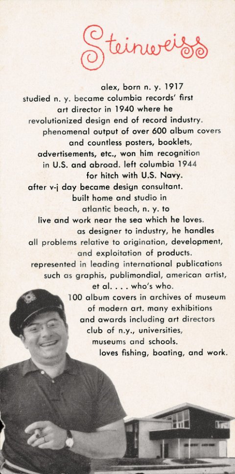
Just having returned from vacation, I discovered that while I was incommunicado Alex Steinweiss—one of my heroes and the inspiration for my Steinweiss font—had passed away. So I'd just like to add my voice (belatedly) to the chorus who have recognized him as one of the giants of 20th century design, who has influenced countless people in the design and illustration fields, and brought delight to millions of others through his beautiful work. The world is indeed a lesser place without him. R.I.P. Mr. Steinweiss.

Fonts In Use: GQ Picks Steinweiss Script for their Comedy Issue

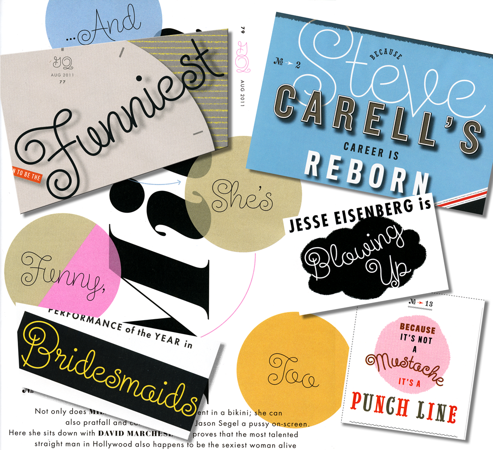
I just got a call from my pal Glenn Parsons of Astrolux Design who informed me that my last font release Steinweiss Script was all over the new issue of GQ Magazine. Kudos to their Creative Director Jim Moore for making such a smart choice!* Here's a collage of a few of the pieces taken from different pages in the current issue. I think these demonstrate nicely some of the versatility of this font, such as the ability to set words on curved paths—and still have all letters connect properly. You can find links to all the outlets where Steinweiss Script is sold (as well as all my other fonts) on the Alphabet Soup pages of my website. I'm also proud to announce that Steinweiss Script is now being sold from the YouWorkForThem website, my newest font reseller.

*Update – June 7,2012: I stand corrected. The choice to use Steinweiss Script was made by GQ Design Director Fred Woodward. My apologies for not checking on that first. M.


Collage of Steinweiss Script Samples in GQ

My Mentor Sol Schwartz In Solo Exhibition at the Norman Rockwell Museum

We all have certain people in our lives—without whom those lives would most likely have taken very different paths. For me there's one person who stands out above all the rest, and his name is Sol Schwartz. I have often spoken about how my growing up in Brooklyn was a formidable influence on what I was to become. When I was a student at Sheepshead Bay High School (quick aside: Larry David was one of Sheepshead's more notable graduates) Sol was a young teacher overflowing with energy, ideas, and inspiration he wanted to share with his students. I don't think anyone was more inspired by Sol than me. More than any other person, Sol is the reason I became a designer. In fact, while my parents were making plans for me to attend law school (unimaginable!), Sol met with and somehow convinced them it would be a better idea to allow me apply to art school. Then he encouraged me to apply to the best: Cooper, Yale and Pratt. I ended up attending my #1 choice, Cooper Union, the experience of which in the end totally transformed my life. So I have a lot to thank Sol for. This month Sol has been accorded an honor that has been long overdue: the Norman Rockwell Museum is giving him a solo show "Sol Schwartz: Drawing in the Dark". Drawing In The Dark

One of Sol's great loves has always been drawing from life. This particular show focuses on the drawings he's created of artists at live performances during summer seasons at Tanglewood, Shakespeare & Co., the Berkshire Theater Festival and Jacob's Pillow. He does these drawings of musicians, conductors, dancers and actors in the dark, while he is in the audience watching them perform. His love for the theater arts permeates every line he draws. With his drawings from Tanglewood one can almost hear the music—the line work being imbued with an energy and life that would not be possible in any other medium.

Sol is one of those artists who cannot help themselves from constantly drawing (I think he might actually draw in his sleep!). His series of nudes drawn with pastel on colored paper are reminiscent of the old masters. When I saw these recently I couldn't help but look up an old self-portrait I had done in Sol's classroom just to compare it with his work, and see if I saw any influence.

Looking at it (and looking back) I think my "drawing" skills may have left a bit to be desired, so I hope in that regard I wasn't too much of a disappointment to my teacher! Sadly I won't be able to make it to the opening at the Norman Rockwell Museum, but for anyone in the Stockbridge, Massachusetts area the opening will take place on Saturday, July 9th. Those who can make it will have the extra added pleasure of listening to Sol give a commentary on his work at 6:00 PM. As a former student of his, I can honestly say that listening to Sol speak is something you won't forget!

You can purchase Sol's book "Drawing Music – The Tanglewood Sketchbooks" through Amazon.

Laura Smith Interviewed by Anne Telford

My wife, Illustrator Laura Smith, was recently interviewed by Anne Telford about her whimsical illustrations for the Summer 2011 edition of The Directory of Illustration's Illustration Voice – the online illustration newsletter. Anne was the founding managing editor of Communication Arts magazine, and is now their Editor-At-Large.

The current issue of Communication Arts magazine (Illustration Annual 52) also features Laura's cover illustration for The Graphic Artists Guild Pricing and Ethical Guidelines (see my previous post on this), and is she currently featured in the Guild's Member Spotlight.

In addition that PEGs cover was recently honored by the Society of Illustrators: Illustrators 53, and was also a winner in the Altpick 7 Awards.