Viewing entries in
Notes

Signed Prints Available on Illogator

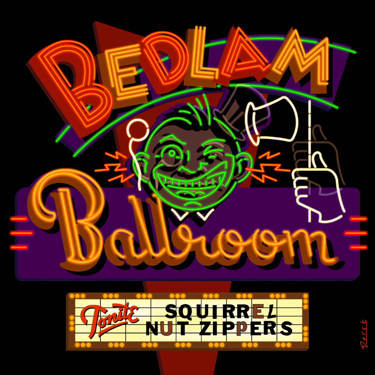
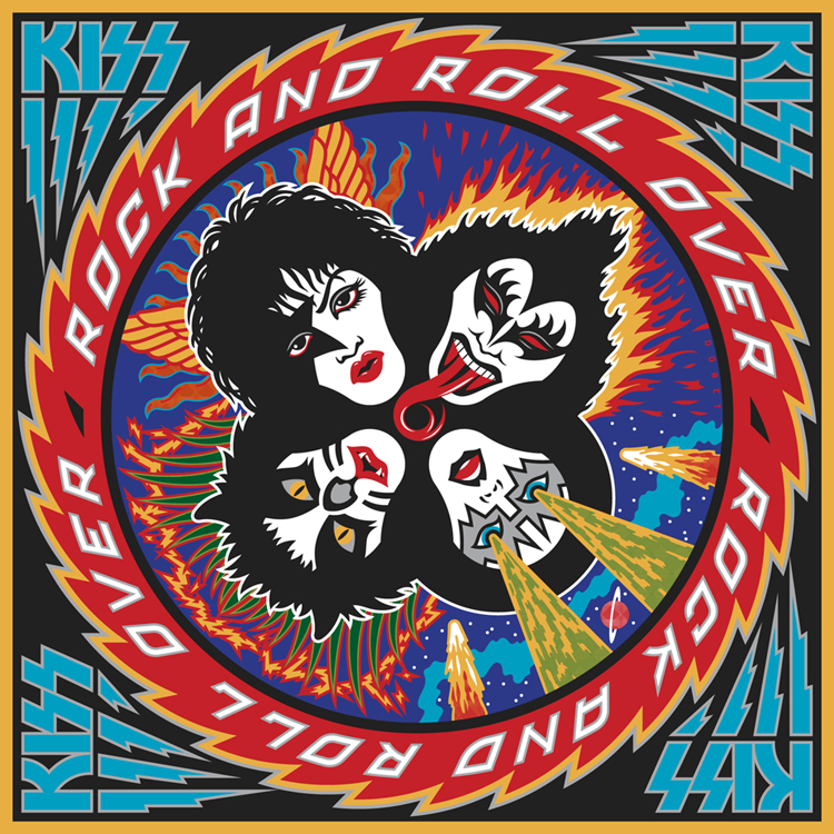
I have 7 different signed prints available for purchase on the Illogator website. They range from silkscreens to giclées, to lithographs. There are 2 different silkscreens that I did to promote my fonts Metroscript and PowerStation. The giclées include work I did for two musical groups—the "Squirrel Nut Zippers" and the "Blue Hawaiians", plus a design I did of the Tribeca Film Festival. The lithographs include a print of the signage I did for "Le Train Bleu" restaurant for NYC's Bloomingdales, and a press proof of my first album cover design for KISS – "Rock and Roll Over". The press proofs from 1976 I recently found tucked away in storage, and are in the same condition as they day I received them for approval of color—they're absolutely mint. I've decided to sign and sell a few of them and keep the rest.

Alphabet Soup Fonts In Use

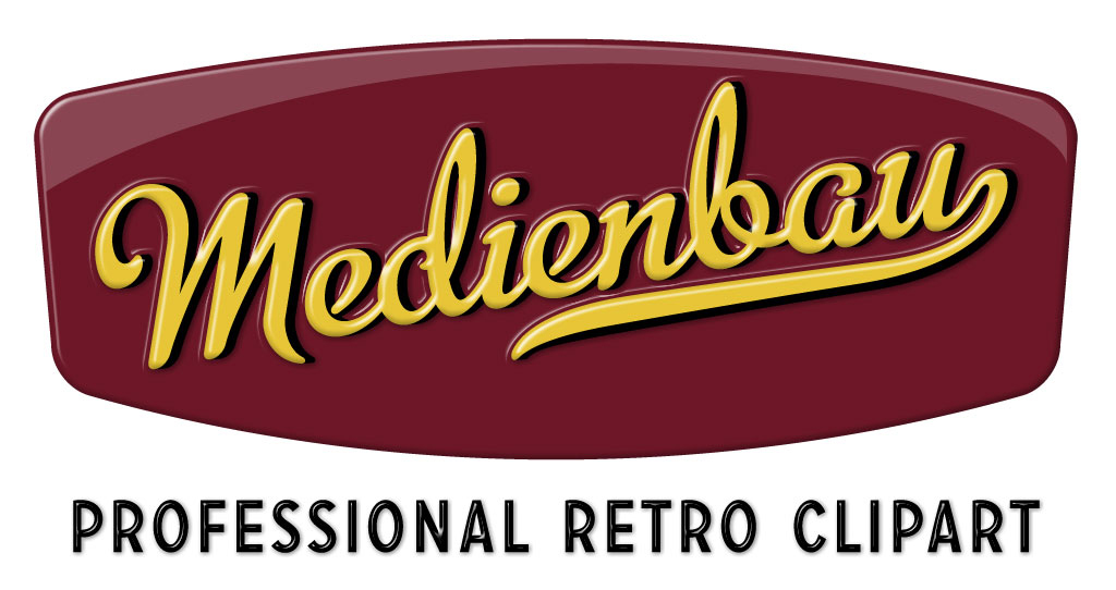
From time to time people send me (or I find on my own) examples of how other designers have used my fonts. Sometimes these samples are really wonderful. So when I come across examples that I feel are unusual, different or extremely well-done, I'd like to post them here. Recently I posted an example of how Metroscript was used in the movie "The Hulk". I would welcome submissions from anyone who would like to email them to me. My first posting in this series comes from Switzerland and was sent to me by its designer. The font is again Metroscript. Usually I'm not a big fan of extruding type dimensionally—I'm kind of a type "purist". But I thought that this one was done really well, keeping it simple and avoiding the temptation to just keep going and going. I love its simple colors and clean lines. Somehow the designer has taken what I feel is a very "American" font and imbued the design with a very European flavor.

It was sent to me by Bernhard Huber who asked that the credit read as follows— Design: Medienbau, Agentur für Konzept und Design, Switzerland

“Deliscript” Font Preview: Followup

A huge Thank You to those who took the time to take a look at my preliminary ideas for "Deliscript". A few of you confirmed some thoughts that had already entered my mind about how to approach this font:

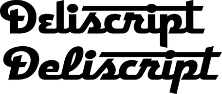
The biggest stumbling block for me was that with the large caps that I initially conceived this font as having, there was a problem if one chose not to set an underscore (such as when setting more than one word): the caps would then appear too large. José and Marcus both suggested reducing the cap size to align with the baseline. Initially I thought that might make the caps too small. But when I tried it out it seemed to work fine—admittedly it took some getting used to after seeing the cap so grandiose at the beginning of the word:

And it seems to work fine if one chooses not to set the underscore:

Or even without the extended crossbars on the "t":

I think that doing it this way will give the font more flexibility. Perhaps I could still include a set of the larger caps as an extra for more dramatic effect. I haven't yet figured out what I'll do about the lighter weight. I'm not that crazy about it, so I was kinda surprised to see both Norman and Marcus commenting that they were partial to it. I'll have to think on that, but any more comments on any of this would really be welcome!

"Deliscript" Font Preview: Your Feedback, Please!

I'm not the most prolific of font designers—perhaps I come up with one a year—but when I do one I try to do a design that's not only uncompromising, but also one that is usable by people with a wide variety of tastes. For the last several months I've been working on a new design that was loosely inspired by one of the signs at Canter's Deli here in Los Angeles. I've been vacillating on several points with regard to the design of this font, and also how many fonts should go into this package. So I thought I'd put it out there to you, my friends and fans, to take a look, read my remarks, and give me your considered opinions via the comments section below.

Above is my original concept for this font which I'm calling "Deliscript". It started out as a straight up and down script, but then I decided to also include a variation that was italicized. In the same fashion as my highly successful Metroscript I thought that having underscore "tails" that would emanate from either certain cap letters or from the last letter of the word in lowercase would be a nice idea.

As you can see above, I immediately ran into a problem: if one choses not to set copy with an underscore (a very likely occurrence), then the caps end up looking much too large for the lowercase.

The solution, of course, was to reduce the size of the caps (above). But then the question arises, do I create two sets of fonts—one with larger caps and underscores (Deliscript Special and Deliscript Special Oblique), and another with smaller caps and no underscores (Deliscript and Deliscript Oblique)? Or do I eliminate the Deliscript Special fonts altogether and just have the more normal versions?

Another question that arises is whether or not it's worth it to have features like the extensions on the "t"s. Part of me likes things like that, but another part says it may not be worth the trouble. It looks perfectly fine without (above). Opinions, anyone?

Finally, I had originally conceived this design as having a lighter weight as well, but I'm not sure it will be worth it. Aesthetically I much prefer the chunkier, heavier versions, and I don't want to go to the trouble of doing this weight just to create a larger font family. So feedback on this question would also be appreciated! Comments?
Barack Obama & JFK

Today is history. I cannot remember ever feeling this thrilled or so hopeful about a new president. The closest thing I can associate with this was the tenor of the nation during the years before the Kennedy assasination. The country was unified behind him and he was beloved by almost everyone. When he was shot I was in school, and I remember students were either stunned or openly weeping. My daughter Wenonah reminded me this morning that once many years ago I spoke to her about the Kennedy years, about how he was loved, how everyone was so positive about—and supportive of—our government. She had told me that she just couldn't imagine ever feeling that way, or even relate to that experience. After the inauguration this morning she told me that now she understood what I meant. After November 22nd, 1963, our country entered a long dark era, from which only now it may be emerging. I never thought a day like this would be possible in my lifetime. After all the US has been through I never imagined that we could again elect a person of such intellect and potential as Barack Obama. I believe he is capable of being one of the greatest leaders this nation has ever had. We will all need to re-evaluate what is truly important in our lives, and he and his administration will need the support of all of us to tackle the monumental challenges that lie ahead.

Set the Wayback Machine: "Viva" Astrology

I thought it would apropos and an interesting idea to start the New Year off by initiating a series of posts that looks back at some of my work from times gone by. Much of this work will be pre-digital—done the old fashioned "analog" way, with pen and ink. Most was done as pre-separated art: I inked my art on multiple cells of frosted mylar using a Rapid-O-Graph technical pen. Basically the areas of black ink on each cell could be designated to print either with CMYK callouts or with Pantone numbers. It was a very laborious process that was easily duplicated after the first few versions of Adobe Illustrator had come out.

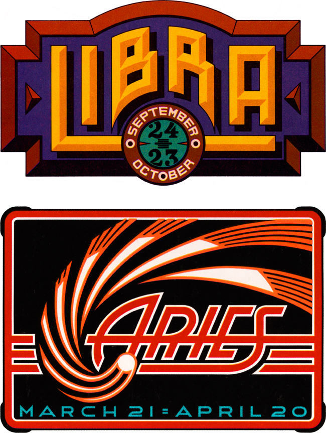
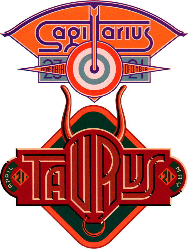
Four Astrology Sign "Logos" for VIVA Magazine

So right now let's set the Wayback Machine for the mid '70s and VIVA magazine published by Penthouse (a kind of Playboy for women). The Art Director—the late Rowan Johnson—asked me to design logos for their monthly astrology column which would change with each issue. Even though at the time I was paid quite a paltry sum for my efforts, this was a great ongoing project for me. Much like my recent "Jewish Zodiac" project, I saw this assignment as an opportunity to create a portfolio of distinct yet related logos. I think they really highlight the possibilities of using letterform design not as an end in itself, but as part of a total design concept where letters are treated as one of several related illustrative elements, and integrated into an expressive whole.

Overspray

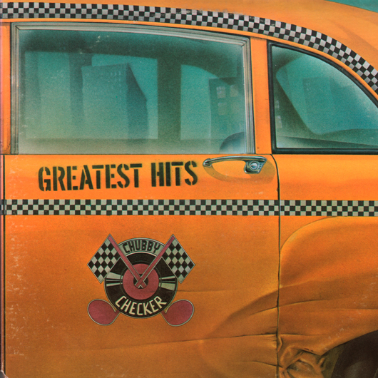
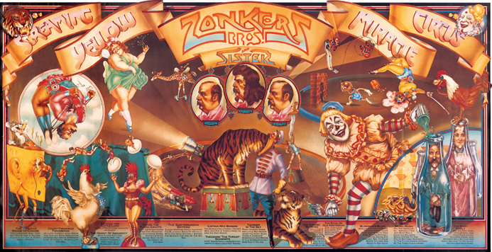
At the very beginning of my career I hooked up with airbrush wiz Charles White III. He rented me deskspace in his studio on Lexington & 26th Street in Manhattan, and helped give my career the push it needed. We did quite a bit of work together in those days—work that I'd like to think was groundbreaking illustration work. Rather than have typography slapped over an illustration, we tried to figure out new and inventive ways of integrating letter and image. This is evident in pieces like the Chubby Checker album cover where the title was part of the illustration—contained in the Checker Cab-like decal I created—or the Gentle Giant cover where I painstakingly figured out what dimensional lettering would look like as it wrapped around a glass jar. One of our first collaborations was the incredibly complex Screaming Yellow Zonkers poster which took a more traditional approach to the integration of letterforms and illustration.

Charlie is finally getting the recognition he deserves for that early work in the just released book Overspray by Norman Hathaway. The book features Charlie who, along with fellow artists Dave Willardson, Peter Lloyd and Peter Palombi, formed a quartet of California artists that transformed the illustration landscape in the '70s. Charlie, Dave and Norman together with legendary designer and art director Mike Salisbury (who contributed an essay to the book) were all in attendance at a book signing at FAMILY in Los Angeles on 11/12/08. To see photos from the FAMILY booksigning (which includes the back of my head) and some discussion from Norman Hathaway about the process and problems he encountered putting together this book, check out his Overspray Blog. To see more of Charlie's work from this period, I've put together a PDF of images (not currently available) culled from his website. Throughout his career Charles White III has been consistently one of the most interesting talents around. Visit his Olio website to see what he's been up to.

The Jewish Zodiac™

About a year ago I was contacted by comedy screenwriter Seth Front who pitched me his idea for "The Jewish Zodiac™": a parody of "The Chinese Zodiac" but with deli foods instead of animals. Each of the 12 signs (based on birth year) would, in a light-hearted way, personify the food's characteristics as well as explore compatability with the other 11 signs. It seemed like a good idea, and I could design them all as vintage deli food labels with the potential of becoming a mini portfolio of 12 related but distinctly different designs. One problem I needed to solve was that Seth had already done food photography, and was intent on using it in the designs. Initially I wasn't hot on using his photography because I thought it would be difficult to integrate into my graphics. But then I figured out a way of using Photoshop and Illustrator to translate the photos into simplified graphics using limited color. The results looking deceptively simple and easily achieved—but figuring it out and translating each photo was in actuality a very labor intensive process. I was then able to extrapolate the label designs using the limited color palettes derived from the processed photographs. Below is a section of one of the photos and the corresponding section of its simplified graphic counterpart I created, reducing it to 6 flat colors:

It took many months to get all 12 done, but I'm very pleased with the group as a whole. Below are two of them—if you'd like to see all twelve in more detail follow this link to the PROJECTS page on my website. To purchase T-shirts, mugs or magnets please visit Seth's "The Jewish Zodiac™" website.

Office Machines & Bubblegum

I've always loved the graphics found on vintage office machines (you know, the ones with industrial hammered metal finishes), which are often comprised of 2 or 3 color decals. They have a lot in common with decals that were used on gum and candy vending machines back in the '40s and '50s. I've managed to collect a few of those, and have always admired the naive, bold and simplistic graphics and design sense they share. I recently found a way to pay homage to them when my friend Jed Davis, Senior AD at both Promo and Direct magazines (and who also runs the indie record label "Eschatone Records") called me with another cover assignment for Promo Magazine.

A few gum machine decals

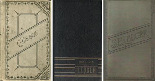
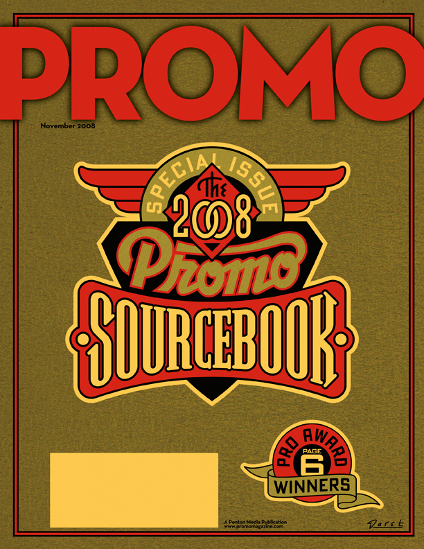
The November issue of Promo is a special issue called "The 2008 Promo Sourcebook" and they needed a cover design that was non-specific, yet eye-catching enough so that people wouldn't mind having it around for several months. My first inclination was to give it a sort of ledger-like look:

But after consideration, I thought that idea might be a little too sedate and staid for what Jed was looking for. Then it occurred to me that perhaps this might be an opportunity to do something along the lines of the decals I had been collecting. I could get color and excitement into a cover that had the feeling of a ledger by also referencing the graphics and decals found on old office and gumball machines. To further the feeling I gave the gold color a subtle "decal" texture, and the background feeling of metal with an industrial machine-like finish.

Fame Has It's Drawbacks...2

Back in May I did a blog posting here talking about the mis-perception that my design services are too expensive for most clients. At the time I wrote: "Something I hear quite frequently runs something like this: 'You'd have been perfect for our project, and I'd have hired you in a minute, but you know, we probably wouldn't have been able to afford you.'"

I'm still getting feedback from many of you out there that you believe what I do is too pricey for your budgets. While that may be true in some cases—such as in national advertising or corporate logos, I do pride myself on my ability to tailor what I do to a client's needs and (more and more) to limited budgets. Here's another case in point.

I was contacted by a photographer from Berlin named Tanja Ortmaier ("Spooky Sally") who does predominantly 1940s style pin-up photography under the name "Cherrymuffin Studios". She asked if I would be willing to design a new logo for her that she could use on her website and could be adapted for various other uses such as signage. While her budget was fairly modest, I was impressed with her work (it's not every day that I get to work with a pinup photographer!) and her enthusiasm was, to put it mildly, infectious! Below are two samples of what I was able to do for her: Upper: for use on website | Lower: for use on signage

Because of her openness and her ability to accept certain limitations, we were both able to bring this project to a successful conclusion in a very short amount of time. Here's a few comments from her:

"Hey Michael, Again - this is awesome! Great how you captured the details of the camera! ...and I'm very happy with the flashlight as well!...YES I'm really happy with all that! Thank you for such a great work! Yippiejaiyeah, Sally."

So while yes—I am in it for the money—I don't have specific rates: hourly, daily or otherwise. I try to evaluate each project on it's own merits, and come up with a price that is fair for all involved. If a client has a set budget (e.g. such as a specific limited rate for a magazine cover) I try to figure out how I can best meet their needs while not overextending myself. Sometimes I can come up with a solution that's a lot simpler than what might have been envisioned. Many times I can figure out a way to successfully solve a design problem that doesn't take me a long time, yet more than satisfies the needs of the project. So please, just remember—if you're in doubt, it doesn't hurt to ask me!

No Second Chances?

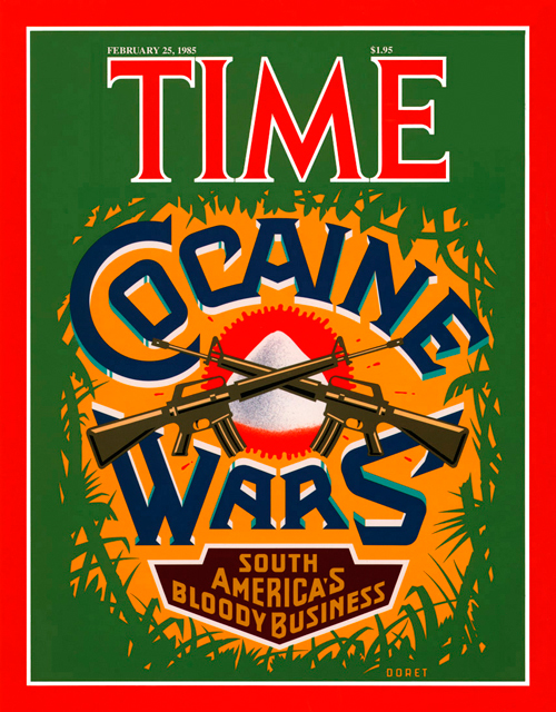
They say there are no second chances, but recently I found that statement to be not entirely true. I've designed and executed art for many covers of TIME magazine. I was never entirely pleased with the cover I did for TIME's "Cocaine Wars" story. I had originally wanted to focus the design around a skull image, and to have the letters in "Cocaine Wars" have snowcaps on them like the letters you'd see on ice machines. But the powers-that-be at time had me eliminate the skull (too menacing) and in it's place illustrate a small mound of "cocaine". The result as you can see was a still a fairly good cover but with a focal point that was kind of anti-climactic.

Fast forward to present day: Rick Klotz of FreshJive—an LA streetwear manufacturer, who also runs his flagship store Reserve in the heart of the Fairfax district—contacted me to see if they could license some of my older designs for silkscreened T-Shirts. He immediately gravitated to some of my TIME covers—including "Cocaine Wars" among others among others. Since I would have to reconfigure the art for silkscreen anyway I immediately saw this as an opportunity to make good on that design that I never felt right about. Freshjive will be distributing that T-Shirt design among others of mine in two different color schemes for their Summer '09 line.

José Cruz: ICONOCLAST

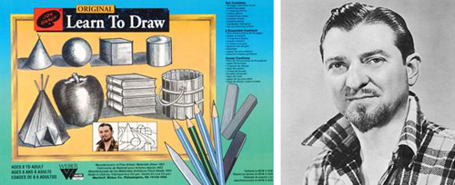
That great populist TV art evangelist from the '50s Jon Gnagy always opened his program with "If you can draw these simple forms: the ball, cone, cube and cylinder, you can draw a real picture the very first time you try" I'm not really sure that it was true, but my good friend and master illustrator José Cruz has taken that dictum quite literally, pushed it about as far as it can be pushed, made it his mantra and applied it to his work. It can be seen in its purest form in the geometric caricatures he has posted on his icon©last Blog. The art of the caricature has always amazed me, but even more so in his startling work. How is it that with these few lines in his carefully composed geometric configurations that we can actually identify specific individuals? I don't understand why, but they work—and artfully so! If you're skeptical, look at the three below: from the Sopranos—Paulie "Walnuts", from Curb Your Enthusiasm—Cheryl David, and from Entourage—Drama. For more on the art of the caricature, check out "Celebrity Caricature in America" at the National Portrait Gallery.

"Striking Images"

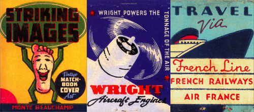
It's no secret that for inspiration I look at a lot of American ephemera. I collect some, but I am also constantly on the lookout for good books to have on hand to refer to for a quick jolt of brilliance. I've got books on neon and cigarette packs, enamelled signs and billboards, wheel charts and travel brochures, and on and on. One recent purchase really stands out in my mind—so much so that I felt I needed to mention it here: "Striking Images" - Edited and Designed by Monte Beauchamp. It's a book of vintage matchbook cover art. There have been other books on the subject, but this one stands out in my mind as having the best, the most unusual, and the most colorful selection of this genre I have ever seen. But what really stands out in my mind is that many of the images are blown up to either full page size—or larger. Monte is also well known as the man behind "Blab!" magazine, a publication that anyone interested in what is current in the Fine Art and Illustration worlds cannot afford to be without. Also worthy of mentioning is that if any of you are going to be in the vicinity of Manhattan (Kansas that is) between the months of August and October you should definitely take in the Blab! Retrospective being held at the Beach Museum of Art.

My Hollywood: Then & Now

Hollywood is a study in contradictions. It's a city that on the one hand celebrates its past, but then turns around and either ignores or vilifies it. Living here is a constant love it/hate it battle with one's own feelings. I recently decided to jump into the fray, attending meetings with the Community Redevelopment Association (CRA) with regard to signage and billboards in Hollywood. The CRA really wants to do the right thing but for too long the residents of Hollywood have not spoken up about their needs, and so the business interests have held sway. Walking the streets here is an assault on ones senses—billboards and signage are starting to completely take over the Hollywood landscape, turning the city into one huge canvas for advertisers to hawk their wares. Landlords make large profits from renting the walls of their buildings to advertisers, and this has gone on unregulated for far too long. It has turned a once beautiful city into the poster child for visual blight. It's no wonder nobody walks in LA—it's not a pleasant experience.

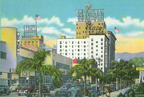
Although it's not the best example of how bad things have gotten here, I thought I'd contrast an image from a postcard of Vine Street from the '40s, with a current shot of the same street.

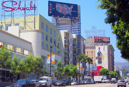
As one can see, billboards were not an issue at the time. Signage was well designed and often dramatic–adding a colorful and graphic component, enhancing the cityscape. The same view (below) although it is a commercial street, and not as an egregious example as I could have shown, demonstrates some of the problems that we face.

The worst one, I feel, is that buildings like this one are now being designed as vehicles to carry billboards. What cannot be seen in this view are the eight billboards that are on this one side of the building alone! Turn around and this humongous billboard is what's in your face, and can be viewed for miles. Gone are the days when architecture was designed to fulfill the purposes of those who would occupy it. Now new buildings in Hollywood are thought of more for their advertising potential than their architectural significance. Also note the way the "Tropic Thunder" billboard obscures the historic "The Plaza" rooftop neon, and how the gargantuan billboard atop Sunset and Vine blots out the sky. Also note that the poor residents of The Plaza have their windows blotted out by a liquor ad. On a more positive note, an attempt was made to resurrect the famous "Schwab's" logo as rooftop neon, but the business connected with it was just a flash in the pan, and disappeared a while ago.

Hollywood is considered one of the worst cities in the country for billboard blight. Various groups have sprung up to try to fight it, but it seems that for every step forward we're able to make, we go back two steps.

What I Do (#3 of 3)

Trying to cite a few sample pieces that are representative of what I do is not that easy. Although there are many common threads running through my work, much of it has ranged all across the board. Many people say they can always recognize it by "my style", but it's not as easy as picking out the work of many illustrators who have a style that's clearly definable. If I had to pick out several pieces that are representative of what I do, I might select the logo I designed for the NY Knicks, one of my covers for Time Magazine, the cover I did for the Squirrel Nut Zippers CD "Bedlam Ballroom" and the treatment I created for the New York Times of the Tribeca Film Festival. These pieces are all quite different in nature, yet tied together by what I believe to be my personal graphic vision.

What I Do (#2 of 3)

I created a teeny-tiny niche for myself when I started doing "letterforms" art—this was back in the ‘70s. For me that time was a low point for typography. There wasn’t that much going on design-wise that held my interest. I felt at the time that illustration and typography/lettering were seen and treated as two seemingly unrelated disciplines. To my mind typography had become uninteresting and was hardly ever fully integrated with images—whether they were photographic or illustrative. At the time the very popular modernist movement (as typified by such designers as Rudolf de Harak and Chermayeff & Geismar) represented a way of approaching design that for me held very little interest. When I looked back a few decades at the rich history of ephemera in this country it seemed that we were in visually lean times.

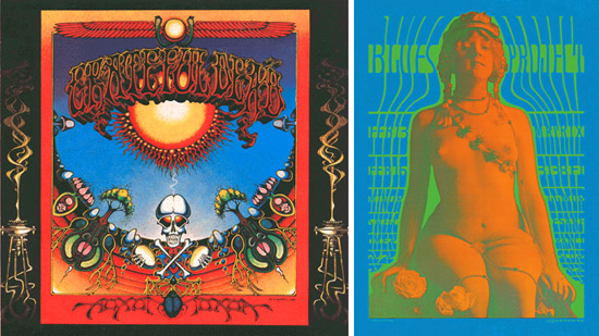
Early work by Rick Griffin (l.) and Victor Moscoso (r.)

While a student at the Cooper Union I was very taken with the "psychedelic" posters that had appeared on both coasts. The work of such artists as Victor Moscoso, Kelly & Mouse and Rick Griffin had a huge impact on me with their unusual use of color and integration of letterforms and striking images. Of course I don’t think I could have verbalized any of this at the time, I just knew what I liked—and wanted to see more of those sorts of things. So I started to create custom letterform solutions, working and collaborating with illustrators—specifically Charles White III and Doug Johnson. I soon realized that I myself could also be a maker of images and so, after gaining a little self-confidence, started to take on projects where the image and the typography associated with it became more integrated with each other—at times becoming one and the same. I guess this was to become my "thing"—the integration of letter and image. Soon, other young designers began imitating what I did. At the time I kind of resented it as “plagiarism”, but I soon realized that imitation was the most sincere form of flattery. Over the years my “imitators” branched out and found their own voices. So it’s gratifying to see that in some small way I may have influenced a generation of designers.

What I Do (#1 of 3)

People are always asking me how I ended up doing what I do. They also want to know if what I do has a "name". My intention was never to set out to be a "lettering artist", but somehow I always gravitated towards solving communication problems with letterforms. I guess in some ways I'm a designer who works like an illustrator. I have done work of all kinds in all sizes—from billboards to postage stamps, from logo design to labels, from CD covers to signage—and then of course there's font design. I don't feel it's ever a good idea to try to fit one's work into categories or niches: what I do overlaps several categories: illustration, graphic design, lettering, typography and font design. What I usually tell people is that I'm a "letterforms" artist—a definition vague enough not to be too confining, but at the same time giving a little more emphasis to the "lettering" part. How I ended up "inventing" this genre (I hope that doesn't sound too immodest) is a whole other matter. I don't want to give myself more credit than I actually deserve by focusing on this, but people are always asking how I got here . . . so, if you're interested, stay tuned for my next post for more of the backstory.

Fame Has It's Drawbacks...(sigh)

Something I hear quite frequently runs something like this: "You'd have been perfect for our project, and I'd have hired you in a minute, but you know, we probably wouldn't have been able to afford you."

Well, many of the instances that clients believed this to be the case would actually have worked out just fine. If I had to depend only on the big-budget projects for my livelihood I'd probably go broke. The truth is I work for all kinds of clients, big, small and in-between. Many times the most interesting projects are the ones that don't have the huge budgets. There sometimes seems to be a direct inverse correlation between budget size and creative freedom. Often we can find a way to work something out.

Just as an example, a recent project of mine was to do logos for a pair of Los Angeles restaurants—one in Beverly Hills, the other in the Los Feliz/Silverlake area—Dominick's and Little Dom's, two recent additions by restauranteur Warner Ebbink.

The budget wasn't gargantuan, but we were also able to work out a situation where I was able to take advantage of his hospitality in exchange for my design expertise—it was win-win all around.