Art Imitates Life...Imitates Art (Canter's Truck #1 of 3)

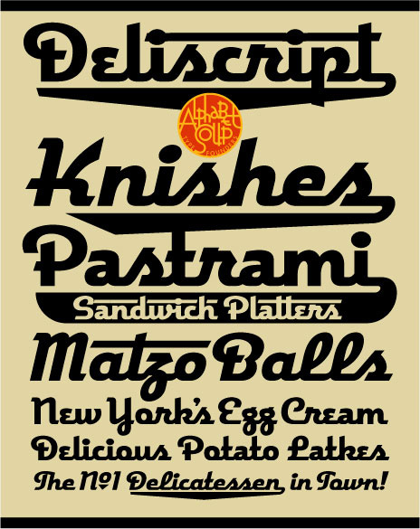
Recently I had a strange (and kind of wonderful) confluence of circumstance—combined with a smattering of coincidence and random luck. It all started right here in this blog over a year ago when I started sharing my thoughts about creating my new font Deliscript. In the posting I mentioned how the design was "loosely inspired by one of the signs at Canter’s Deli", a Los Angeles staple for almost 80 years:
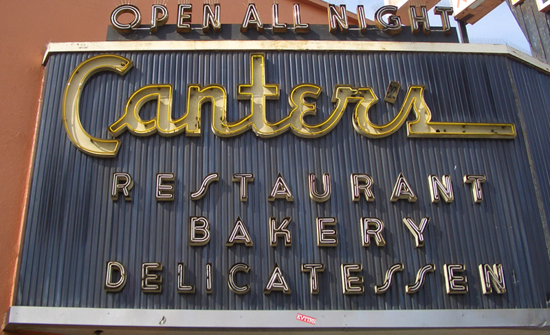
At any rate my good fortune with Deliscript began about two months ago when I learned that it been selected by the Type Directors Club in NYC for inclusion in their annual show. About a month later I got a call from Bonnie Bloomgarden, the great-granddaughter of Ben Canter—one of the original Canter Bros. She and her sister Dena were trying to do a few things to gently update the Deli, while still respecting its heritage. One of their ideas was to create a "Canter's Truck" and take advantage of the recent mobile gourmet food trucks craze. A lot of the newer trucks have been completely "wrapped" with colorful graphics using fairly new printing technology.

She told me that they had started looking for fonts to design the wrap for the truck themselves, but then realized it might be a little difficult for them without having a lot of graphic design experience. Then fortune smiled on Bonnie and Dena when they did a web search Googling "Deli" and "Font" and ran smack into Deliscript (probably because of the Canter's mention in this blog) and then in turn found, and contacted me.

It has been a real pleasure working with Bonnie, a young person with good entrepreneurial instincts that are combined with a keen sense of what is worth keeping in the Canter's visual vocabulary, and what perhaps should be let go. We both concurred that the truck identity should be based on that neon sign, and that I should use Deliscript as the starting point. I also suggested that we somehow should try to incorporate into the truck design their famous neon chef, who for years has been carrying that platter of freshly baked bread:

At first I tried to graphicallyt recreate him pretty much as he was for the side of the truck. I soon realized that my rendition seemed far too literal for the look I was going for. Then, in an old matchbook catalog, I found a cut of a little round chef carrying a platter of turkey, and decided to use that as the basis for creating my updated baker (a little slimmed down) for the door of the truck:

In "Art Imitates Life...Imitates Art #2" I'll discuss how we created the design for the truck.

Deliscript Lauded by Type Directors Club

I was extremely excited to learn recently that my Deliscript font family (Alphabet Soup's major font project of 2009) was chosen by the Type Directors Club to receive their prestigious "Certificate of Excellence in Type Design" in the display fonts category for their TDC² 2010 Typeface Design Competition`. Deliscript was one of only 16 designs chosen from the many typefaces entered from 29 countries.

Deliscript will be showcased in TDC² 2010, will be on display in New York City throughout the summer of 2010, and will be published in TDC's Typography 31, the Annual of the Type Directors Club. The exhibition will then go on tour traveling throughout North and South America, Europe, and East Asia.

Once again I'd like to extend my thanks to the very talented Patrick Griffin of CanadaType for his invaluable help with Deliscript's OpenType programming.

"QWERTY" Pen & Card Case Released by Acme Studio

Acme Studio of Maui, Hawaii is known for having an incredible roster of world reknowned designers who have designed pens, watches, cufflinks, wallets and various other accoutrements for them. Some time ago I proposed a pen and business card  case to them with a vintage typewriter key theme. This January they've released my "QWERTY" pen and business card case design. Currently it's at the top of their New Releases page (click on "New Releases" at upper left) and and on their Designers page (click on my name a little ways down the list at the left).

I’ve always loved vintage office machines—especially old typewriters. I guess it’s because I grew up with them. My Dad was a writer, and my memories of him are filled with the sound of his tap, tap, tapping away day and night on his trusty old Underwood. When word processors started taking over, he just found it too difficult to make the transition. It’s hard to explain, but I think it had something to do with a kind of personal bond that he had formed with his machine. Because of my early associations with manual typewriters I still love not just their look and graphics, but especially the feel and clackety-clack sound of the keys, and the imperfect impressions they’d make on paper.

Those memories of my father and his Underwood are now very near and dear to me. Typewriters have now been pretty much relegated to the dustbin of history. The “QWERTY” keyboard layout still survives despite many attempts to improve on it. In designing this pen and case I saw an opportunity for me to create a small homage to these wonderful machines. It may sound odd, but the way I see it, in a way it’s kind of like one almost obsolete writing instrument paying tribute to another.

Acme Studio products can be purchased in Acme Shops worldwide, in better stationery and art supply stores, in museum shops, and online.

Signed Prints Available on Illogator

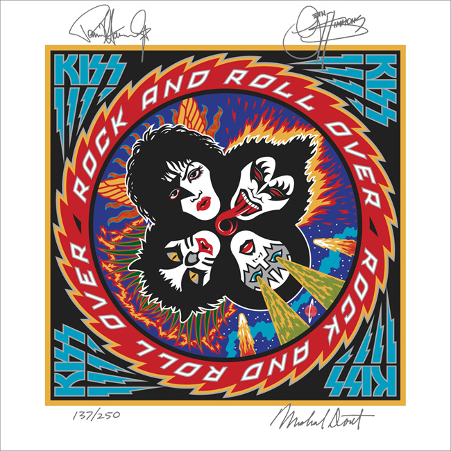
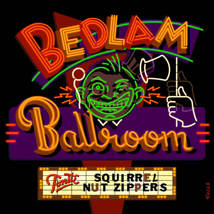
I have 7 different signed prints available for purchase on the Illogator website. They range from silkscreens to giclées, to lithographs. There are 2 different silkscreens that I did to promote my fonts Metroscript and PowerStation. The giclées include work I did for two musical groups—the "Squirrel Nut Zippers" and the "Blue Hawaiians", plus a design I did of the Tribeca Film Festival. The lithographs include a print of the signage I did for "Le Train Bleu" restaurant for NYC's Bloomingdales, and a press proof of my first album cover design for KISS – "Rock and Roll Over". The press proofs from 1976 I recently found tucked away in storage, and are in the same condition as they day I received them for approval of color—they're absolutely mint. I've decided to sign and sell a few of them and keep the rest.

Alphabet Soup Fonts In Use

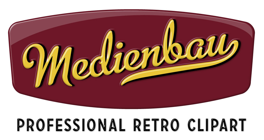
From time to time people send me (or I find on my own) examples of how other designers have used my fonts. Sometimes these samples are really wonderful. So when I come across examples that I feel are unusual, different or extremely well-done, I'd like to post them here. Recently I posted an example of how Metroscript was used in the movie "The Hulk". I would welcome submissions from anyone who would like to email them to me. My first posting in this series comes from Switzerland and was sent to me by its designer. The font is again Metroscript. Usually I'm not a big fan of extruding type dimensionally—I'm kind of a type "purist". But I thought that this one was done really well, keeping it simple and avoiding the temptation to just keep going and going. I love its simple colors and clean lines. Somehow the designer has taken what I feel is a very "American" font and imbued the design with a very European flavor.

It was sent to me by Bernhard Huber who asked that the credit read as follows— Design: Medienbau, Agentur für Konzept und Design, Switzerland

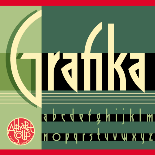
Announcing Grafika: It's a New "Old" Font . . . (or is it an Old "New" Font?)

I'm very pleased to announce the release of Grafika, a font design that has been "in the making" for many more years than I'd care to remember! It can be purchased from Font Bros, MyFonts, FontShop, Veer and YouWorkForThem.

Grafika began its genesis when I received a call to work on a feature film. That phone call came from Ismail Merchant and James Ivory, the reknowned team who have given us such films as "A Room With a View", "Howard’s End" and "Remains of the Day". The assignment was to create a title treatment for their upcoming film "Savages".

The title treatment (above) that I created to reflect the Art Deco sensibility of the film was so well received that it was decided that we would emulate its elegant, elongated look in all the typographic elements of the film. To do that I needed to create what would be my first complete font design. So taking my design cues from the logo I had created, I put pencil to paper and came up with a basic character set. Then I inked it on vellum (which was as hi-tech as it got at that time), and had it photographed and positioned on a roll of Typositor film.

Over the years I had forgotten about this font design. My career became totally about assignment work. I hadn’t gone back to designing fonts until recently when I started doing it again under my foundry name Alphabet Soup. Recently I unearthed a poster for Savages which contained all the credits set in that nameless font I had designed for the film. Looking at it again after all these years I realized that for a young designer this hadn’t been bad. So I decided to revisit it, and to add Grafika to my collection at Alphabet Soup.

To see Grafika in more detail, you can download the PDF brochure I've created (3.5 MB). As always, I welcome your comments!

The Return of . . . KISS (#2)

When Paul Stanley came by my studio to discuss how to proceed on the art for the cover of their upcoming CD/DVD package "Sonic Boom", I had no idea what to expect. I hadn't met with him since working on Rock and Roll Over, and had very little memory of what that had been like. Any anxiety I had melted away when we started talking. Paul is a "gentlemen's gentleman" and I immediately felt at ease talking with him—as if all those years had not intervened since the last time we had spoken. After some small talk he explained what he was after with the new cover art. His vision for this album was to make it as vital and raw as it had been when they did RaRO. He felt that that had been some of the best work that they had ever done, and wanted the new album to recreate that energy both musically and visually. While he didn't want me to reprise what I had done with my art for the earlier cover, he did want me to try to capture some of the same spirit, attitude, energy, and look that I had instilled in that piece. Also one of his stipulations was that unlike RaRO (where I had created abstract, graphic versions of the KISS personas) this time he wanted photographic representations of the four group members in full makeup. When I did RaRO I had a 12" canvas to work on. Now with CD covers and digital booklets that canvas had been reduced to less than 40% of its original size. Designing in a 4¾" space poses some very different problems from what I faced while working on covers for vinyl releases. In fact the older cover design would not have worked at that size, it's many elements would have felt crowded into a small space. So the elements of Sonic Boom had to be bigger, bolder—and fewer. I made the decision to make the title the main focus of the graphics, moving the other elements (faces, KISS logo) into prominent—but subordinate—roles.

So I set about putting pencil to paper and trying to solve this the way I solve any other design problem. I did not want to get psyched-out by thinking too much about how the new design would compare with RaRO. That cover had taken on a life of its own and had become a pop culture icon. Creating an iconic cover could not have been one of my goals. All I was capable of doing was to try to create the most compelling graphics possible within the parameters and limitations that had been set out for me. So I started out at the core of this design by creating what I call a "word constellation" out of the title. I tried to make it communicate its meaning visually by not only making it angular and "explosive", but also by creating a shape that was somewhat suggestive of flight—a "flying wing", if you will. Bearing in mind the symmetrical, mandala-like layout of RaRO I started designing the new piece as a field growing out of the center of the square, with the four members faces moving outwards from the center, and capped with my version of the ubiquitous KISS logo.

It took about a week for me to develop my sketch to the point where I felt confident in what I had come up with. As I had done with RaRO, I felt so strongly about this cover design that I decided to not present any other options—I wanted this to be the ONE.

This is the rough pencil I first presented to Paul. I held my breath as he first took it in, and then was able to exhale when I saw a big smile appear on his face.

Next: A few changes and the final art.

The Return of . . . KISS (#1)

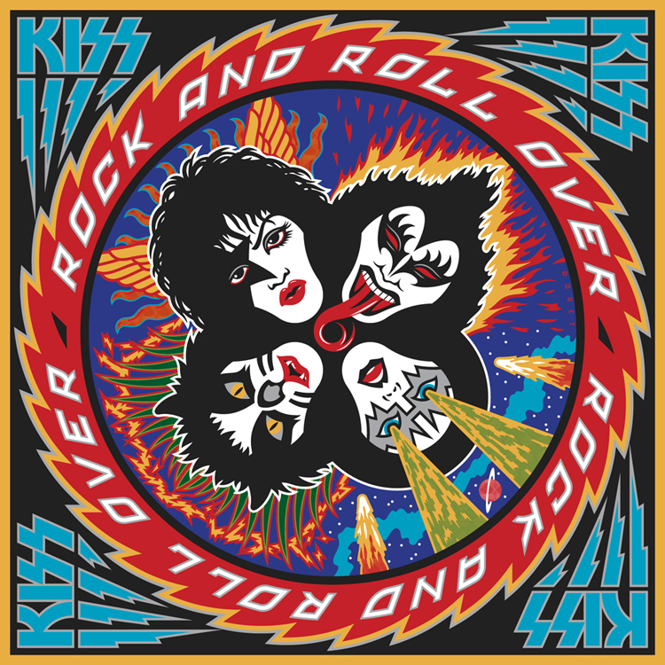
I've been waiting a few months to be able to talk about this—and I have talked about it to some degree in a few online interviews, but not really in any detail. Back in April of this year I received a telephone call from out of the blue—from somewhere in South America. At the other end of the line was KISS' Paul Stanley. It'd been more years than I cared to remember since we last spoke. That was when I had done the cover art for "Rock and Roll Over"—KISS' 5th album and their 2nd to go Platinum. So you can understand my surprise when Paul asked if I'd be interested in designing the cover art for KISS' first studio album in 11 years—which Paul himself was producing.

That's when I started remembering how exciting it was the first time around, to have been involved in that fast-paced world of entertainment and music. For me it had been a far cry from doing the corporate logos, magazine and book covers I had been working on at the time. An "edgy" job for me then was doing a spread for High Times (yep, they've been around for a while)! I've always enjoyed the fact that doing what I do has enabled me to straddle many different design worlds, from the fairly straight to the totally off-the-wall. I always tried to say "yes" to just about anyone who was adventurous enough, and had the vision to see how having me design for them could work to their advantage. At any rate I had said "yes"to KISS the first time around (even though I had no idea what I was doing), so of course I again said yes to Paul. We agreed to meet when he returned at the conclusion of their South American tour.

Much to my surprise the "Rock and Roll Over" cover had in recent years become one of the most—if not the most—talked about piece of art in my portfolio. It was a little bewildering to me how over the years that cover had become an icon for this iconic group. I've been contacted by more people about my KISS artwork in the past 6 or 7 years than in all the years prior, and more than any other piece I've ever done including the New York Knicks logo. So the expectations for this new art I was to work on were quite high.

Next: the new cover design revealed.

Alphabet Soup Now Live on FontShop

It's been a long time coming, but my foundry, Alphabet Soup has now gone live on the world renowned font reseller FontShop—the first mail-order distributor of digital fonts. In the weeks and months leading up to this I had the pleasure of working with Stephen "Stewf" Coles, self-proclamied "Glyph Pusher" at FontShop and Editor of Typographica, "a review of typefaces and type books, with occasional commentary on fonts and typographic design". Among his many other pursuits, Stephen is also a regular contributor to FontFeed, "a daily dispatch of recommended fonts, typography techniques, and inspirational examples of digital type at work in the real world".

(Not Too Much) Lost in Translation

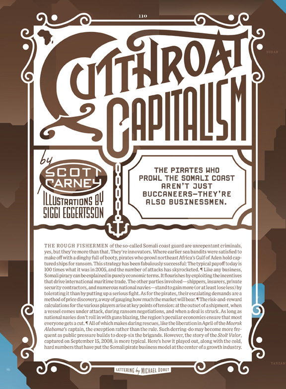
I recently worked with Art Director Maili Holiman designing the opening page and titles for an article about the Somali pirates for the July issue of Wired Magazine (it might take a few moments for this article to load). No sooner had I finished doing the five pieces of art than I was contacted by Wired Italia, who asked me to recreate all the art I had done—but in Italian. Recreating designs with different wording can be challenging as my designs are usually based on the specific letters I'm dealing with, how they relate to one another, how many words there are, etc. The main piece was particularly challenging as the design was more complicated than the others. But at least the main word kept the cap "C" which otherwise would have posed a major problem:

After dealing with the the opener the four other heads were slightly less problematic to deal with:

I don't know, but it seems to me in some cases the Italian version might even work slightly better than it's English counterpart. I had never before dealt with this type of problem, but can only guess that with our shrinking world we'll be seeing more and more of this type of crossover.

Come for the Music—Go Home with a T-Shirt

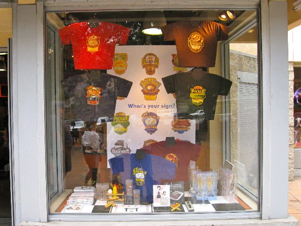
One of my favorite projects of late has been designing the 12 signs of the Jewish Zodiac™. Seth Front, who is the mastermind behind this project recently alerted me to the fact that the Hollywood Bowl has gone zoinks for his zodiac—devoting an entire window display to it. If you can't make it to the Bowl this summer, you can always check out the designs on my website, or purchase the merch on the Jewzo site itself.


Charles White III Studio Sale

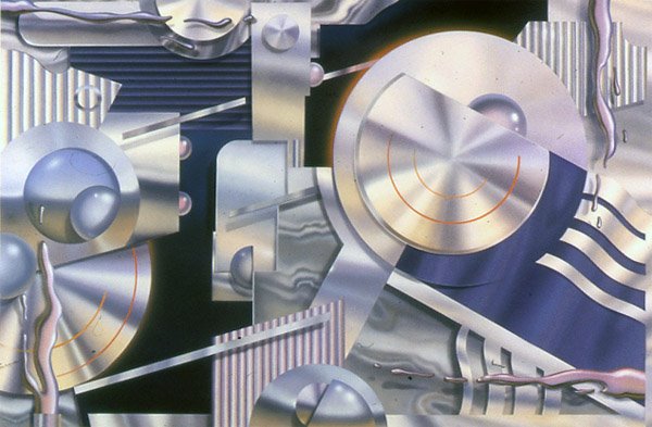
Mark Sunday June 7th on your calendars: my mentor, the great Charles White III, is opening the doors of Olio to the public, and putting some classic work up for sale. He will be making available paintings:

...sculptures, like bits and pieces of the fantastical work he did for "Treasure Island" and the "Atlantis" hotels:

...and various and sundry prints and other choice tidbits:

This is a once in a lifetime opportunity, and not to be missed! Check out more on Charlie's blog. Please RSVP by email or by calling Lynn at 818.789.5613 by May 29th.

Olio - 9 Wavecrest Avenue
Venice, CA 90291
310.452.1912
Sunday June 7th 2009 – 3:00 PM-6:00 PM
 

Free Parking:

Deliscript Released on Font Bros.

At long last, thanks to some savvy assistance and excellent technical OpenType encoding from Patrick Griffin of Canada Type, Deliscript Upright and Deliscript Slant have finally been released. Currently they can be found exclusively on the FontBros. website. Check out the User Manual to get an idea of how the different features are accessed.

Thank you one and all for your suggestions. I do plan on adding lighter weights to this family, as well as versions with Eastern European accented characters, and one for those who only have OpenType incompatible applications. Any comments would still be appreciated!