An Interview With “Posting and Toasting”–Pt. 2

Yesterday I presented Part 1 of  Seth Rosenthal‘s interview from his blog (Posting and Toasting) with me about my experience in creating the identity for the NY Knicks. So without further adieu, reproduced below is Seth's second installment:

Star-divide

Behind the Knicks Logo with Michael Doret: Part 2

In Part 1 of our conversation with Knicks logo designer Michael Doret, we talked to Michael about the initial assignment he received in 1991 and got to see a few of his sketches and logo concepts that didn't end up getting picked. It was a prolonged back-and-forth process between Michael and the league, and today we'll look back at the steps of that process leading up to the Knicks logo that's been in place for 20 year sand counting.

Before we take a look at some more sketches, I should mention that, out of sheer coincidence, ESPN's Jared Zwerling has an interview up today with Tom O'Grady, who was-- at the time-- a representative of the league office that contracted Michael's work for this project. Though this conversation has been more about turning up old sketches than it's been about the stories surrounding them, I invite you to check out Jared's piece for another perspective on the logo's history.

Star-divide

Here's more from Michael:

"The development of this logo lasted about six months, and during that time there was a lot of back-and-forth in terms of which designs were developed further and which designs were shelved. I was hired by NBA Creative Director Tom O'Grady, who was great to work with. He was very open to all the ideas I presented to the league. In the one idea they ended up selecting, I had pretty much taken many of my design cues from their old Knicks logo. I had thought "I know they're telling me to shoot for the moon on this, but I know that the way these things work—they'll get scared and won't want to make a big change". So, I gave them that one as a sketch, which was kind of like an updated, contemporized and cleaned up version of the old logo."

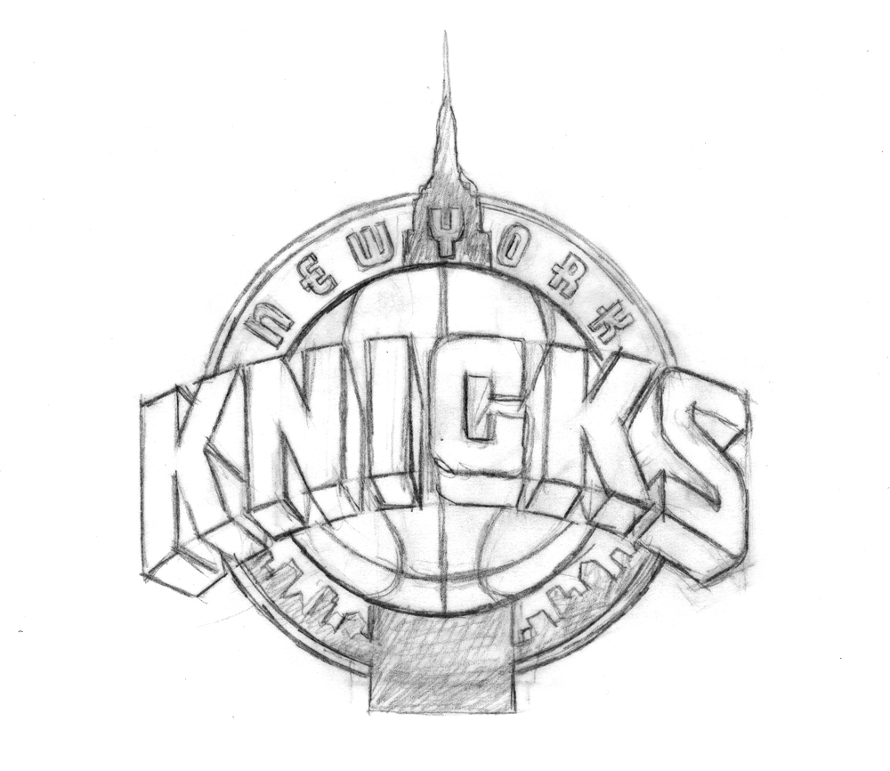
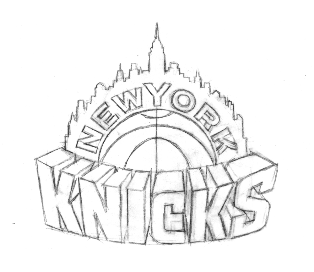
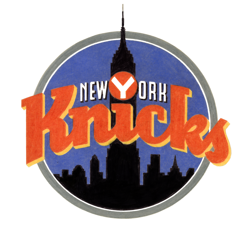
With that in mind, here's a look at the metamorphosis of the logo with which we're familiar today:


A couple of things:

1. You can see in that third-to-last sketch where Michael started experimenting with the color scheme (which is different from the final one).

2. Recall from Part 1 that one of the initial design requests was the inclusion of the Empire State Building, so some of these look just like the familiar logo, but wearing a building hat. Obviously, that element got cut from the final logo.

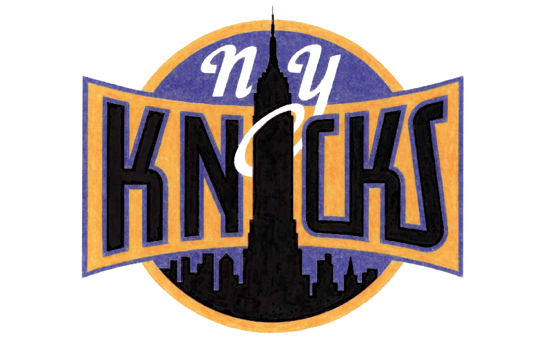
Ultimately, this was the design of Michael's that the Knicks chose heading into the 1992 season. A few years later, Michael was asked to design and integrate the "New York" line above the "Knicks". Recently the logo has undergone a minor color makeover, but it's otherwise the same as it was back in '92, not unlike my voice.

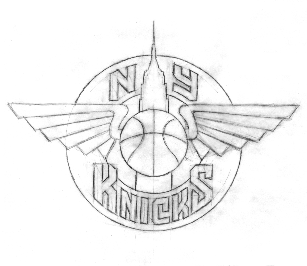
Now, that wasn't the only thing Michael was working on for the Knicks project. He also presented them with a series of monogram sketches-- more compact, initial-based logos that could be used for other purposes. Here are some of those sketches:

The league ended up setting for just the main logo and none of Michael's monogram designs. But wait-- that last one looks familiar, doesn't it? Indeed, it's the token insignia the Knicks have been using as a secondary logo in 1995. It's graced equipment and merchandise since then, and was featured on the back of the uniform until recently. Michael's design drew its inspiration from the old MTA subway tokens, and, if you look back at yesterday's post, elements of it crept into early concepts of the main logo. New York's adoption of the design has a bit of a story behind it:

"Being a New Yorker and growing up riding the subways, I always had that image of the subway token with the Y cut out of it somewhere in the back of my head. I just saw an opportunity to somehow use that iconic NY image for an iconic NY team. Using it for a secondary Knicks logo was something I wanted to push for. When we started discussing a secondary logo—"a monogram or something". I gave them quite a few different ideas, but at the time, they decided not to use any of them. I thought "okay, that's fine"-- I was being paid fairly for the logo development work that I was doing. That whole secondary logo/monogram thing was dropped, and I got paid for the work I had done on it (but not for finished art or usage). Then, several years later, after this whole project was done, an old friend of mine called and said "did you know the Knicks are using that token logo you did for them in your sketches?". I had had no idea-and more importantly, I had not been paid for any usage fees for that design. No one from the organization had informed me, so I contacted the people at the NBA. I don't think Tom O'Grady was there anymore, or maybe he wasn't in the same position—at any rate I don't remember speaking to him about this. I tried to discuss it with some people there, and they informed me that no, the token monogram was their idea—they had created it, and I had had nothing to do with it.

A couple of years had gone by before I found out about this infringement, and In the meantime some of my work had been published in a book called "Design In Progress - What Happens Behind the Scenes", which was about how design projects are developed. I had picked the Knicks logo as a case study of how I develop a logo design, and so in the book were printed many of the sketches seen in this blog. It was just one or two pages in the book, but among the material published was one of the sketches that had included the NYK token monogram. This book was published just after I had completed the Knicks project, and well before the Knicks had started using the token logo. So when they said to me "well, you didn't do it, and if you're going to insist on this and say you did, you're going to need to prove it", I just pointed them towards the book, which had a copyright date of 1992. Realizing they were caught with their pants down and wanting to avoid any kind of legal entanglements, they begrudgingly told me "well, okay we'll pay you for this", and then to punish me said "but you'll never work for the NBA again". That, of course, has been borne out by history.

I felt like I was there at the beginning helping to create a look that a lot of sports teams have picked up on, and from which a lot of other designers really benefited. After that debacle it wasn't me that was being consulted for my design expertise—but other designers who took their cues from what I had begun—and you can see that in a lot of the team logos these days. I feel like I should have been part of that. But if I had to do it all over, I would still stick to my guns and fight for what's right."

Cool. Thus concludes our journey through the history of the Knicks logo(s). Huge thanks to Michael for sharing all this with us, and to P&T's normanhathaway for helping to set it up. Once again, I encourage you to check out Michael's website and blog, and to read the ESPN interview with Tom O'Grady for more logo history.


An Interview With "Posting and Toasting"

My good friend Norman Hathaway is an avid New York Knicks fan, and follower of Seth Rosenthal's humorous Knicks blog Posting and Toasting which boasts one of the biggest communities of Knicks fans on the internet. Apparently Norman spoke or wrote to Seth about my involvement with the NBA, and specifically about how I created the current identity for the Knicks. So Seth contacted me, and we talked about how that whole thing went down. I dug up a ton of my old sketches and comps for this project and sent them to Seth who put them all together, interviewed me and is now posting the story in two parts over two days on his blog. Today, I've reproduced verbatim (below) Seth's first post, and tomorrow will do so again with the second:

Star-divide

Behind the Knicks Logo with Michael Doret: Part 1

This is the current Knicks logo. This is what the Knicks logo looked like in 1992. Little has changed, y'all. They added a little "New York" and modified the colors recently, but have done nothing else to alter a design that's been the primary logo for over twenty years. That emblem has been a constant symbol of the team, and its distinctive big, block lettering echoed throughout several other teams' redesigns in the '90s, some of which are still in place today. So, where did this logo-- which has persisted through multiple Knicks regimes-- come from? With the help of P&T citizen normanhathaway, I had the pleasure of corresponding with Michael Doret, the man who made the Knicks logo.
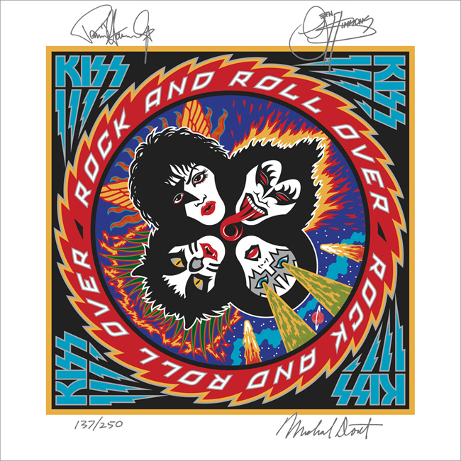
Doret is a New York-raised, Los Angeles-based designer and lettering artist with a rather extensive resume. When the NBA approached him in Spring of 1991, he'd already done some work for the league, as well as designs and design ideas for the MLB, the NFL, TIME Magazine, the band Kiss(!), and a lot more. So, the league felt pretty confident in his abilities and gave him pretty much free reign to try out different logos and letterforms:

"Before starting on this design project I didn't receive that much input from the NBA other than the directive that they wanted to have something symbolic of New York CIty incorporated into the logo. After discussion we eliminated several options (such as the Statue of Liberty), and settled on the iconic Empire State Building as the only viable alternative that might work in the new logo. So in the beginning stages that was the given which, as we all know, they ended up deciding against as the logo development progressed. I think other than keeping the original blue and orange from the old logo, there wasn't that much else given me in terms of requirements. The directions I took were mostly left up to me."

It was a fairly open-ended task and, as Michael notes, the only specific request made of him didn't even make it to the final product. So, with that dearth of instruction in mind, he set about producing a variety of design concepts. In Part 1 of our magical journey through Michael's old files, he'll show us some of the concepts that didn't make it.

Star-divide

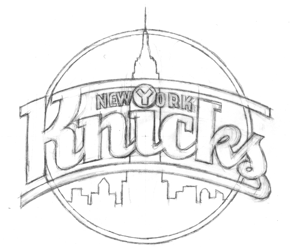
To generate ideas, Michael began with some rough sketches, examples of which are below.

With the Empire State Building icon relatively unchangeable, Michael focused his imagination on the lettering:

"At that time (and even still) my work was all very lettering-oriented. I was trying to open up new areas of letterform design that, up until that point, had tended to be a bit stodgy and traditional. I was just trying to do something different for the time. In actuality I was picking up a lot of cues from bygone eras, from when lettering was really in its heyday-like in the 1930s and '40s-only this time around with a slight twist."

Some of the sketches and elements of others eventually made it into color concepts which, before the widespread use of computer design programs, Michael rendered in colored pencil (the '90s were a dark time).

Any of these could have ended up as the Knicks' primary logo (and, incidentally, Michael loves all his logo babies, but told me the first of those color logos was his favorite), but alas, they could only pick one

In Part 2 (tomorrow, perhaps) we'll look at the process behind the logo of Michael's that the Knicks did choose, and learn about how another familiar piece of Knicks iconography also comes from Michael's desk.


Fun With Type!

Last year I became a beta-tester for Astute Graphics’ Adobe Illustrator plugin “VectorScribe”. Those who know me know that I’m not really a very tech-savvy person. I get quite comfortable just sticking with doing things the way I usually do them. Over the years I’ve become very adept at using Illustrator, and was not overly excited at the thought of having to learn some new tools. I’d heard of Illustrator plugin tools, but I’d never really thought of using them before. So, to my surprise, I almost immediately embraced the new tools in VectorScribe. They work really well, ironing out a lot of the inherent flaws in Illustrator. I’d learned to live with a lot of those flaws, but once I learned I didn’t need to live with them anymore, those “flaws” started to look more and more like gaping wounds. VectorScribe is great—now I don’t know how I ever got along without it! You can download a little Case Study we did about VectorScribe here. I would definitely encourage all serious Adobe Illustrator users to at least try the 14 day free trial version. It will change your life!

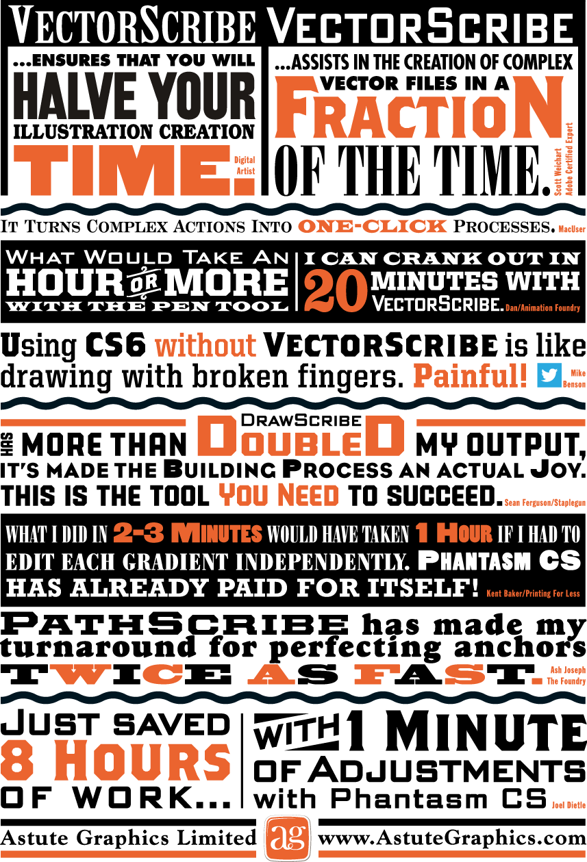
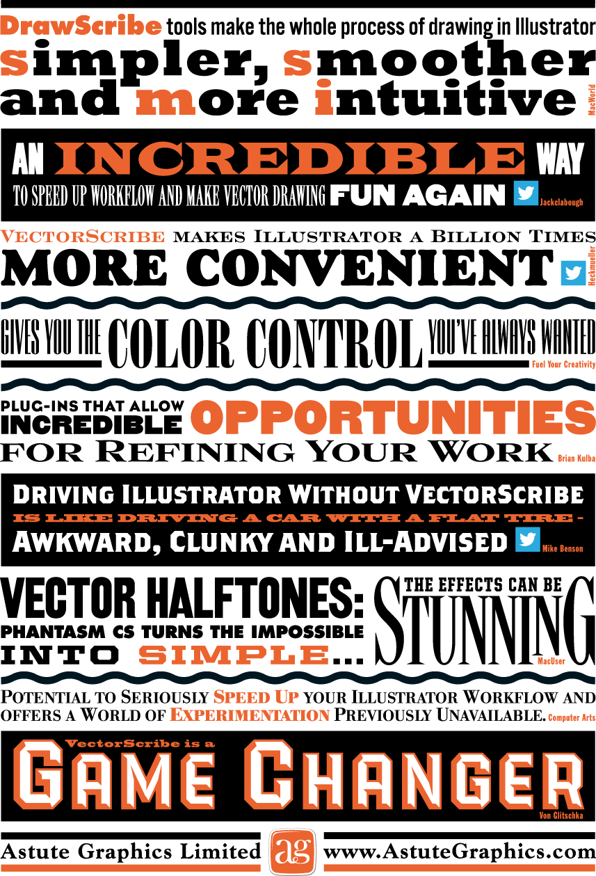
So when the good folks at Astute Graphics asked me if I’d work on a little printed promo for them I thought “Well, why not? I really believe in their products”. The front and back covers of the piece were to be covered with testimonial quotes about their plugins from other users. The challenge was to make this list of quotes visually exciting. Most of my work is lettering-centric, but with this project the challenge was to only use set type and limited color—something a little different for me. I did use two of my own fonts, PowerStation (currently on sale) and DeLuxe Gothic: see if you can find them. Anyway, I think you can see that it’s possible to create a lot of visual fun by just using the basics, and combining them in imaginative ways. This is real Alphabet Soup!

Above is how the front cover turned out...

...and the back cover below:

The Dyna-Fonts Winners at Applied Arts

The judges at this year's Applied Arts Design Competition, in their first ever Typeface Design category, selected both Dynascript and Dynatype as winners. They were selected as The Dyna-Fonts—a typeface family.

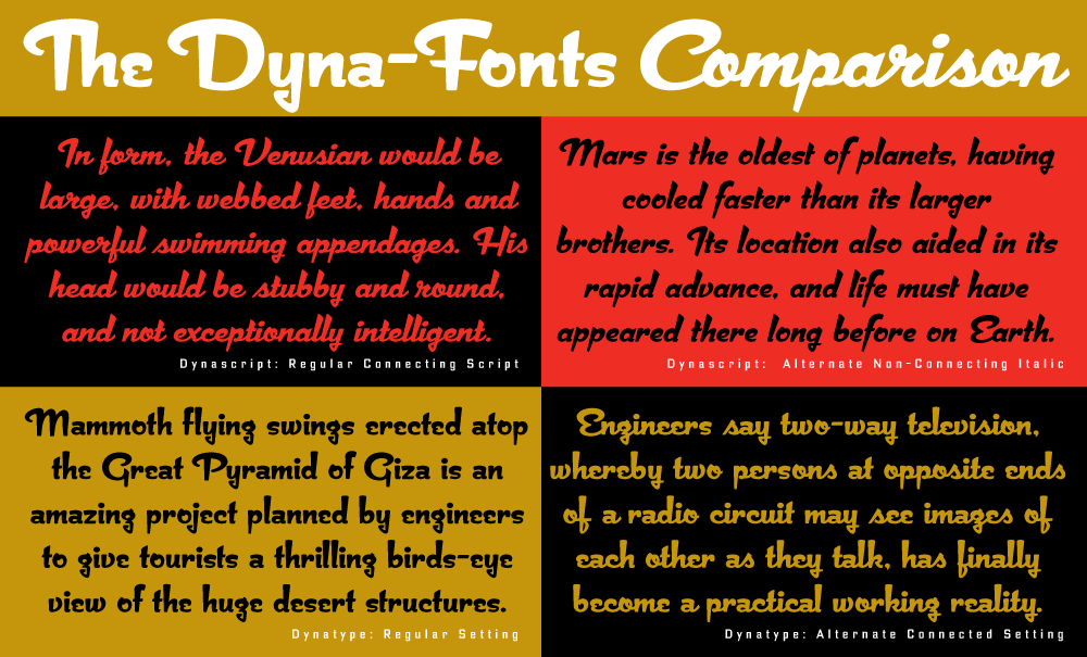
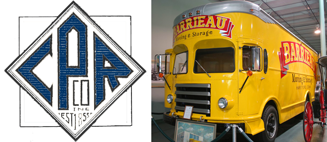
I'm very proud of these fonts, and am pleased that they've begun to get the recognition I think they deserve. They work extremely well both together and separately, and in both display and in smaller settings, as you can see from the comparison below (click to enlarge).
I've begun to make both Dynascript and Dynatype available together at a reduced price. They can be found under the name "The Dyna-Font Collection" which can be purchased at MyFonts.

The Dyna-Fonts are now following in the footsteps of some of my other recent fonts that have garnered industry acclaim—most notably Deliscript, which was lauded by the Type Directors Club in their TDC² 2010 competition and also in 2011 by CA's Typography Annual 1, (the page excerpt of which can be seen HERE), and  Steinweiss Script—also recognized in this year's Typography Annual 2, (the page excerpt of which can be seen HERE). After being named a "Rising Star" Metroscript became "MyFonts’ Brush Script Font of the Year" and was subsequently named as #5 in Smashing Magazine’s “30 Brilliant Typefaces For Corporate Design“. The magazine went on to say about Metroscript: "lettering artist Michael Doret has adapted his trademark hand-lettering style to the computer, creating one of the most sophisticated suites of script fonts on the market.”

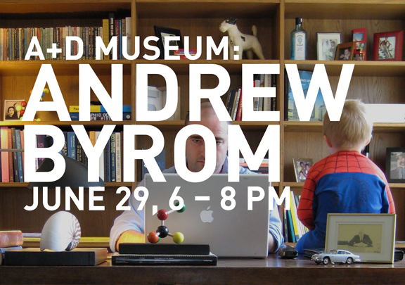
Andrew Byrom Discussion at A+D Museum/LA

I met Andrew Byrom about a year ago when he gave a short talk at Pecha Kucha Night in Los Angeles. His creatively innovative and non-traditional approach to experimental typographic design really blew me away: I had never before seen work like his which blurred the edges between graphic design, scupture, and conceptual/perfornance art. There’s really no easy way to describe his work. He just let me know he’s giving a presentation on June 29th at the Architecture and Design Museum. If you’re interested in what’s happening on the cutting edge of typographic design, don’t miss this event!

See you there.


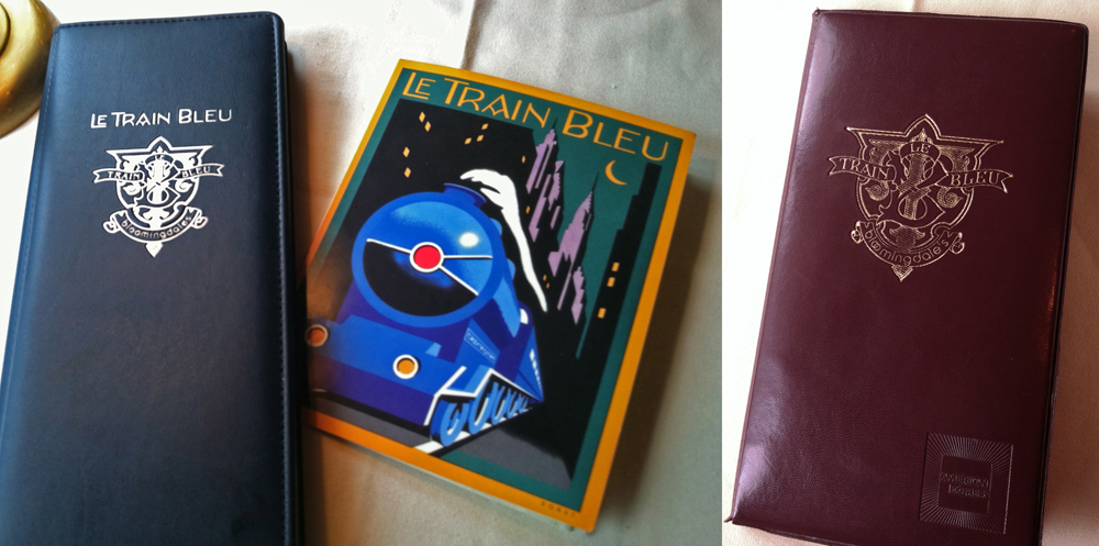
Le Train Bleu #2

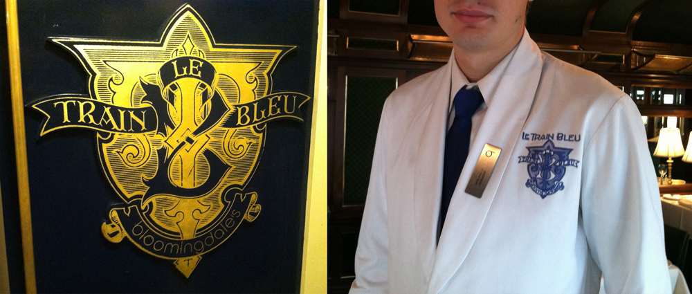
Two years ago I visited Bloomingdale's in NYC, and specifically their Le Train Bleu restaurant for which "back in the day" I had originally designed many of the original elements. In my visit to NY last month I revisited the restaurant—and this time dined there. If I was surprised the last time to see that my signage and monograms were apparently still in use, dining in the restaurant this time allowed me to see the full extent to which everything I had done was still there—just as it was the day it opened back in the '80s. I hadn't known that they were still using the menu design I had done for them, or to the extent that they were using the emblematic monogram I had done at the same time. After years and years of use I would have imagined that the menu would have been a bit dog-eared, but apparently they've been printing and reprinting it all this time.

Aside from it being rendered in gold leaf on the outside of the train car and imprinted on the wine list and check wallet, they'd gone so far as to embroider the monogram on each and every uniform in the restaurant—classy! Perhaps that says something about a designs longevity?

And here's a reminder for those who are interested: there are prints of the Le Train Bleu vertical format artwork—identical to the signage murals outside the restaurant—available on my ILLOZ site. These prints are finely produced, hand-crafted 12 color fine art lithographs that are virtually identical to the original painting.

Letterpress Print Giveaway to Purchasers of Dynatype Until March 31

Dynatype, just released on MyFonts is on sale at a 20% discount. And until the end of March, I am also pleased to offer purchasers a special limited edition print:  

This 8½” x 11″ signed and numbered edition is letterpress printed by Terrence Chouinard of Ithaca Typothetæ in Athens, Alabama. Mr. Chouinard keeps a low profile, but you can read his CV here. (Scroll down to bottom of page.)

So, for $48 you’ll get my latest font design and you’ll receive a numbered, limited edition, finely-crafted letterpress print—printed on exquisite Hahnemuhle Copperplate stock—and signed by yours truly. If you’re game, you can click HERE to start the process.

If you are among those taking advantage of this offer, you can expect to receive an email from me asking for a mailing address to send your print to. Rest assured—I will NOT share your info with anyone!

This offer applicable to United States residents only.

Please Email me with any questions.

New Font: Dynatype Just Released


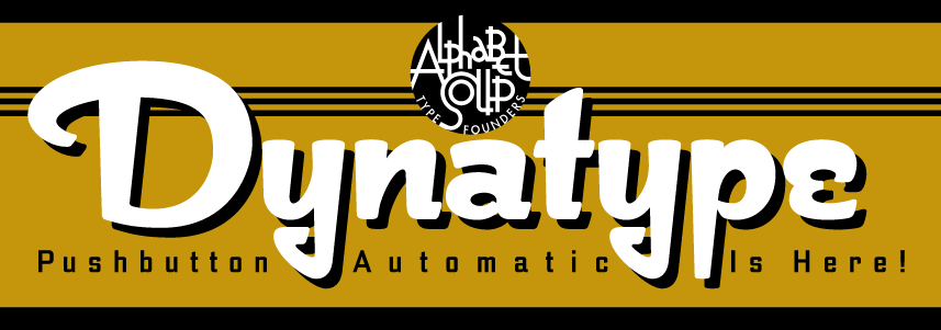
Alphabet Soup is proud to announce the release of Dynatype—the second of its “Dyna-Fonts”. WhereasDynascript was primarily a connecting script font with a non-connecting italic alternate style, Dynatype is first and foremost an upright, non-connecting font with an upright, connecting alternate component.

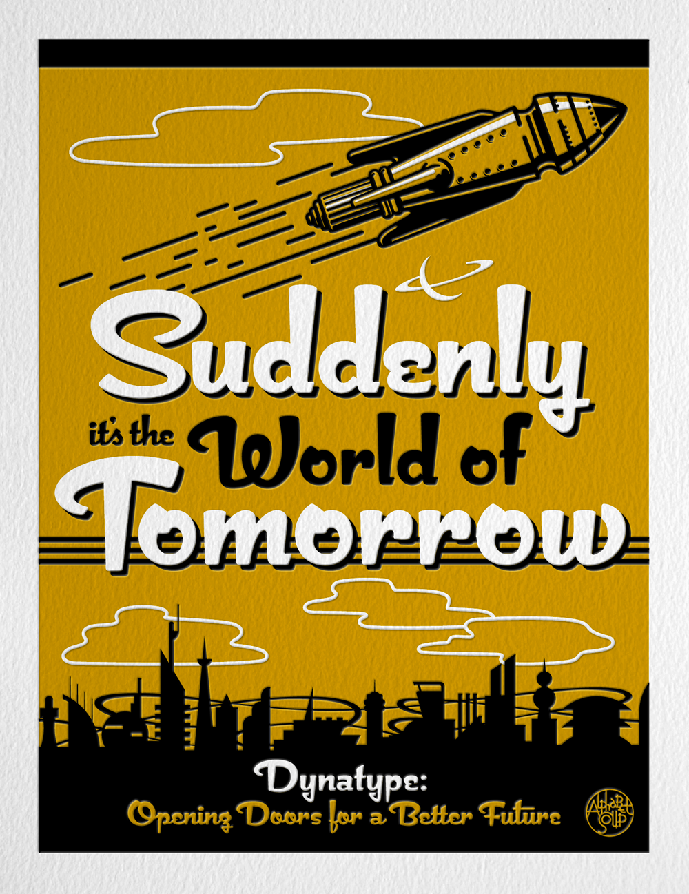
"Suddenly…it’s the World of Tomorrow!” With the push of a button Dynatype will automate your typesetting experience. Dynatype is actually 2-Fonts-In-1: without switching fonts you will be able to instantly change from Dynatype’s “regular” default style to its alternate connecting version with the simple push of a button.

To some these fonts may be reminiscent of various mid-century neon signage, and of sign writing, Speedball alphabets and even baseball scripts. The design of the Dyna-fonts also takes some cues from a historical typographic curiosity that began in Germany in the ‘20s and which lasted into the ‘60s—when Photo-Lettering gave it the name “Zip-Top”. Basically it was believed to be the wave of the future—that by weighting an alphabet heavier in its top half, one could increase legibility and reading speed. The jury’s still out on whether or not there’s any validity to this notion, but hopefully you’ll agree that in the context of this design, the heavier weighting at the top of the letters helps to create some uniquely pleasing forms, and two unusual fonts.

Typesetters across the planet will be able to set copy in their language of choice.

Dynatype’s 677 glyphs can be used to set copy in: Albanian, Basque, Catalan, Cornish, Croatian, Czech, Danish, Dutch, Esperanto, Estonian, Faroese, Finnish, French, Galician, German, Hungarian, Icelandic, Indonesian, Irish, Italian, Kalaallisut, Latvian, Lithuanian, Malay, Maltese, Manx, Norwegian Bokmål, Norwegian Nynorsk, Oromo, Polish, Portuguese, Slovak, Slovenian, Somali, Spanish, Swahili, Swedish, Turkish, and Welsh—and of course English. Sorry! Languages of the Lunar Colonies not yet supported.

Dynatype on MyFonts HERE. Download the Dynatype Manual HERE Dynatype Design and Art: Michael Doret Dynatype OpenType Programming: Patrick Griffin/Canada Type

Audio Interview w/Tony Ross at TonyTeach

TonyTeach is an online learning center where you can find video tutorials, podcasts and live training for Flash, Toon Boom Animate, Photoshop, and more—both for free, and for purchase. Recently Tony Ross caught up with me, and we had a half hour discussion about how I work, my inspirations, digital vs. analog, and about my career in general—plus I give a couple of useful tips on using Adobe Illustrator's pen tool that even this seasoned teacher was surprised by. Here's a recording of that discussion: Tony Ross Interview

Update: Terry Chouinard Got Your Help!

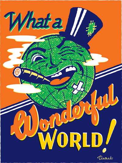
I'm very pleased to report that Mr. Chouinard achieved his Kickstarter goal. Those who've invested $35 or more can choose from among the prints by 15 different artists—myself included–to receive as one of the perks for being a contributor. See Terry's Kickstarter page for details. I'm also pleased to report that Terry will make available to me 100 beautifully printed 18" x 24" letterpress copies of my "Wonderful World" artwork, below, which I will sign and make available as soon as the ink dries. So even if you missed being a contributor to his campaign you can still obtain a copy of that print. If you'd like to reserve one, send me an email and I'll be sure to set one aside for you. Thanks!

Terry Chouinard Needs Your Help!

Terry Chouinard is a master letterpress printer. Letterpress printing is a craft that is slowly disappearing, but there are still some great practitioners out there keeping it alive. Mr. Chouinard has invented a device that will greatly enhance their ability to keep ink colors accurate and consistent throughout a print run—no matter how big or small. One of his followers wrote a really nice piece describing what he's done on her blog Quince & Quire. He's looking for small investors to be able to make his "Ink Dial" a reality—and has posted it on Kickstarter. Terry asked me to donate a piece of art so that he could offer a signed, limited edition, letterpress version of it as a reward to investors, and I gladly offered my piece "Wonderful World". For an investment of as little as $35 a beautiful hand-printed 18" x 24" letterpress version of this art could be yours.

Wonderful World


There are 14 other artists who have committed art to Terry to try to help him get his Ink Dial off the ground. Please check out this very worthy project. The more you donate the more prints you could be rewarded with by the likes of Marian Bantjes, Andrew Byrom, Paul Shaw and Jack Unruh. His deadline on Kickstarter is coming up soon—take a look and see if you don't want to support this very worthy project.