Viewing entries tagged
font

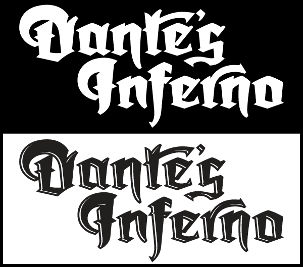
In the Works—New Blackletter/Hybrid Font

I have an aversion against taking the easy road. These days many font designers create their designs by referencing designs from the past. Make no mistake—there’s a goldmine of vintage designs out there waiting to be rediscovered. But there are a few of us font designers still left who want to create something that’s not been seen before . . . but that’s not that easy to do. Most of my fonts (with the exception of Steinweiss Script and DeLuxe Gothic) are completely new inventions.

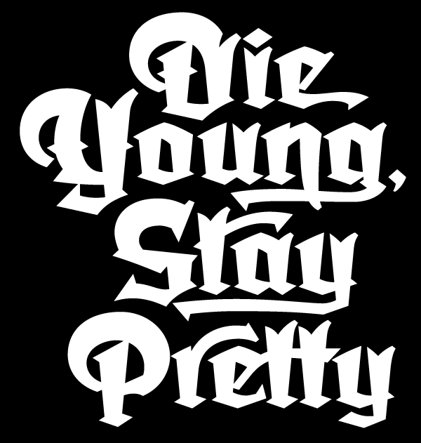
I’ve been working on the font design shown here for the better part of a year—ever since I completed the Dyna-Fonts. The beginings of this font can be traced back to a project I worked on many years ago: a logo I was asked to design for the Califonia Angels baseball team. The work I did for them never saw the light of day, but I always had a soft spot in my heart for one of the logo designs I developed. The letterform portion of my design was comprised of what I called a sort of “blackletter/hybrid”. So I took the basis of that design and expanded it into a full working typeface design. Its working title is currently “Dark Angel”, derived from the project it had originated from.

My intention is that this font be more versatile and more legible than most other blackletter fonts. It’s going to have many, many ligatures, alternates, and letters with tails, and free-floating swashes, giving designers many opportunities to create one-of-a-kind graphics and titling.

It will also come in two versions: a regular solid version and an “underlit” version with a sort of hand-tooled effect.

By the way, did you notice that there are virtually no verticals and no horizontals in this font? I would not have been able to execute this design as you see it without the incredible vector plug-ins from Astute Graphics—particularly VectorScribe. These plug-ins have definitely filled many of the gaps I found in Adobe Illustrator, making it possible for me to do many things that I wouldn't have attempted without them.

This font is currently in its final stages of programming and production, with a tentative projected release date of June or July 2013. The name “Dark Angel” isn’t yet set in stone, and I’d like to consider other suggestions for the name. If I end up using the name you've come up with for this font, you will be the first to receive a complimentary copy of it as soon as its released.

To send a name suggestion for this font, or if you’d like to be notified when the font is released, please drop me an email and I’ll put you on my list to notify.


The Dyna-Fonts Winners at Applied Arts

The judges at this year's Applied Arts Design Competition, in their first ever Typeface Design category, selected both Dynascript and Dynatype as winners. They were selected as The Dyna-Fonts—a typeface family.

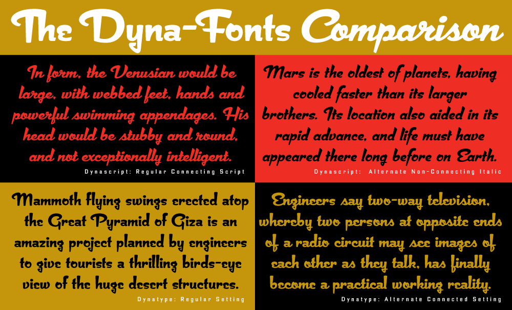
I'm very proud of these fonts, and am pleased that they've begun to get the recognition I think they deserve. They work extremely well both together and separately, and in both display and in smaller settings, as you can see from the comparison below (click to enlarge).

I've begun to make both Dynascript and Dynatype available together at a reduced price. They can be found under the name "The Dyna-Font Collection" which can be purchased at MyFonts.

The Dyna-Fonts are now following in the footsteps of some of my other recent fonts that have garnered industry acclaim—most notably Deliscript, which was lauded by the Type Directors Club in their TDC² 2010 competition and also in 2011 by CA's Typography Annual 1, (the page excerpt of which can be seen HERE), and  Steinweiss Script—also recognized in this year's Typography Annual 2, (the page excerpt of which can be seen HERE). After being named a "Rising Star" Metroscript became "MyFonts’ Brush Script Font of the Year" and was subsequently named as #5 in Smashing Magazine’s “30 Brilliant Typefaces For Corporate Design“. The magazine went on to say about Metroscript: "lettering artist Michael Doret has adapted his trademark hand-lettering style to the computer, creating one of the most sophisticated suites of script fonts on the market.”

Typography Enters the Space Age! - Dynascript's World Premiere on MyFonts

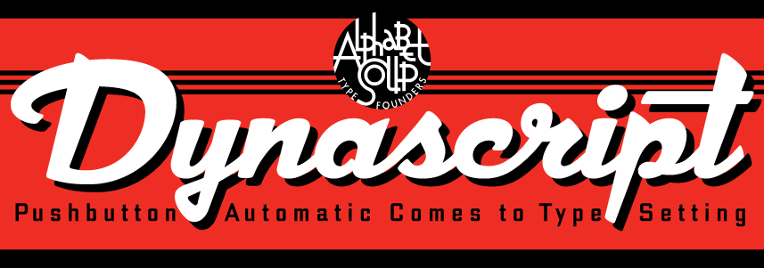
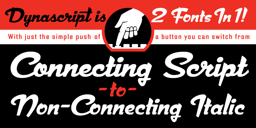
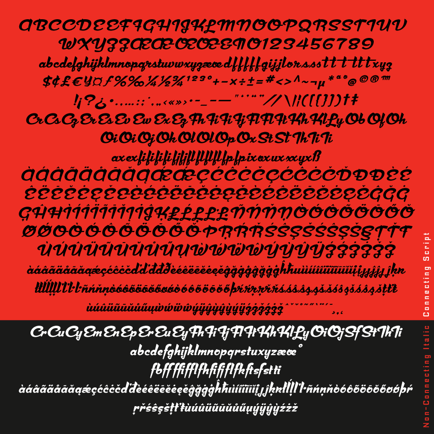
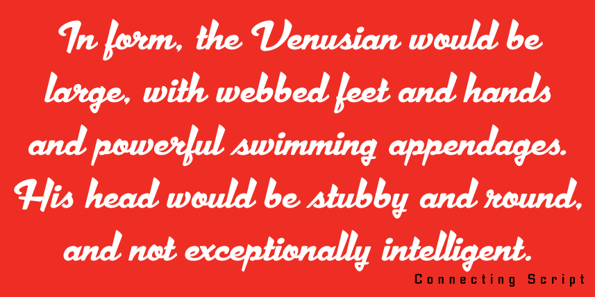
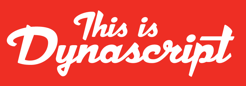
DynascriptDynascript brings the ease of “Pushbutton Automatic” to your typesetting experience. Dynascript is actually 2-Fonts-In-1: without switching fonts you can instantly change from Dynascript’s connecting font to the non-connecting italic with the simple push of a button. (Just press the “Stylistic Alternates” button in the OpenType palette.) 2 Fonts In 1! Typesetters across the planet will also be able to set copy in their language of choice. Global Language Support Dynascript’s 694 glyphs can be used to set copy in: Albanian, Basque, Catalan, Cornish, Croatian, Czech, Danish, Dutch, Esperanto, Estonian, Faroese, Finnish, French, Galician, German, Hungarian, Icelandic, Indonesian, Irish, Italian, Kalaallisut, Latvian, Lithuanian, Malay, Maltese, Manx, Norwegian Bokmål, Norwegian Nynorsk, Oromo, Polish, Portuguese, Slovak, Slovenian, Somali, Spanish, Swahili, Swedish, Turkish, and Welsh—and of course English. Sorry! Off-world languages not yet supported. Dynascript Complete Character Set What is Dynascript? It’s is a completely original, never before seen, bold script font—but to some it may be reminiscent of various mid-century neon signage, and of sign writing, Speedball alphabets and even baseball scripts. The design of Dynascript also takes some cues from a historical typographic curiosity that began in Germany in the ‘20s and which lasted into the ‘60s—when Photo-Lettering gave it the name "Zip-Top". Basically it was believed to be the wave of the future—that by weighting an alphabet heavier in its top half, one could increase legibility and reading speed. The jury’s still out on whether or not there’s any validity to this claim—but you can decide for yourself!

Dynascript makes it's debut today on MyFonts, and we'll start its special introductory sale on MyFonts tomorrow (25% Off!).

For more detailed information please download “The Dynascript Manual” pdf (800 kb).

Dynascript Design and Art: Michael Doret

Dynascript OpenType Programming: Patrick Griffin/Canada Type


I Am Pleased To Announce...

...that my latest font design is just about ready for release. It's a script font in OpenType format, but I believe it's unlike anything else on the market.Dynascript (connecting script) What makes Dynascript unique (apart from its design) is that it's actually two fonts in one. The default font (above) is a connecting script. However, with the simple press of a button in the OpenType palette you will be able to convert your copy into the alternate non-connecting version of Dynascript (below)—a very different look! Dynascript (non-connecting script) Dynascript will contain almost 700 glyphs with support for the following languages: Albanian, Basque, Catalan, Cornish, Croatian, Czech, Danish, Dutch, Esperanto, Estonian, Faroese, Finnish, French, Galician, German, Hungarian, Icelandic, Indonesian, Irish, Italian, Kalaallisut, Latvian, Lithuanian, Malay, Maltese, Manx, Norwegian Bokmål, Norwegian Nynorsk, Oromo, Polish, Portuguese, Slovak, Slovenian, Somali, Spanish, Swahili, Swedish, Turkish, and Welsh. Oh, and I almost forgot—English.

I'm currently involved in creating the supporting graphics, and I hope to have Dynascript released very soon. Also in the works—a completely redrawn upright version of Dynascript which I should have ready for release withinin the next few months.

Steinweiss on Steinweiss

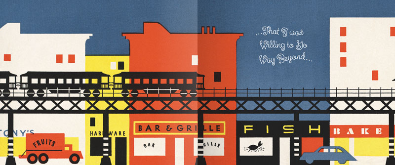
When I originally did the title lettering for "Alex Steinweiss: The Inventor of the Modern Album Cover" I hadn't yet designed "Steinweiss Script". In fact it was designing this headline that spurred me to do that typeface design. In retrospect there were many interior headlines and other lines of copy for the book that Josh Baker, AD at Taschen, would have liked to have had set in a new Steinweiss Script font. But they had to settle for what was available at that time, which was one of several different digitized versions of what Alex Steinweiss had originally designed for Photo-Lettering. Now Taschen has released their more moderately priced trade edition of this incredible book—and just in time for this release I was able to reset all their headlines and other copy the way we had originally wanted to—in Steinweiss Script:

Above: Before and After Details from the older and newer editions

Below: You can Look Inside the earlier edition...

...or Look Inside the newer version:

Our intention was that the newer version, with everything reset in Steinweiss Script, would feel closer to what Mr. Steinweiss would have done had he been able to apply his scrawl to these pages.

Just a reminder: Steinweiss Script is available for purchase on MyFonts, Veer, FontShop and YouWorkForThem. To learn more about these fonts, read Steven Heller's Imprint article or MyFonts' Creative Characters for January.

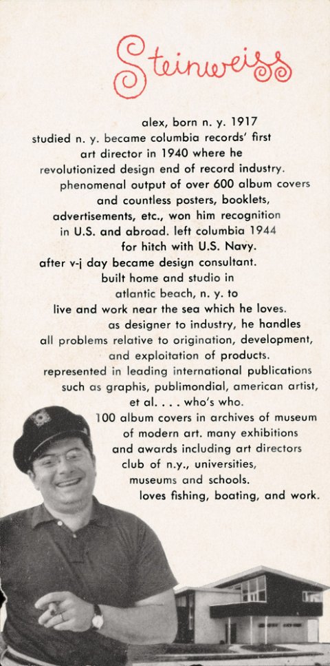
Alex Steinweiss, 1917 – 2011

Just having returned from vacation, I discovered that while I was incommunicado Alex Steinweiss—one of my heroes and the inspiration for my Steinweiss font—had passed away. So I'd just like to add my voice (belatedly) to the chorus who have recognized him as one of the giants of 20th century design, who has influenced countless people in the design and illustration fields, and brought delight to millions of others through his beautiful work. The world is indeed a lesser place without him. R.I.P. Mr. Steinweiss.

Fonts In Use: GQ Picks Steinweiss Script for their Comedy Issue

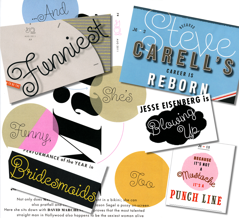
I just got a call from my pal Glenn Parsons of Astrolux Design who informed me that my last font release Steinweiss Script was all over the new issue of GQ Magazine. Kudos to their Creative Director Jim Moore for making such a smart choice!* Here's a collage of a few of the pieces taken from different pages in the current issue. I think these demonstrate nicely some of the versatility of this font, such as the ability to set words on curved paths—and still have all letters connect properly. You can find links to all the outlets where Steinweiss Script is sold (as well as all my other fonts) on the Alphabet Soup pages of my website. I'm also proud to announce that Steinweiss Script is now being sold from the YouWorkForThem website, my newest font reseller.

*Update – June 7,2012: I stand corrected. The choice to use Steinweiss Script was made by GQ Design Director Fred Woodward. My apologies for not checking on that first. M.


Collage of Steinweiss Script Samples in GQ

It Began in NoHo: Thank You Art Institute!

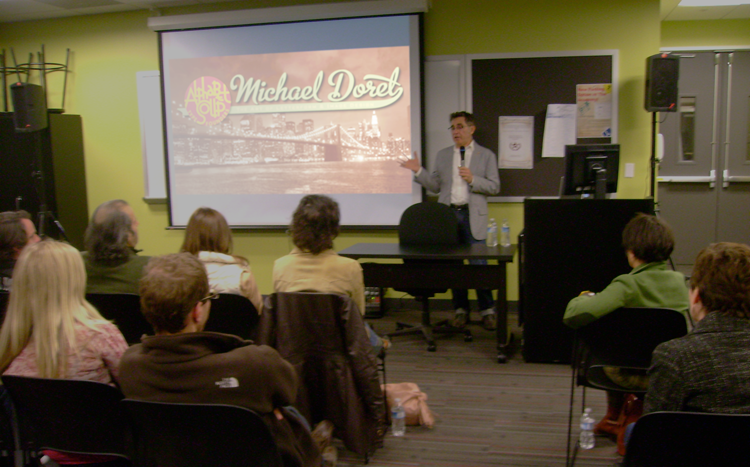
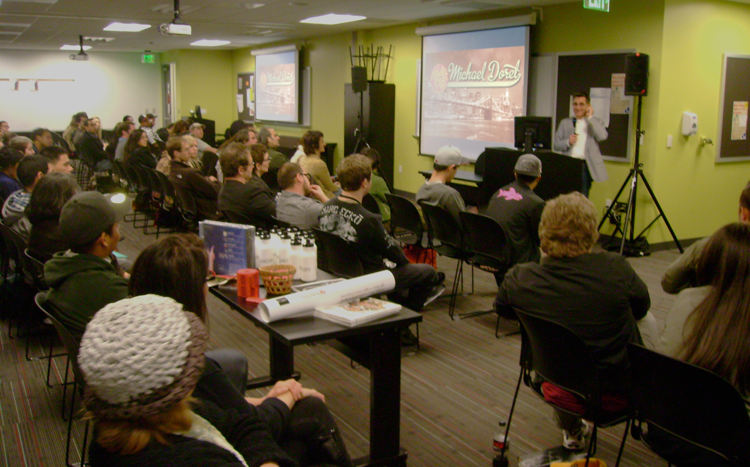
Last Friday I gave a talk to a capacity crowd at Art Institute of California – Hollywood. A big "THANK YOU" goes out to John Judy, the Academic Director of Graphic Design and Foundation Studies who planned the evening, and set it all up. I tailored my hour-long talk "It Began In Brooklyn" to what I expected would be a mostly student crowd, but many professionals showed up as well. The school opened up their space to a triple–wide room with three screens and three projectors—an unexpected layout which actually worked quite well. Afterwards we had a Q&A where I tried to answer some great questions from students and professionals. We then raffled off a Wacom tablet, a 1 year subscription to Lynda.com, several signed event posters and a CD of the complete Alphabet Soup Font Collection. I must say that it was really gratifying to see the high interest level displayed by many of the students. All in all it was a great evening. I hope everyone enjoyed it as much as I did! Below, a few photos taken by John Judy after the talk.

"It Began in Brooklyn"................................. A Talk at The Art Institute of California

I've been invited by The Art Institute of California–Hollywood to give a talk – it's coming up on March 4th. Here, culled from the copy of the invite, a description of what I'll be discussing:

"Michael will delve into his past and share with the audience the primal sources for the sensibilities that drive his art, and how he came to do what he does. With graphic examples Michael will discuss how he discovered that his environment and surroundings while growing up made deep and lasting impressions in his young mind that are still blatantly reflected in the samples of work he’ll be showing from various stages in his career." Basically, it's a talk about inspiration, and how we're all surrounded things that may inspire us, even if we're not completely aware of them.

This is an open invite to all who are interested. The Art Institute is located at 5250 Lankershim Boulevard in North Hollywood.

After the talk I'll give away one CD copy of "The Alphabet Soup Font Collection" ($595 value) to one lucky attendee. There'll also be a WACOM tablet and a one year subscription to Lynda.com ($250 value) given away as well. Bring your calling cards for the raffle!

If you're thinking you'd like to attend, you can find more info and an RSVP link on my website, or on my Facebook Events page.

Is Steinweiss Your Type? Pre-Valentine's Sale!

R U My Type? Mark your iCals! The Steinweiss Script 20% off sale will begin on Tuesday, February 8th.

Steinweiss is the perfect type for helping to pull you out of your shell, and getting you to express your most heartfelt sentiments.

Available in Bold, Medium and Light, or all together as a loving Family.

Just go to MyFonts on (or after) February 8th to hook up.

If you'd like to cozy up and get more familiar with Steinweiss before jumping into a serious relationship, read Steven Heller's recent Imprint article. Steinweiss Script also features prominently in the lovingly composed interview I just did for Creative Characters.

Just Revealed: 3 Colors Typesetting With PowerStation Fonts

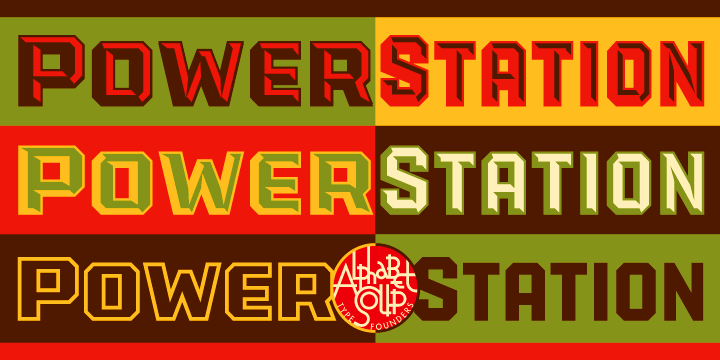
PowerStation in 3 Colors It's always nice when someone reveals something new to you about your own work. That's what has recently happened in the preparation of the Creative Characters newsletter that MyFonts has just published on my work. While helping to prepare font samples for the sidebar, Anthony Noel was experimenting with my PowerStation fonts, and stumbled across a capability that I had not intended.

PowerStation Sample

In setting the copy he inadvertantly combined both PowerStation Block and PowerStation Wedge. When I designed this font for 2-color layered typesetting, I had not even considered combining these two fonts on layers, one over the other. But that's exactly what Mr. Noel did, with what for me were unexpectedly interesting results. I would have never thought it would work, and so never tried it.

So what's come out of this is that we've discovered that PowerStation can now be typeset in three colors. Two color typesetting was always achievable with either the PowerStation Block fonts or the PowerStation Wedge fonts. The difference is that one would need BOTH of those packages in order to set type in three colors. I've created a PowerStation User Manual Supplement (1.1 MB download) which outlines the steps that need to be taken to effectively create three color typesetting. PowerStation my be purchased from MyFonts, Veer, FontShop, FontBros or YouWorkForThem.

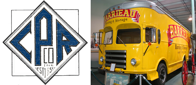
Canter's Truck Design Co-Stars with Bonnie Bloomgarden On Channel 4

http://www.youtube.com/watch?v=sirQx_KSnkI

Watch for it – it's about halfway through, and then again at the end. Ain't she a cutie...I mean the truck.

Bonnie is the great-granddaughter of Ben Canter, founder of Canter's Deli. Bonnie, along with her sister Dena, conceived the truck idea, found me, and worked together with me to come up with a great design.

To see and read more about Deliscript and the Canter's Truck design, click HERE.

Steinweiss Script - Just Released!

We're very proud to be able to finally announce the release on MyFonts of The Steinweiss Script Family. We've described these fonts briefly in the last two postings (scroll down) but, to reiterate, this family is made up of three weights—a Light, a Mediuim and a Bold. Within each of the three weights, through advanced OpenType features, a user has the ability to access three distinct variations: Simple, Fancy, and Titling. Rather than trying to describe them again, I've provided an image that demonstrates what they are:

I began designing this font with just the larger caps and taller ascenders/descenders, but in the end felt that giving user's these options would add usefulness to the font. These variations make Steinweiss Script accessible not just for headlines, but for applications where vertical space might be an issue,  and also for longer passages of text.

To help users understand how to be able to access these features (and also to show off the font) I created "The Steinweiss Script User's Guide" in PDF form (1.2 MB download). I've also created an "Incomplete" character showing to give somewhat of an idea of what's in the font:

Steinweiss Script is available on MyFonts and FontShop either as a family of all three weights, or each of the weights can be licensed individually.

As always, we'd love to hear your comments about this font!

Steinweiss Script - Design and Art: Michael Doret - after Alex Steinweiss Steinweiss Script - OpenType Programming: Patrick Griffin/Canada Type

Steinweiss Script Update: Release Date Set

Head's up everybody! I've just set the release date for the Steinweiss Script Family for Tuesday, November 9th. It will be available only on MyFonts—at least initially. And I'll be running an introductory sale at a 20% discount. For a good preview of what's in the font and how it's OpenType features work you can download "The Steinweiss Script User's Guide" (about 1.2 MB).

"Steinweiss Script"...Soon to be Released

Back in the summer of 2009 I was contacted by Josh Baker at Taschen Publishing about doing some work on the huge commemorative edition they were putting together on the work of Alex Steinweiss. For those of you who are not familiar with that name, Mr. Steinweiss is considered to be the inventor of the album cover as we have come to know it—as a kind of mini-poster with graphics relating to the musical content of the album. He produced hundreds of covers for 78 RPM albums between the late 1930s and the late 1940s. Of course I was thrilled to have anything to do with this project. My assignment was to do some lettering for the cover and title page that was in the spirit of Mr. Steinweiss' very graphic calligraphy, which had become known as "The Steinweiss Scrawl". This "scrawl" had become ubiquitous and inextricably associated with his work. Here's an example of one of his album covers:

Steinweiss' calligraphic work was very spontaneous and kinetic, while the work of lettering artists tends to be more carefully studied and worked out. So it was a bit of a challenge to try to capture that spontaneity in my piece of digital art for Taschen's cover—as seen below:

While I was working on this, Josh and I had discussed the possibility of doing similar lettering for all the different chapter headings and headlines throughout the book (about 16 of them), but decided that it wasn't practical for budgetary reasons. The subject of creating a "scrawl" font was also discussed, but was nixed for the same reason—in addition there wouldn't have been enough time to do it: creating a font from scratch can be a very time-consuming process.

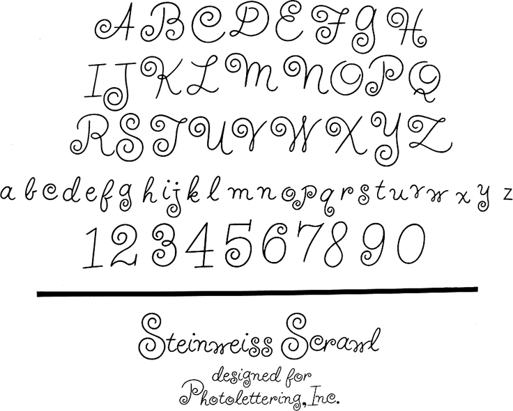
Around 1951 Alex Steinweiss had actually created a font called "Steinweiss Scrawl" for Photo-Lettering. (Coincidentally my first job after graduating Cooper Union was as Ed Benguiat's assistant at Photo-Lettering!). But this font was extremely limited in it's capabilities, and although it had a certain bouncy charm and naïveté, in my opinion, it didn't really capture the fluidity of Steinweiss' calligraphy:At any rate, shortly after completing the Steinweiss project for Taschen, I decided to pursue on my own the design of a font in the spirit of his calligraphy. The challenge was enormous—to create a typeface that retained the sense of hand-letting and fluidity within the context of a digital font. Where Steinweiss' scrawls were all slightly different from each other, shifting and changing according to the needs of a particular cover design, a font designer has to commit to specific forms that need to be set in stone, so to speak. In this particular font, the "managed" nature of the design had to appear to be "unmanaged"!

Part of my solution was to create the typeface with a ton of alternates, lowercase ligatures, and caps/lowerase ligatures. Creating this as an OpenType font would be the only way to wrangle these thousands of pieces together into a coherent typeface design. Luckily I was able to count on the expert programming help of Patrick Griffin of Canada Type. Also, I was fortunate enough to be able to contact the Steinweiss family through Taschen, and get the official Steinweiss approval for this font design.

At this point until the fonts are released (very soon!), for those interested in seeing more, you may download "The Steinweiss Script User's Guide" that I've just completed (about 1.2 MB).

In a nutshell, here's how the fonts are organized: "Steinweiss Script" is a family of fonts in three weights: "Steinweiss Script Light", "Steinweiss Script Medium", and "Steinweiss Script Bold". Additionally, within each weight there are three variations: Simple, Fancy, and Titling. These relate to the size/ratio of the caps to the lowercase, the complexity of those caps, and the size of the ascenders/descenders on the lowercase characters. The reason for all this is to add usefulness to the font, making it accessible not just for headlines, but for longer passages of text as well.

I am going to try to release these fonts within the next week or so. Please stay tuned for more information! I will announce here as soon as they go live.

Introducing DeLuxe Gothic — 50% Off Special!

Due to a threatened lawsuit by the folks at FontHaus (who somehow believe they are the only ones entitled to use the name "Bank Gothic") I have changed the name of my font "Bank Gothic AS" to "DeLuxe Gothic". I have great respect for the original designer of Bank Gothic, Mr. Morris Fuller Benton, and chose the name DeLuxe Gothic because it was the name that The Intertype Corporation used for their version of this classic font during the early years of the 20th Century.

My particular take on this design was that I always felt it could use a set of lowercase letters, and that is what sets my font apart from the rest. You can get a better look at it if you download the DeLuxe Gothic Brochure. Coincidental to the release of my renamed font, I've decided to run a Special Promotion on MyFonts: 50% off this font for one time only, and for a limited time—hurry and get yours before they sell out!

Fonts In Use: Veer Picks PowerStation

Today I was surprised to see that Veer, one of my font resellers, had selected one of my fonts—PowerStation—to use throughout it's current online and print promotion "The Super‑Incredible Activity Book for Creatives".

They actually used PowerStation as the basis for major graphics on over 15 pages throughout the 100 page book.

Veer selected both PowerStation Solid and PowerStation Solid Wide to feature in this promo.

I was pleased to see that they used this font in a variety of different layouts, demonstrating its flexibility—despite the fact that PowerStation's layered typesetting features or faceted letterforms weren't used.

Thank you Veer . . . and thank you Joe Newton!

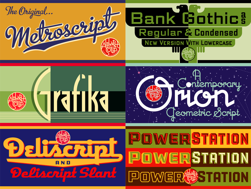
The Alphabet Soup Collection: on Sale at Veer

Just up on Veer, this all-inclusive collection of my fonts is on sale at 30% off the total of what they would cost if purchased individually. Veer's special promotion will be ongoing until the middle of May.