Viewing entries in
Gigs

An Interview With "Posting and Toasting"

My good friend Norman Hathaway is an avid New York Knicks fan, and follower of Seth Rosenthal's humorous Knicks blog Posting and Toasting which boasts one of the biggest communities of Knicks fans on the internet. Apparently Norman spoke or wrote to Seth about my involvement with the NBA, and specifically about how I created the current identity for the Knicks. So Seth contacted me, and we talked about how that whole thing went down. I dug up a ton of my old sketches and comps for this project and sent them to Seth who put them all together, interviewed me and is now posting the story in two parts over two days on his blog. Today, I've reproduced verbatim (below) Seth's first post, and tomorrow will do so again with the second:

Star-divide

Behind the Knicks Logo with Michael Doret: Part 1

This is the current Knicks logo. This is what the Knicks logo looked like in 1992. Little has changed, y'all. They added a little "New York" and modified the colors recently, but have done nothing else to alter a design that's been the primary logo for over twenty years. That emblem has been a constant symbol of the team, and its distinctive big, block lettering echoed throughout several other teams' redesigns in the '90s, some of which are still in place today. So, where did this logo-- which has persisted through multiple Knicks regimes-- come from? With the help of P&T citizen normanhathaway, I had the pleasure of corresponding with Michael Doret, the man who made the Knicks logo.

Doret is a New York-raised, Los Angeles-based designer and lettering artist with a rather extensive resume. When the NBA approached him in Spring of 1991, he'd already done some work for the league, as well as designs and design ideas for the MLB, the NFL, TIME Magazine, the band Kiss(!), and a lot more. So, the league felt pretty confident in his abilities and gave him pretty much free reign to try out different logos and letterforms:

"Before starting on this design project I didn't receive that much input from the NBA other than the directive that they wanted to have something symbolic of New York CIty incorporated into the logo. After discussion we eliminated several options (such as the Statue of Liberty), and settled on the iconic Empire State Building as the only viable alternative that might work in the new logo. So in the beginning stages that was the given which, as we all know, they ended up deciding against as the logo development progressed. I think other than keeping the original blue and orange from the old logo, there wasn't that much else given me in terms of requirements. The directions I took were mostly left up to me."

It was a fairly open-ended task and, as Michael notes, the only specific request made of him didn't even make it to the final product. So, with that dearth of instruction in mind, he set about producing a variety of design concepts. In Part 1 of our magical journey through Michael's old files, he'll show us some of the concepts that didn't make it.

Star-divide

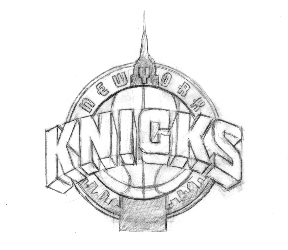
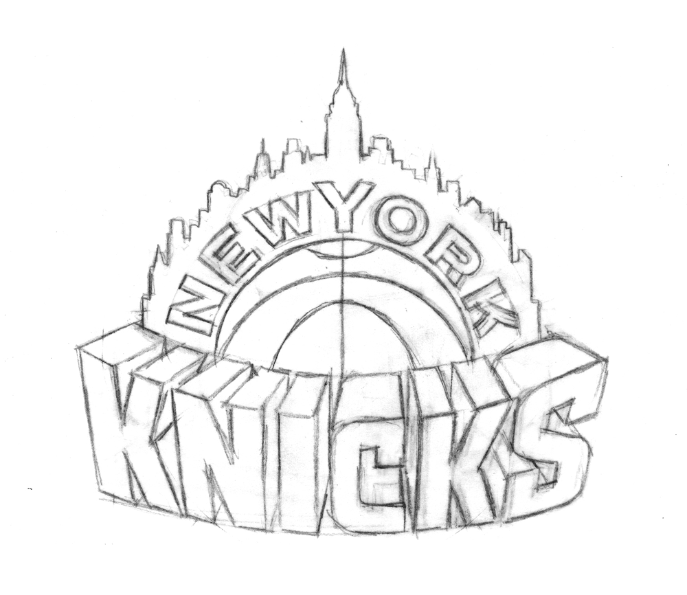
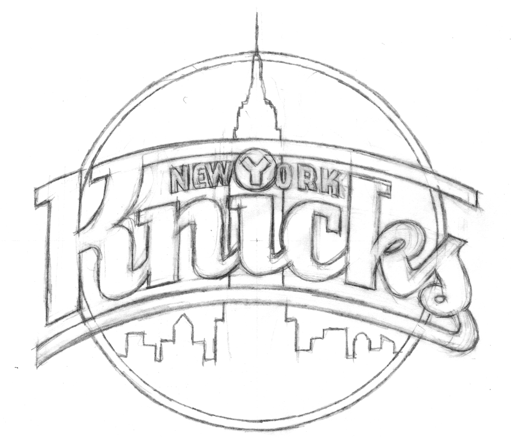
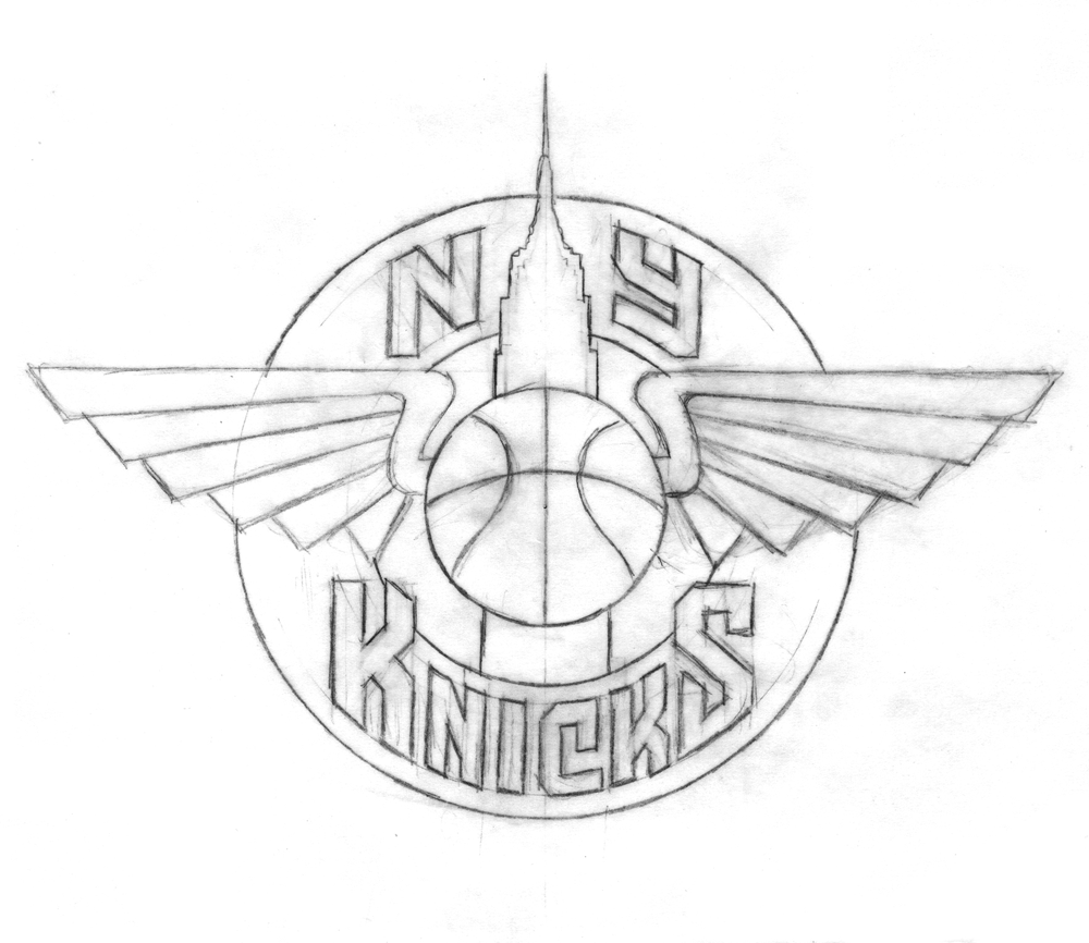
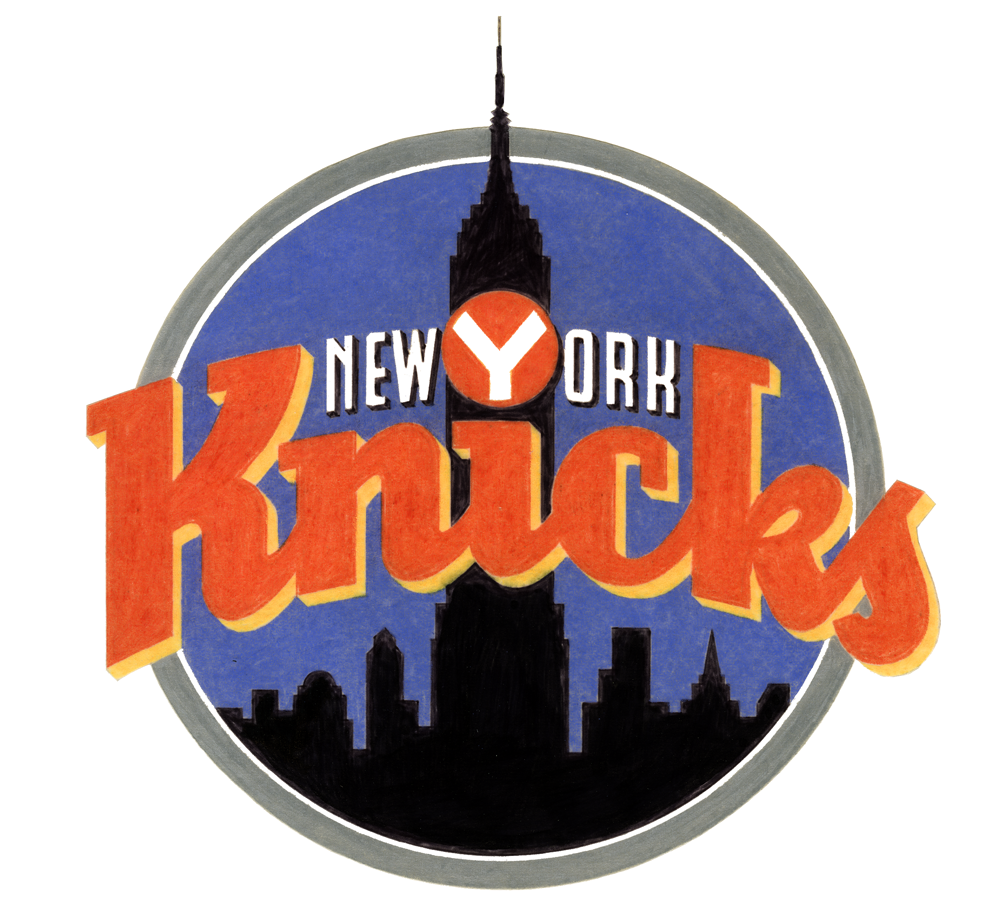
To generate ideas, Michael began with some rough sketches, examples of which are below.

With the Empire State Building icon relatively unchangeable, Michael focused his imagination on the lettering:

"At that time (and even still) my work was all very lettering-oriented. I was trying to open up new areas of letterform design that, up until that point, had tended to be a bit stodgy and traditional. I was just trying to do something different for the time. In actuality I was picking up a lot of cues from bygone eras, from when lettering was really in its heyday-like in the 1930s and '40s-only this time around with a slight twist."

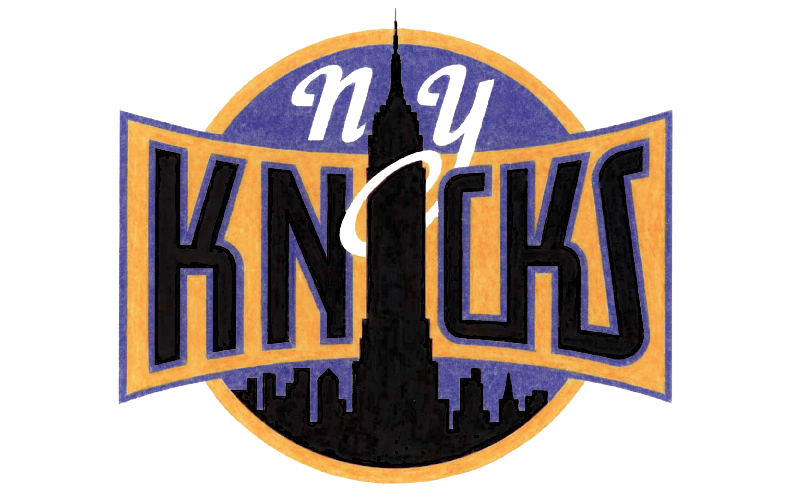
Some of the sketches and elements of others eventually made it into color concepts which, before the widespread use of computer design programs, Michael rendered in colored pencil (the '90s were a dark time).

Any of these could have ended up as the Knicks' primary logo (and, incidentally, Michael loves all his logo babies, but told me the first of those color logos was his favorite), but alas, they could only pick one

In Part 2 (tomorrow, perhaps) we'll look at the process behind the logo of Michael's that the Knicks did choose, and learn about how another familiar piece of Knicks iconography also comes from Michael's desk.


Fun With Type!

Last year I became a beta-tester for Astute Graphics’ Adobe Illustrator plugin “VectorScribe”. Those who know me know that I’m not really a very tech-savvy person. I get quite comfortable just sticking with doing things the way I usually do them. Over the years I’ve become very adept at using Illustrator, and was not overly excited at the thought of having to learn some new tools. I’d heard of Illustrator plugin tools, but I’d never really thought of using them before. So, to my surprise, I almost immediately embraced the new tools in VectorScribe. They work really well, ironing out a lot of the inherent flaws in Illustrator. I’d learned to live with a lot of those flaws, but once I learned I didn’t need to live with them anymore, those “flaws” started to look more and more like gaping wounds. VectorScribe is great—now I don’t know how I ever got along without it! You can download a little Case Study we did about VectorScribe here. I would definitely encourage all serious Adobe Illustrator users to at least try the 14 day free trial version. It will change your life!

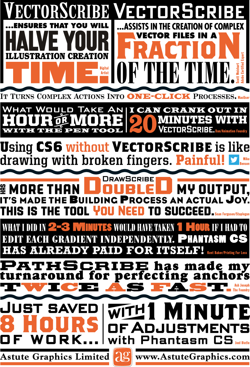
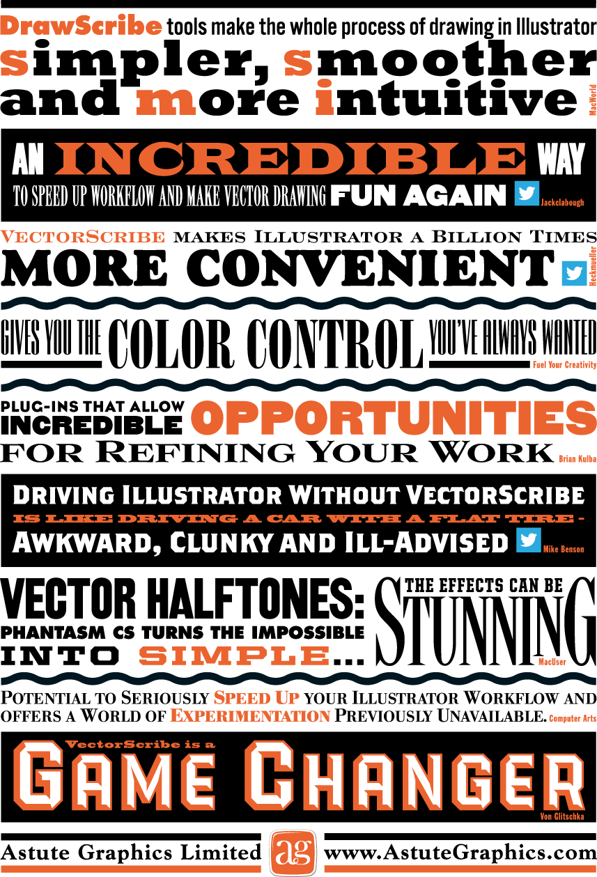
So when the good folks at Astute Graphics asked me if I’d work on a little printed promo for them I thought “Well, why not? I really believe in their products”. The front and back covers of the piece were to be covered with testimonial quotes about their plugins from other users. The challenge was to make this list of quotes visually exciting. Most of my work is lettering-centric, but with this project the challenge was to only use set type and limited color—something a little different for me. I did use two of my own fonts, PowerStation (currently on sale) and DeLuxe Gothic: see if you can find them. Anyway, I think you can see that it’s possible to create a lot of visual fun by just using the basics, and combining them in imaginative ways. This is real Alphabet Soup!

Above is how the front cover turned out...

...and the back cover below:

Le Train Bleu #2

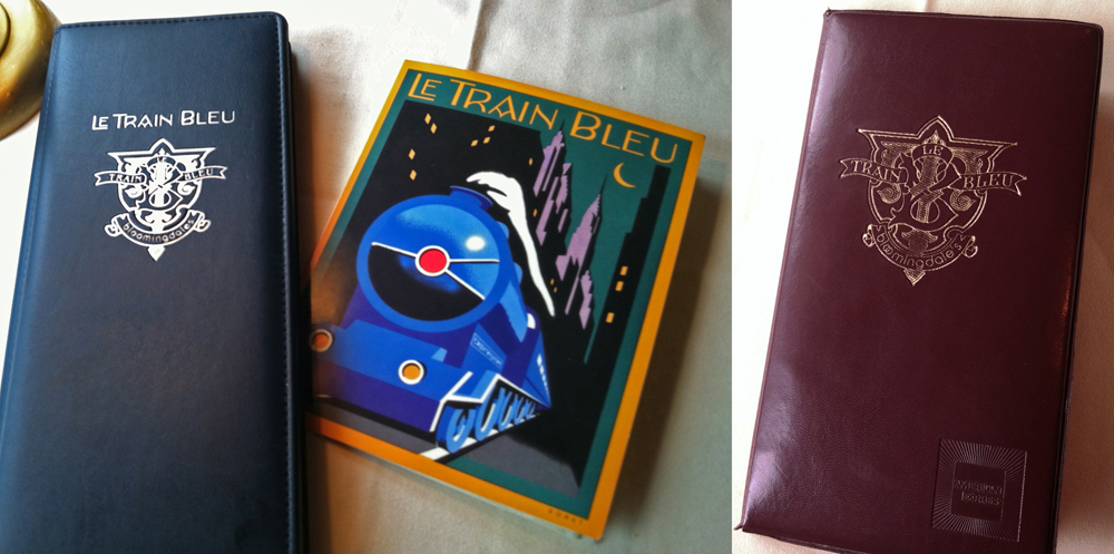
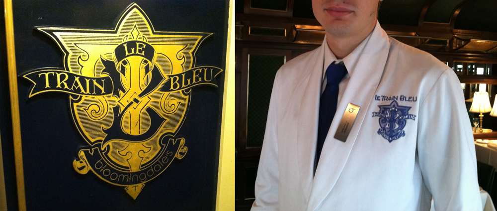
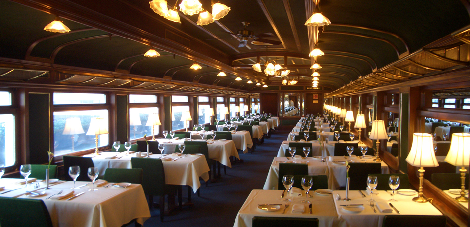
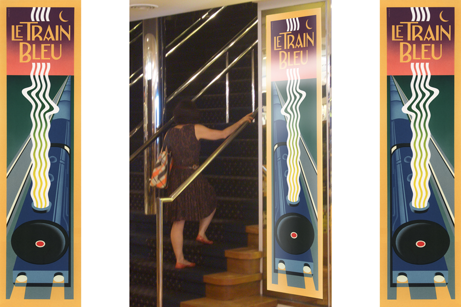
Two years ago I visited Bloomingdale's in NYC, and specifically their Le Train Bleu restaurant for which "back in the day" I had originally designed many of the original elements. In my visit to NY last month I revisited the restaurant—and this time dined there. If I was surprised the last time to see that my signage and monograms were apparently still in use, dining in the restaurant this time allowed me to see the full extent to which everything I had done was still there—just as it was the day it opened back in the '80s. I hadn't known that they were still using the menu design I had done for them, or to the extent that they were using the emblematic monogram I had done at the same time. After years and years of use I would have imagined that the menu would have been a bit dog-eared, but apparently they've been printing and reprinting it all this time.

Aside from it being rendered in gold leaf on the outside of the train car and imprinted on the wine list and check wallet, they'd gone so far as to embroider the monogram on each and every uniform in the restaurant—classy! Perhaps that says something about a designs longevity?

And here's a reminder for those who are interested: there are prints of the Le Train Bleu vertical format artwork—identical to the signage murals outside the restaurant—available on my ILLOZ site. These prints are finely produced, hand-crafted 12 color fine art lithographs that are virtually identical to the original painting.

It Began in NoHo: Thank You Art Institute!

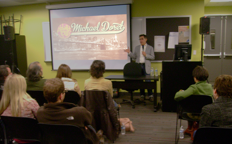
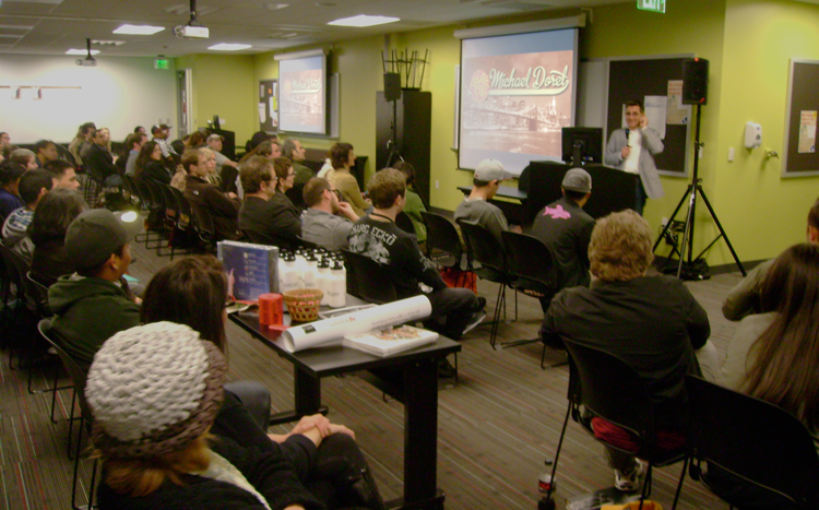
Last Friday I gave a talk to a capacity crowd at Art Institute of California – Hollywood. A big "THANK YOU" goes out to John Judy, the Academic Director of Graphic Design and Foundation Studies who planned the evening, and set it all up. I tailored my hour-long talk "It Began In Brooklyn" to what I expected would be a mostly student crowd, but many professionals showed up as well. The school opened up their space to a triple–wide room with three screens and three projectors—an unexpected layout which actually worked quite well. Afterwards we had a Q&A where I tried to answer some great questions from students and professionals. We then raffled off a Wacom tablet, a 1 year subscription to Lynda.com, several signed event posters and a CD of the complete Alphabet Soup Font Collection. I must say that it was really gratifying to see the high interest level displayed by many of the students. All in all it was a great evening. I hope everyone enjoyed it as much as I did! Below, a few photos taken by John Judy after the talk.
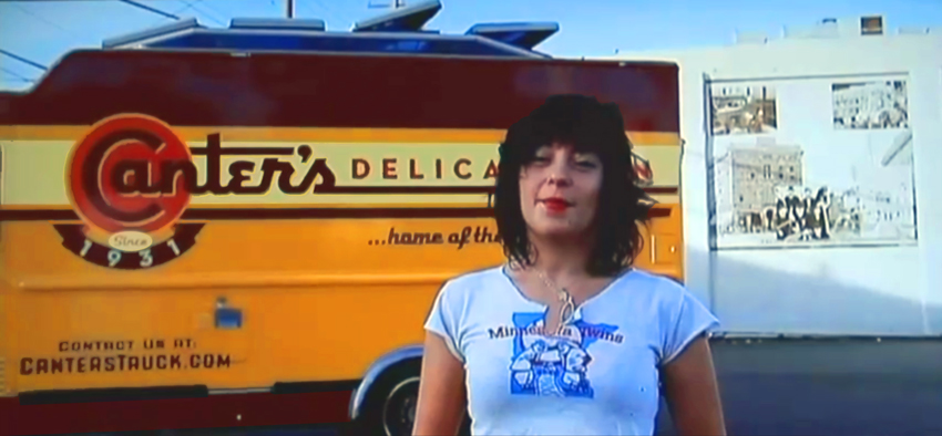
Canter's Truck Design Co-Stars with Bonnie Bloomgarden On Channel 4

http://www.youtube.com/watch?v=sirQx_KSnkI

Watch for it – it's about halfway through, and then again at the end. Ain't she a cutie...I mean the truck.
Bonnie is the great-granddaughter of Ben Canter, founder of Canter's Deli. Bonnie, along with her sister Dena, conceived the truck idea, found me, and worked together with me to come up with a great design.

To see and read more about Deliscript and the Canter's Truck design, click HERE.

Steinweiss Script - Just Released!

We're very proud to be able to finally announce the release on MyFonts of The Steinweiss Script Family. We've described these fonts briefly in the last two postings (scroll down) but, to reiterate, this family is made up of three weights—a Light, a Mediuim and a Bold. Within each of the three weights, through advanced OpenType features, a user has the ability to access three distinct variations: Simple, Fancy, and Titling. Rather than trying to describe them again, I've provided an image that demonstrates what they are:

I began designing this font with just the larger caps and taller ascenders/descenders, but in the end felt that giving user's these options would add usefulness to the font. These variations make Steinweiss Script accessible not just for headlines, but for applications where vertical space might be an issue,  and also for longer passages of text.

To help users understand how to be able to access these features (and also to show off the font) I created "The Steinweiss Script User's Guide" in PDF form (1.2 MB download). I've also created an "Incomplete" character showing to give somewhat of an idea of what's in the font:

Steinweiss Script is available on MyFonts and FontShop either as a family of all three weights, or each of the weights can be licensed individually.

As always, we'd love to hear your comments about this font!

Steinweiss Script - Design and Art: Michael Doret - after Alex Steinweiss Steinweiss Script - OpenType Programming: Patrick Griffin/Canada Type

Steinweiss Script Update: Release Date Set

Head's up everybody! I've just set the release date for the Steinweiss Script Family for Tuesday, November 9th. It will be available only on MyFonts—at least initially. And I'll be running an introductory sale at a 20% discount. For a good preview of what's in the font and how it's OpenType features work you can download "The Steinweiss Script User's Guide" (about 1.2 MB).

"Steinweiss Script"...Soon to be Released

Back in the summer of 2009 I was contacted by Josh Baker at Taschen Publishing about doing some work on the huge commemorative edition they were putting together on the work of Alex Steinweiss. For those of you who are not familiar with that name, Mr. Steinweiss is considered to be the inventor of the album cover as we have come to know it—as a kind of mini-poster with graphics relating to the musical content of the album. He produced hundreds of covers for 78 RPM albums between the late 1930s and the late 1940s. Of course I was thrilled to have anything to do with this project. My assignment was to do some lettering for the cover and title page that was in the spirit of Mr. Steinweiss' very graphic calligraphy, which had become known as "The Steinweiss Scrawl". This "scrawl" had become ubiquitous and inextricably associated with his work. Here's an example of one of his album covers:

Steinweiss' calligraphic work was very spontaneous and kinetic, while the work of lettering artists tends to be more carefully studied and worked out. So it was a bit of a challenge to try to capture that spontaneity in my piece of digital art for Taschen's cover—as seen below:

While I was working on this, Josh and I had discussed the possibility of doing similar lettering for all the different chapter headings and headlines throughout the book (about 16 of them), but decided that it wasn't practical for budgetary reasons. The subject of creating a "scrawl" font was also discussed, but was nixed for the same reason—in addition there wouldn't have been enough time to do it: creating a font from scratch can be a very time-consuming process.

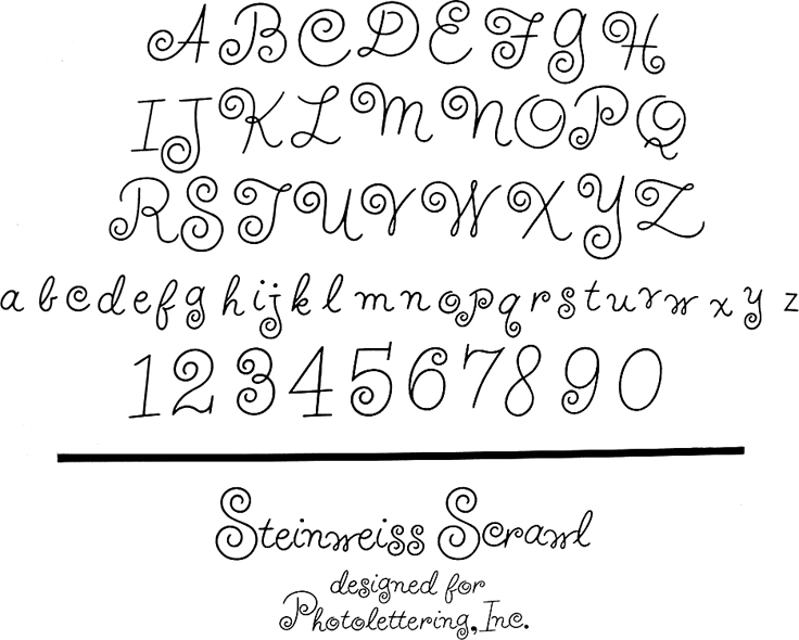
Around 1951 Alex Steinweiss had actually created a font called "Steinweiss Scrawl" for Photo-Lettering. (Coincidentally my first job after graduating Cooper Union was as Ed Benguiat's assistant at Photo-Lettering!). But this font was extremely limited in it's capabilities, and although it had a certain bouncy charm and naïveté, in my opinion, it didn't really capture the fluidity of Steinweiss' calligraphy:At any rate, shortly after completing the Steinweiss project for Taschen, I decided to pursue on my own the design of a font in the spirit of his calligraphy. The challenge was enormous—to create a typeface that retained the sense of hand-letting and fluidity within the context of a digital font. Where Steinweiss' scrawls were all slightly different from each other, shifting and changing according to the needs of a particular cover design, a font designer has to commit to specific forms that need to be set in stone, so to speak. In this particular font, the "managed" nature of the design had to appear to be "unmanaged"!

Part of my solution was to create the typeface with a ton of alternates, lowercase ligatures, and caps/lowerase ligatures. Creating this as an OpenType font would be the only way to wrangle these thousands of pieces together into a coherent typeface design. Luckily I was able to count on the expert programming help of Patrick Griffin of Canada Type. Also, I was fortunate enough to be able to contact the Steinweiss family through Taschen, and get the official Steinweiss approval for this font design.

At this point until the fonts are released (very soon!), for those interested in seeing more, you may download "The Steinweiss Script User's Guide" that I've just completed (about 1.2 MB).

In a nutshell, here's how the fonts are organized: "Steinweiss Script" is a family of fonts in three weights: "Steinweiss Script Light", "Steinweiss Script Medium", and "Steinweiss Script Bold". Additionally, within each weight there are three variations: Simple, Fancy, and Titling. These relate to the size/ratio of the caps to the lowercase, the complexity of those caps, and the size of the ascenders/descenders on the lowercase characters. The reason for all this is to add usefulness to the font, making it accessible not just for headlines, but for longer passages of text as well.

I am going to try to release these fonts within the next week or so. Please stay tuned for more information! I will announce here as soon as they go live.

PEGs Cover Released w/Laura Smith Artwork

Years ago I designed the cover for the 6th Edition of the "Graphic Artists Guild Handbook–Pricing & Ethical Guidelines". I'd like to believe that my cover helped start a tradition of having excellent covers for the Guild's main publication. Among the previous cover artists have been such luminaries as Lou Brooks, Noah Woods, John Hersey, and Richard McGuire—each with a decidedly different point of view and aesthetic. Now my wife, illustrator Laura Smith has joined that grand tradition.

The Graphic Artists Guild has just released the 13th Edition with Laura's beautiful work gracing the front back and spine:

The cover artists chosen by the Guild for the this project have always been given free reign to come up with a theme that would be carried through the book. Laura chose a circus theme since two things she loves are storybook illustration and circus imagery. This is especially evident on the back cover of this book where she's created and written copy for an elaborate series of spots highlighting in circus/storybook style various aspects of the business of design and illustration:

Laura has always been one of the few illustrators who understands how to completely integrate typography into her illustrations, and this cover really demonstrates that fact. The Guild has chosen to highlight Laura and tell more of this story in their Member Spotlight. But also please check out the rest of the Graphic Artists Guild website—it's the only organization that's totally devoted to promoting and protecting the social, economic and professional interests of all graphic artists.

I will be headlining an event that the LA Chapter of the Guild will be holding later this month in downtown Los Angeles . . . but more about that later.

+++++++++++++++++++++++++++++++++++++++++++++++++++++

I wasn't going to post the PEGs cover I designed back in the day, but since Ms. Blake asked, here it is. Side note: the beginnings of the style that eventually became my Metroscript font can be seen in the word "Guidelines".

Le Train Bleu @ Bloomingdale's

While in New York City to give a talk at the Type Directors Club Laura and I stopped in at Bloomingdale's. I hadn't been back to Bloomingdale's for many years, so while there I thought I'd check to see if some signage I had designed for their "Le Train Bleu" restaurant might still be in use. To my utter amazement, my work was there—still in use after 30 years. The restaurant itself is a stunning recreation of a vintage dining car, and has been virtually unchanged inside since the day my work first adorned its entrance.

The Original "Le Train Bleu" was a luxury French night express train which carried wealthy and famous passengers between Calais and the French Riviera from 1922 until 1938.

Back in 1980 I had designed and painted art for two panels that were to bookend the stairway leading up to the restaurant. The challenge, as outlined to me by then Bloomingdale's Creative Director John Jay, was to design a poster reminiscent of the great transport posters of the '20s, '30s and '40s,—but in an extremely thin vertical format: almost a 4 to 1 height to width ratio. Also the design had to be able to mirror itself so that it could appear on either side of the entrance. Designing the piece so that one had almost a bird's-eye view of the train which was letting out a very art-moderne steam stream seemed like a natural for the format.

This was not a typical project for me at the time because I had never executed a painting like this before. In addition the typography played a much smaller role in the design, and in the end was much more toned down than in most of my other work.

Above is the menu cover I designed as a companion to the stairway panels. It depicts the same train as in the panels from the more traditional "heroic" viewpoint seen in many transport posters of the time. I redid the lettering, but kept it in the same moderne style—only in a lighter weight. And unlike the panels the art for which I had painted in gouache, I did the menu cover as pre-separated mechanical art—much more akin to my current work which is usually done in Adobe Illustrator.

Additionally I had designed the "Le Train Bleu" seal or monogram that appears in relief outside the restaurant and on printed materials. This was much more akin to the type and letterform-centric work that I've become known for, and was designed to be very heraldic in nature. To my surprise this large monogram in relief was also still there, looking as fresh as the day it was first mounted in the vestibule of the restaurant at the top of the stairs.

For those who are interested there are prints of the Le Train Bleu vertical format artwork available on my ILLOZ site. These prints are finely produced, hand-crafted 12 color fine art lithographs that are virtually identical to the original painting.

Please also see my more recent supplemental posting on Le Train Bleu at Bloomingdale's.

Back to the Future

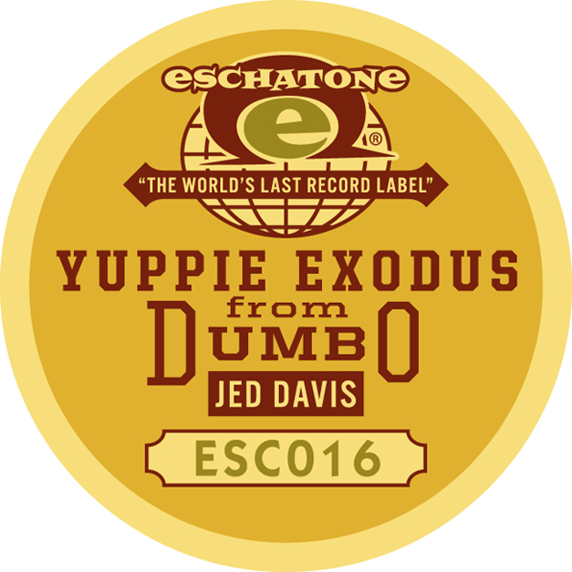
My friend Jed Davis, for whose recording company Eschatone Records I had designed a vinyl record label, recently asked me to design packaging for an unusual project. While most people in the recording industry are trying to figure out "what's next", Jed was asking the question: how can I get back to basics? What came before MP3s, before CDs and Casettes, before 8–Tracks, and before 33, 45 and 78 RPM records? The answer: wax gramophone cylinders, of course! So Jed decided to release one of his own recordings not only as a digital download but, hoping to reach the untapped centenarian demographic, also as a limited edition, signed wax gramophone cylinder. But unfortunately, as Jed was to learn from The Vulcan Cylinder Record Company, it had to be made of hard plastic instead of the traditional wax. Undaunted, Jed decided to move ahead declaring that since it would be hard plastic "it will never degrade, no matter how many times you play it on your family Edison". He also decided to accommodate all those without gramophones by including a free digital download together with the purchase of the cylinder.

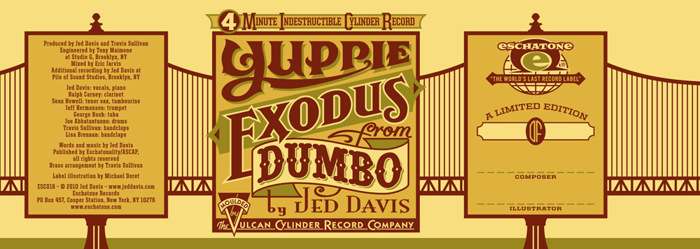
When Jed asked me to design the labels for the cylinder, I thought "Well, I've designed covers for LPs, for cassettes and for CDs. This may very well be my last opportunity to design a gramophone label." The title of his release was "Yuppie Exodus from Dumbo", and Jed gave me free reign to design both the wraparound label and the round label for the top of the cylinder container:


When the labels were finally printed by Vulcan, the colors came out a little differently from what I had designed, but I have to say that I'm pretty much OK with it. I think it does give it a slightly more vintage feel that's appropriate for this project:

This is a signed (by Jed and by me) and numbered edition limited to 50 cylinders. Hear the song and purchase the cylinder/download HERE—before it's too late!

Talk at the Type Directors Club

If you're going to be anywhere in the vicinity of New York City in late July, then I'd love to invite you to the talk I've been asked to give by the Type Directors Club. I'll be talking about my work, both new and old—and more specifically about all the influences I've had over the years that helped form my aesthetic sensibility, especially those that worked on me as kid growing up on the streets of Brooklyn. So is it "Nature or Nurture"? You be the judge!

I'll be in New York to attend the opening night festivities at Cooper Union on July 20th for TDC² 2010 – the show which honored my Deliscript fonts.

My talk will be held on Thursday, July 22nd, 6:00–8:00 PM at the Type Directors Club: 347 W. 36th St, #603, NYC.

Please RSVP to the TDC by Email or call them at (212) 633-8943 to reserve your spot.

Art Imitates Life...Imitates Art (Canter's Truck #2 of 3)

Although most of the food trucks are similar in appearance, many contain details that slightly alter some of their proportions. So it became necessary for me to visit the Road Stoves truck depot and to take pictures of the truck that would be closest to the one that Bonnie would be getting, and to use those photos as templates for my design—I'd also have to Photoshop out the existing graphics, making the truck as clean as I could to act as a blank canvas for my new design:

I set about to create the elements for the truck wrap, basing the graphics on the look of the Canter's neon sign and my font Deliscript. I felt I needed to modify Deliscript a bit to make this a strong graphic statement—kind of like a logo for the truck. So I began by creating a large, circular initial "C" in Canter's—and that became the basis for the look:

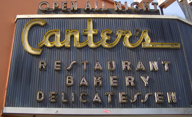
I also settled on a palette of colors that I felt would be attractive and reflect what I thought of as a Deli aesthetic. The unique double "SS" in "DELICATESSEN" was borrowed from the neon sign—one of many small details that I felt would help keep continuity between the restaurant and the truck. I added some other elements such as "Since 1931" that Bonnie wanted. In my first iteration for the truck my feeling was that I'd try it as a white truck—a good clean look— and adjust the graphics accordingly.

I might've had the Good Humor truck from my youth in Brooklyn in mind:

Nevertheless, a white truck wasn't exactly what Bonnie had planned on. I have to admit that I'm glad she pushed me to do a more colorful truck. Even though the truck was to be treated as a "vehicle wrap" by SignQuest, a process that is being more and more widely used, I decided to treat the truck as if I was designing a paint job in order to give it a look that was more in keeping with its mid-century heritage. Keeping the color palette that I had first come up with I created some mock ups that I thought would work even better for Canter's than my all white version:

We also decided that it would be a good idea to have a slogan and, after much deliberation, settled on "...home of the Kibitz Room". The Kibitz Room is the dive bar/cocktail lounge that's off in a corner of Canter's Deli. Like Canter's, it's an LA institution that just seems to keep going and going.

I had envisioned that we would somehow use my very graphic take on the neon baker sign on the service side of the truck. So I put him on the door and let the steam from his platter trail back along the length of the truck towards the menu. Along the top of the truck yet another version of the Deliscript/Canter's logo:

In “Art Imitates Life…Imitates Art #3″ I’ll post photos of the actual truck wrapping, and also of the finished truck.

Art Imitates Life...Imitates Art (Canter's Truck #1 of 3)

Recently I had a strange (and kind of wonderful) confluence of circumstance—combined with a smattering of coincidence and random luck. It all started right here in this blog over a year ago when I started sharing my thoughts about creating my new font Deliscript. In the posting I mentioned how the design was "loosely inspired by one of the signs at Canter’s Deli", a Los Angeles staple for almost 80 years:

At any rate my good fortune with Deliscript began about two months ago when I learned that it been selected by the Type Directors Club in NYC for inclusion in their annual show. About a month later I got a call from Bonnie Bloomgarden, the great-granddaughter of Ben Canter—one of the original Canter Bros. She and her sister Dena were trying to do a few things to gently update the Deli, while still respecting its heritage. One of their ideas was to create a "Canter's Truck" and take advantage of the recent mobile gourmet food trucks craze. A lot of the newer trucks have been completely "wrapped" with colorful graphics using fairly new printing technology.

She told me that they had started looking for fonts to design the wrap for the truck themselves, but then realized it might be a little difficult for them without having a lot of graphic design experience. Then fortune smiled on Bonnie and Dena when they did a web search Googling "Deli" and "Font" and ran smack into Deliscript (probably because of the Canter's mention in this blog) and then in turn found, and contacted me.

It has been a real pleasure working with Bonnie, a young person with good entrepreneurial instincts that are combined with a keen sense of what is worth keeping in the Canter's visual vocabulary, and what perhaps should be let go. We both concurred that the truck identity should be based on that neon sign, and that I should use Deliscript as the starting point. I also suggested that we somehow should try to incorporate into the truck design their famous neon chef, who for years has been carrying that platter of freshly baked bread:

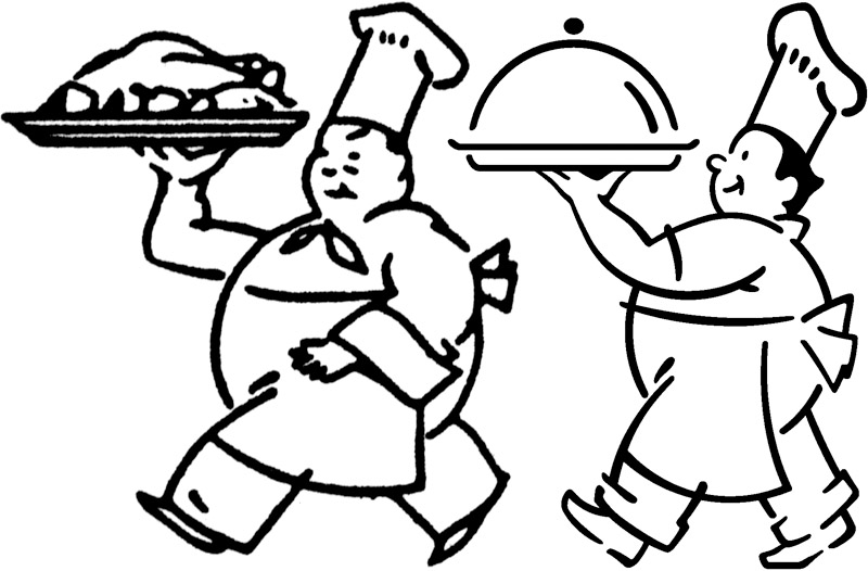
At first I tried to graphicallyt recreate him pretty much as he was for the side of the truck. I soon realized that my rendition seemed far too literal for the look I was going for. Then, in an old matchbook catalog, I found a cut of a little round chef carrying a platter of turkey, and decided to use that as the basis for creating my updated baker (a little slimmed down) for the door of the truck:

In "Art Imitates Life...Imitates Art #2" I'll discuss how we created the design for the truck.